UA Brand House
City Concept
Recognized globally for its mission to make athletes better, Under Armour embarked on a two-year test-and-learn initiative to reimagine its retail experience — moving away from a fragmented “billboard and POP card” approach toward a unified, consumer-centric store format that put product at the center of every experience.
Working across Global Brand, Strategy, Digital Experience, and Store Design — and in close partnership with agencies Fitch and Gensler — a retail North Star was defined around a new 2,000 sq ft store format with a redesigned fixture system that made product the hero. A bright, open design and balanced co-gender product approach made it easier for consumers to navigate the space and discern the layout at a glance.
With the store format established, brand photography, design, and voice were unified into a cohesive creative strategy — adaptable from small-format doors to multi-level flagship locations and delivering intuitive shopability, integrated brand storytelling, and dedicated product experiences across every touchpoint.
The result was a commercially viable Brand House experience scalable across owned and operated stores, wholesale, and partner doors — piloted and launched globally across North America, APAC, LATAM, and EMEA in 2021.
Understanding
the Athlete
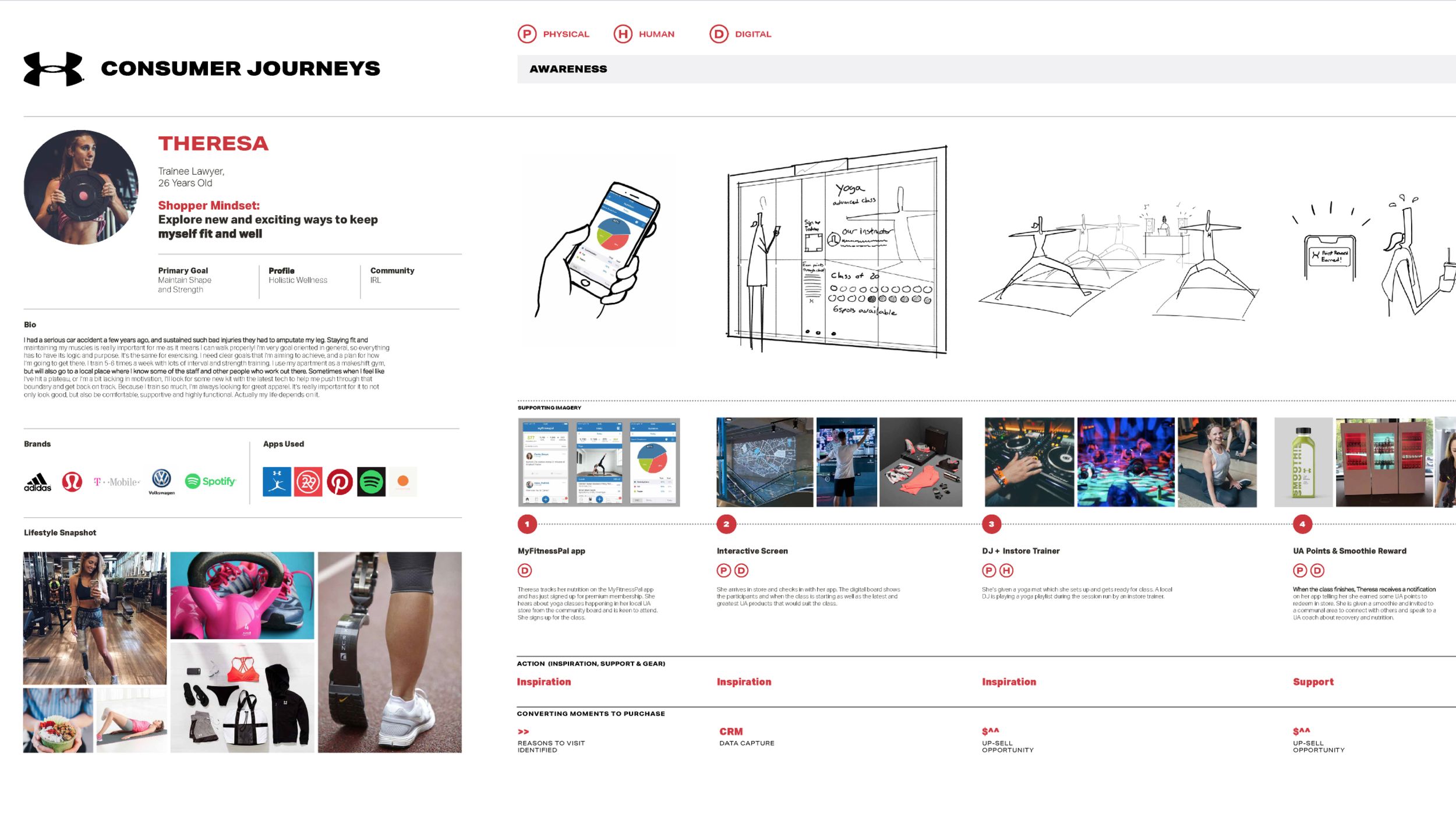
To personalize the store experience and map a seamless consumer journey, we partnered with Fitch to develop five distinct consumer personas. Each profile was differentiated by demographics, fitness goals, brand affinity, and product interest — all anchored to the "Focused Performer" as our core target consumer. These personas were foundational to store flow, experience design, and the broader concept development process.
The Building Blocks
The heartbeat, flashes of color, expressive type, and bold imagery formed the foundation of the UA brand identity — each element thoughtfully applied across advertising, packaging, and store design to create a system of balance and unity recognizable at every scale and touchpoint. Within the new Brand House, these elements worked in concert to reinforce the brand promise, guide the consumer, and ensure a consistent and cohesive experience across every owned, wholesale, and partner door globally.
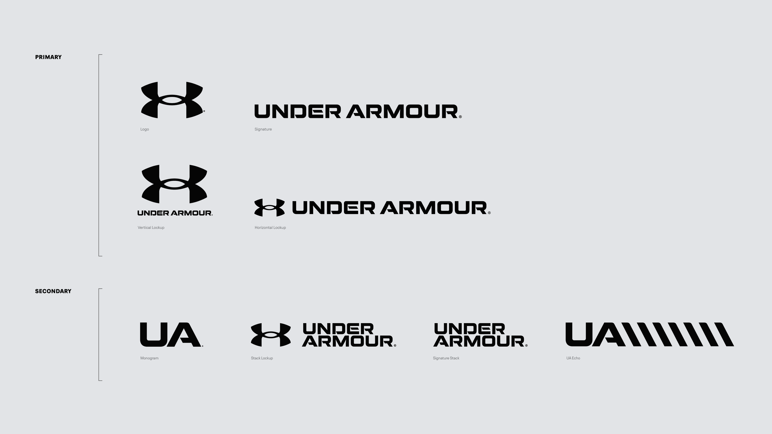
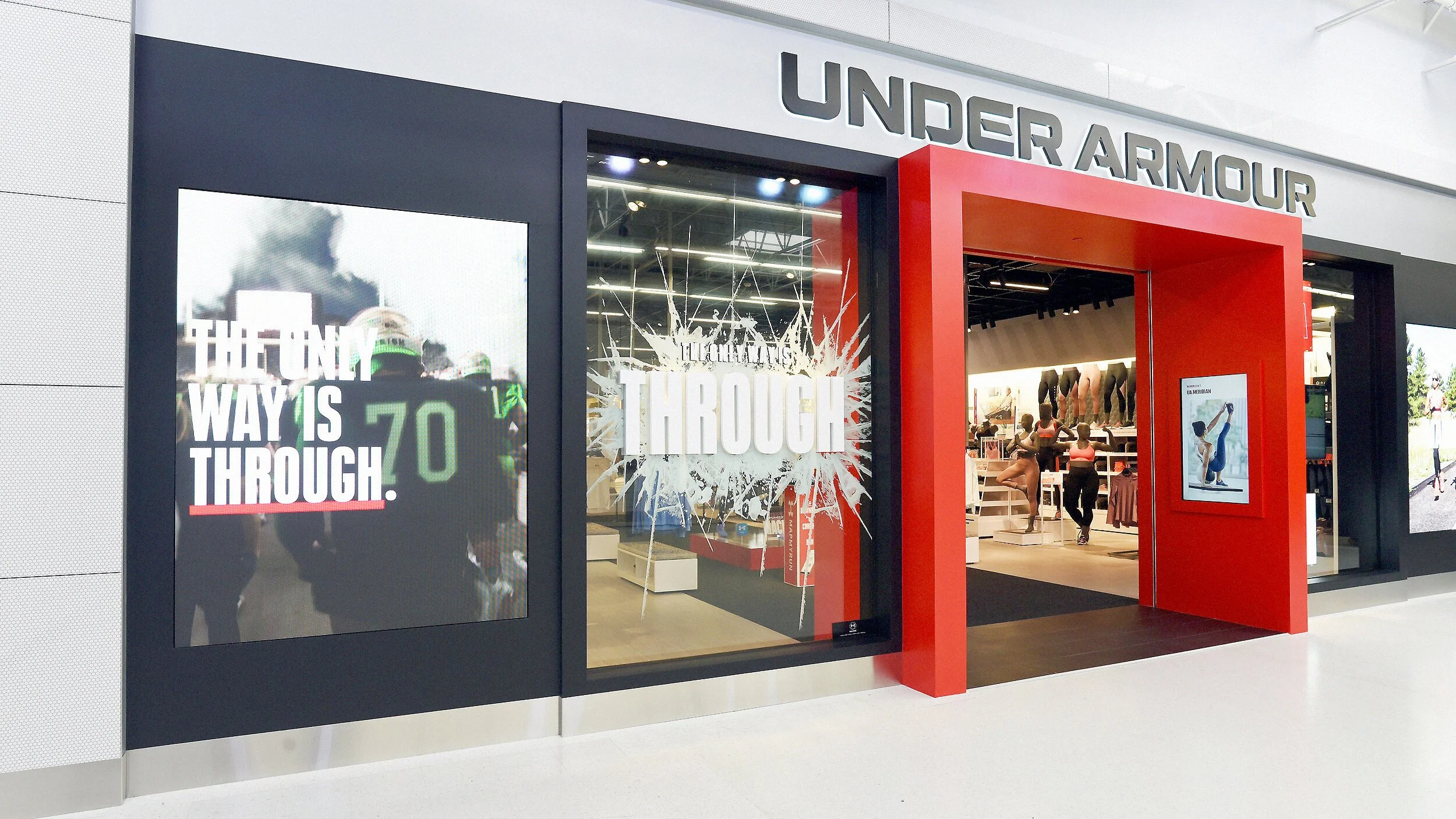
The UA Heartbeat and logo suite were the centerpiece of the brand's identity, consistent and intentional across storefronts, fixtures, displays, and point-of-sale to maintain brand strength, legibility, and recognition at scale.
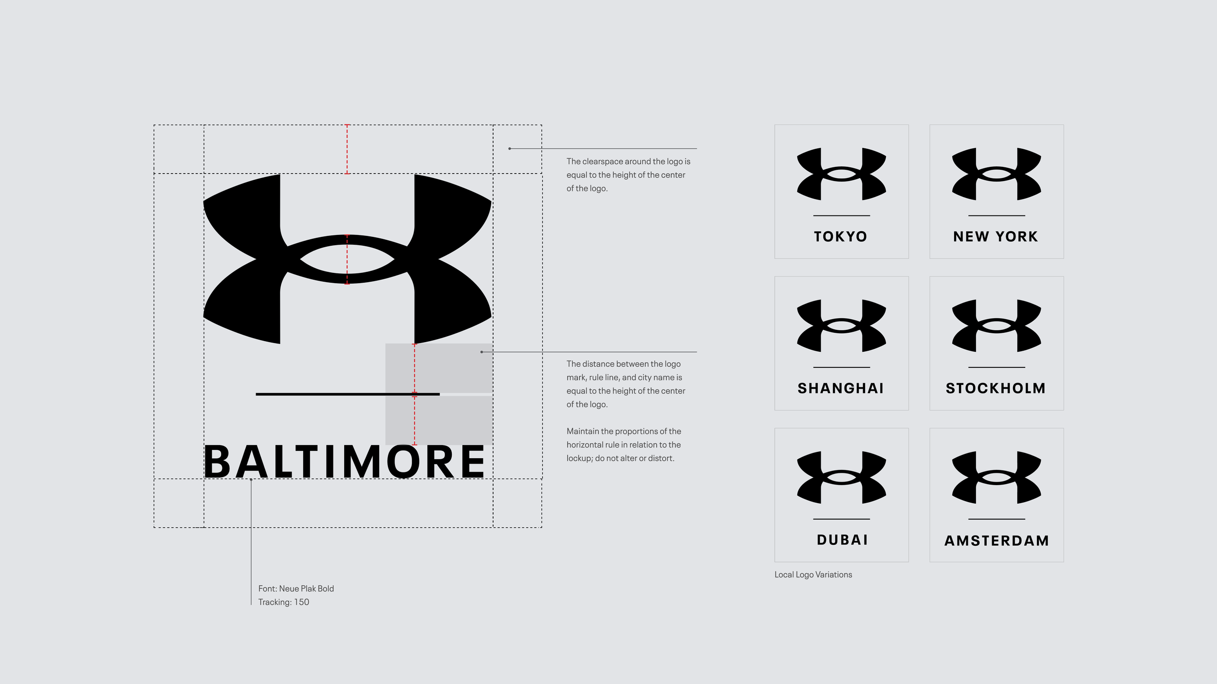
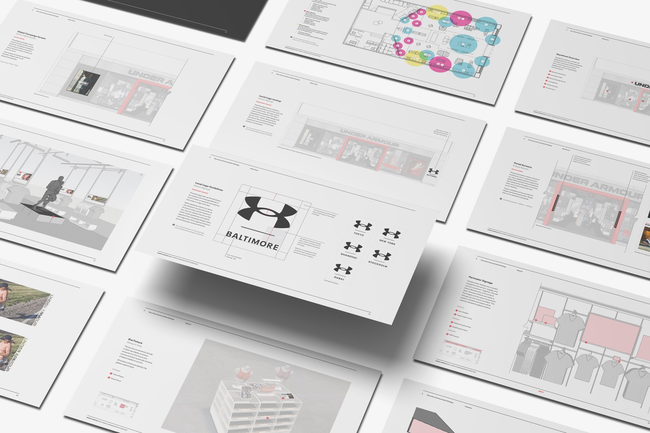
The localized logo lockup created a unique store identifier — connecting each location to its region, city, or local community. Integrated into the initial design and construction, it was part of the storefront from day one.
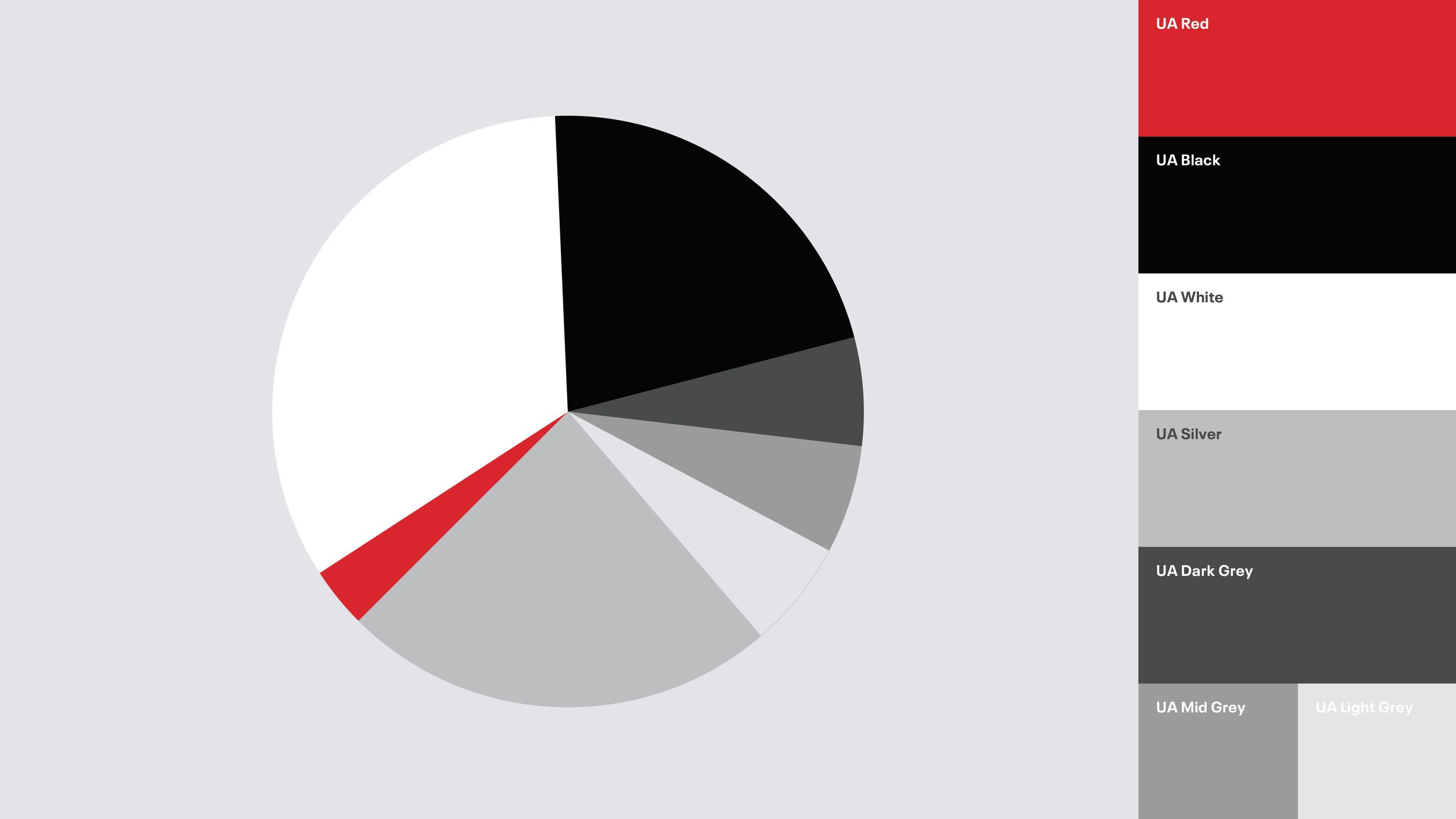
A white-dominant color palette complemented by strategic proportions of UA Red, Black, and Grey created a distinctive retail presence across store design, fixtures, and visual communications.
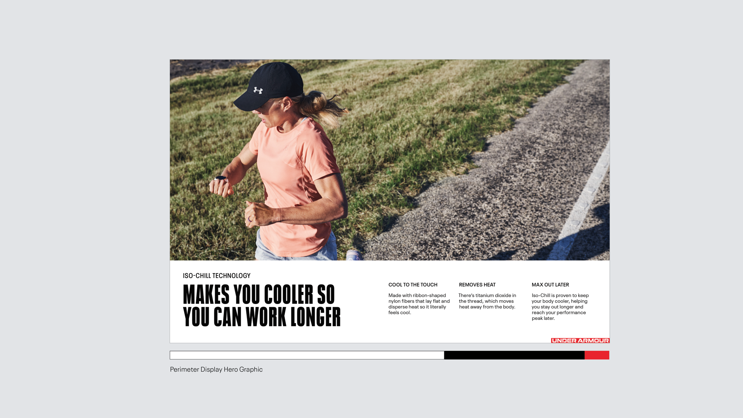
Specific design expressions varied in their interpretation of the palette across locations. To ensure consistency, the retail communications design system was intentionally restrained — allowing photography, product displays, and visual merchandising to take center stage with color.
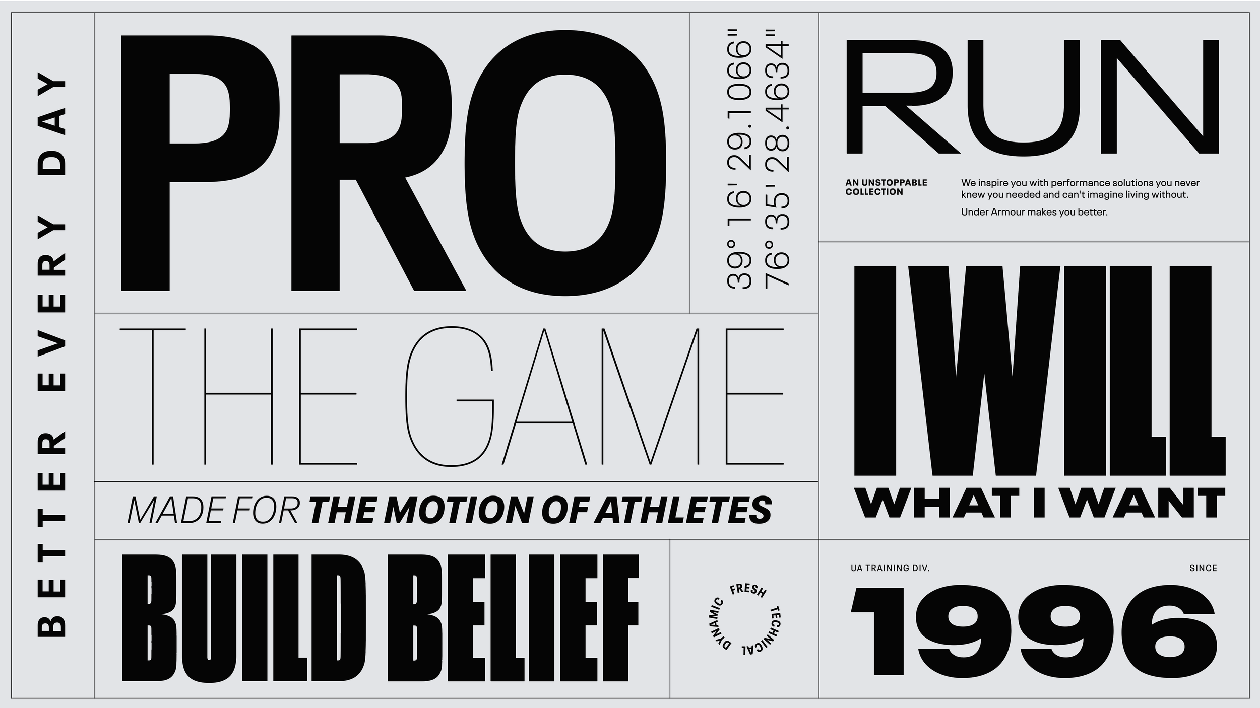
The identity system leveraged 36 variants of the Neue Plak typeface family — ensuring flexibility, creativity, and typographic consistency.
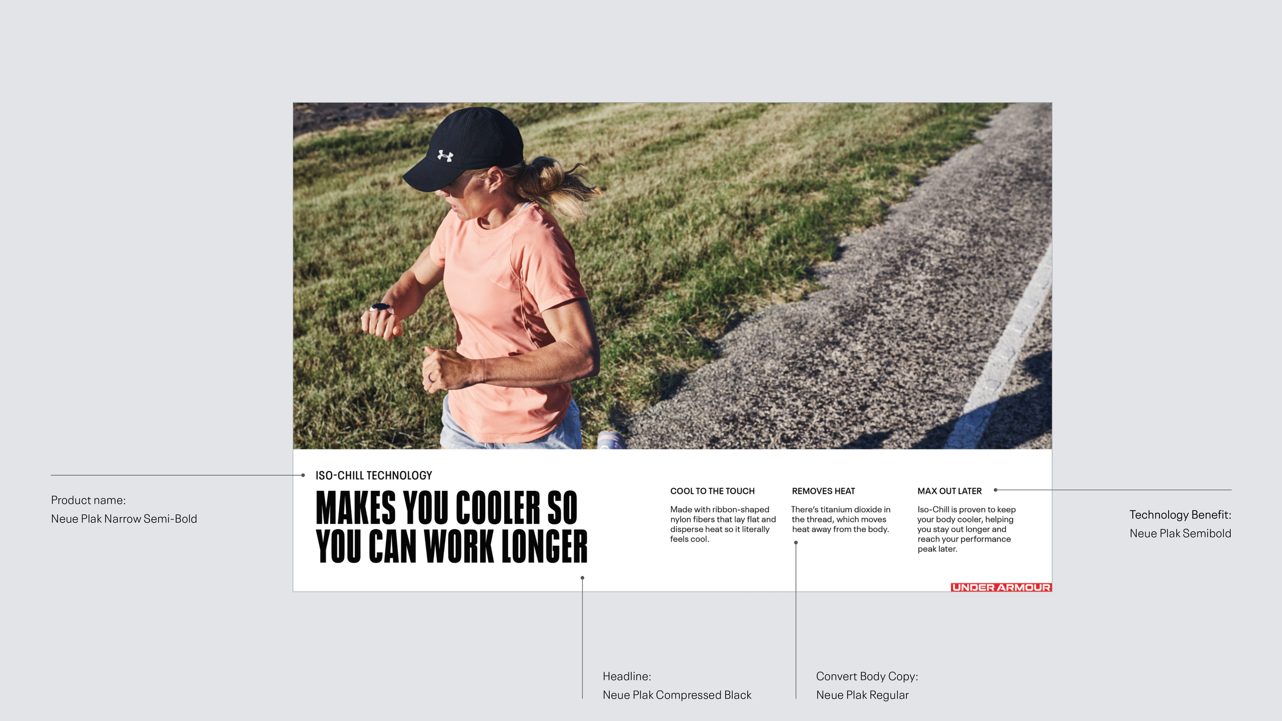
For in-store communications, the Neue Plak family was streamlined to four weights — establishing a clear typographic hierarchy that made information easy to find at a glance.
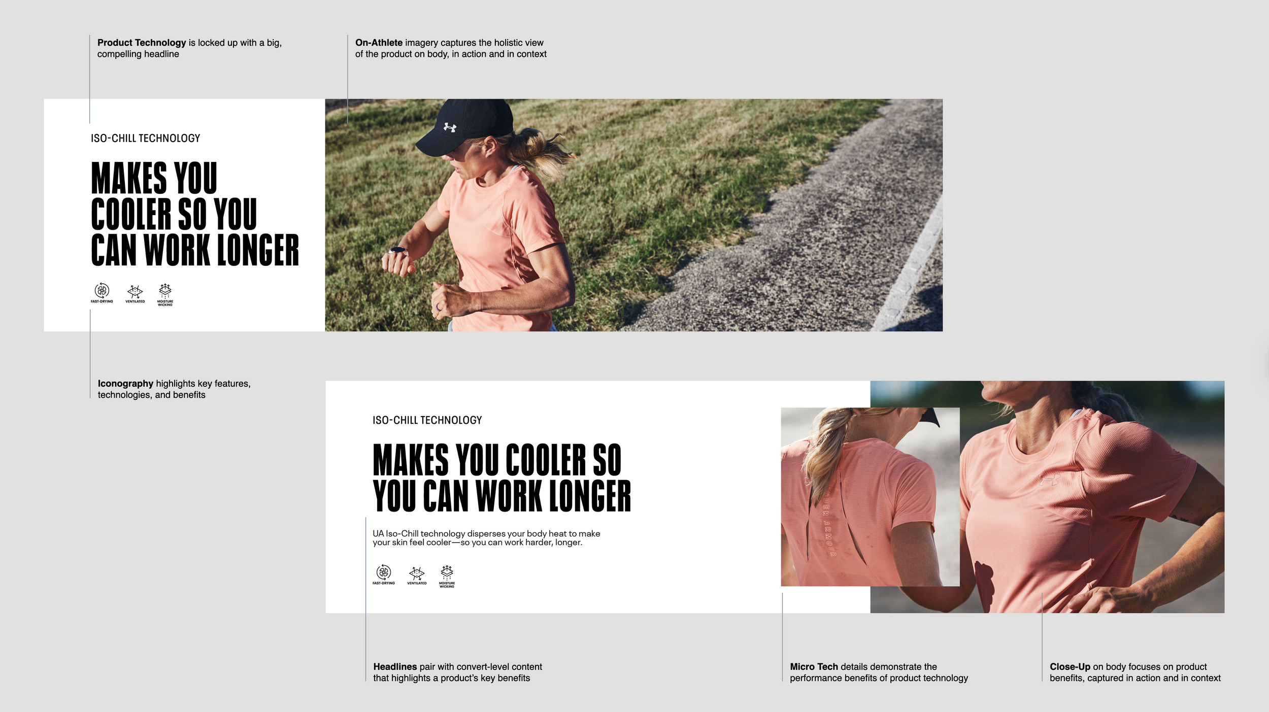
A clear visual hierarchy of information and photography told a complete product story — starting wide to establish the narrative, then moving closer to reveal the performance details that brought the brand promise to life.
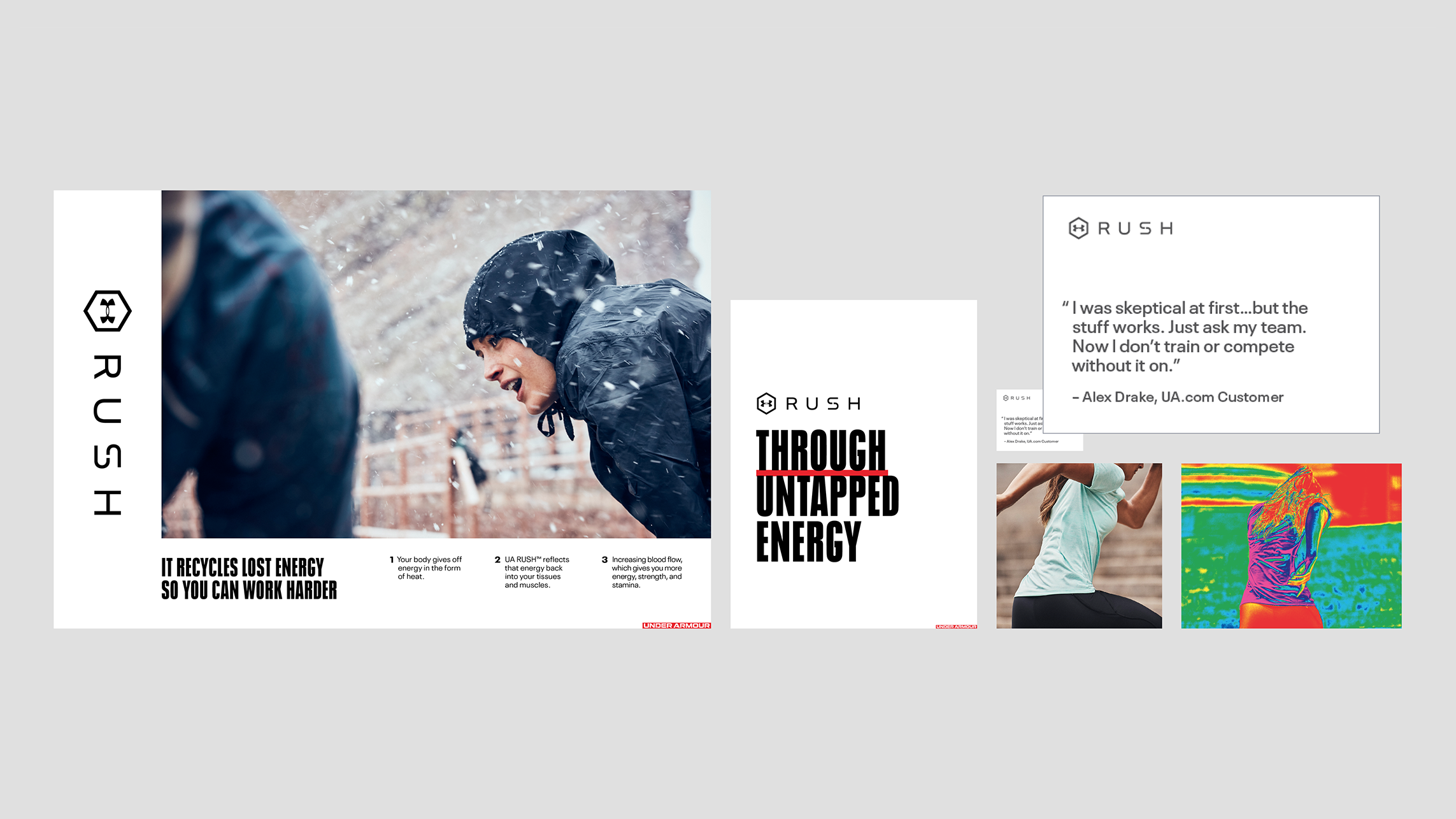
Together, the design system delivered a consistent visual communication experience across zones — combining imagery, headlines, product features, and expert testimonials to give consumers multiple ways to engage with the product story at every touchpoint.
Guiding the
Athlete
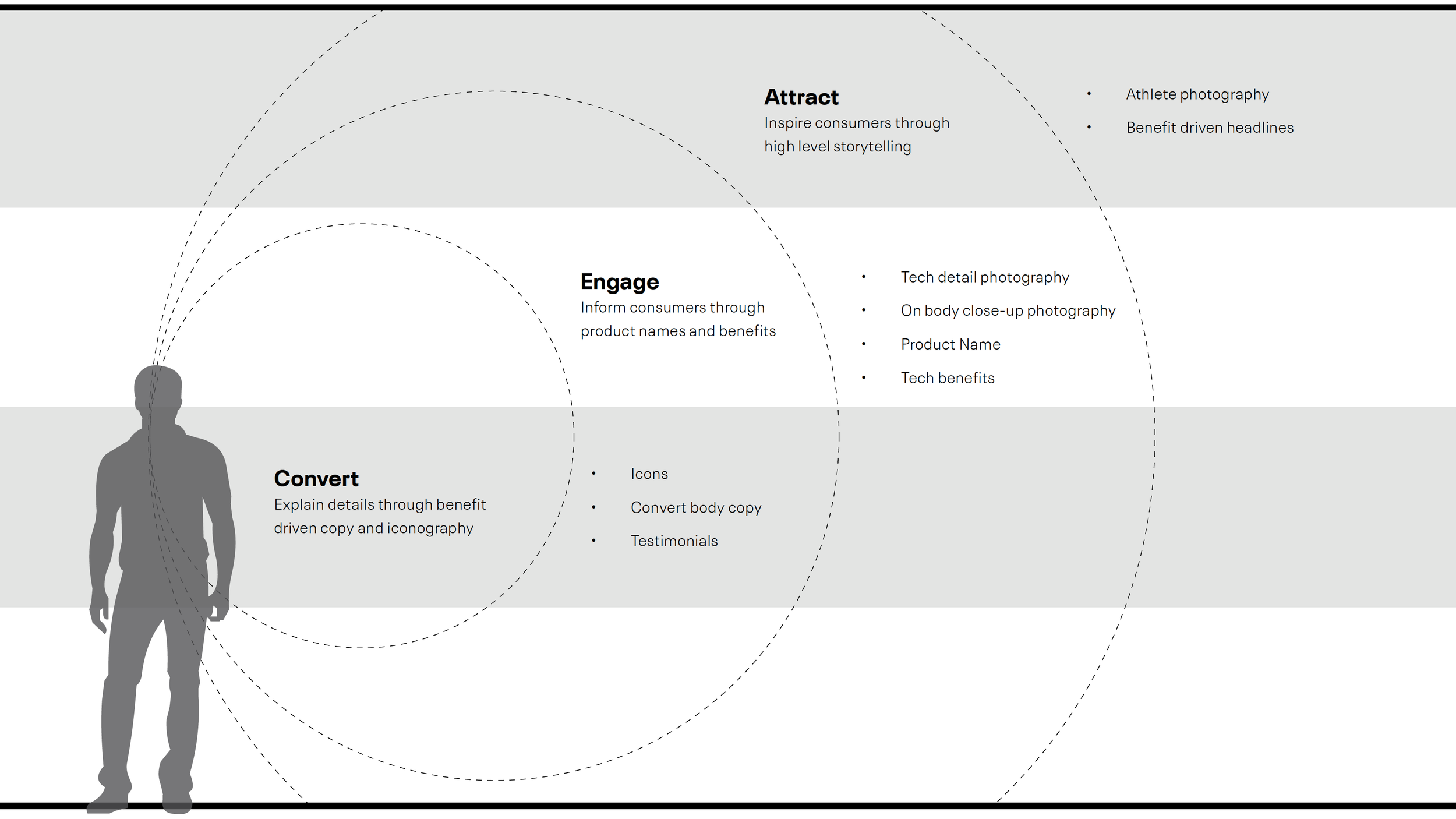
A hierarchy of story types defined the communications strategy across each location — placing the right narrative at the right moment along the consumer journey. Stories of athletes, products, and technology were woven throughout to reinforce the brand promise at every touchpoint, while a layered Attract, Engage, Convert approach gave consumers the information and inspiration needed to make confident purchasing decisions.
Every Store
Tells a Story
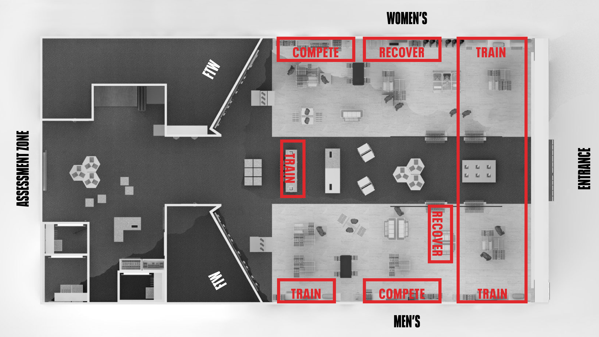
Store areas were laid out strategically — new arrivals at the front, core products in dedicated zones, and footwear anchored at the back — creating a natural flow that guided consumers through the space. Curated flex zones were activated through seasonal campaigns, product spotlights, and athlete narratives. Digital and physical messaging touchpoints were woven throughout, giving regions the flexibility to tell locally relevant stories of athletes, products, and technology.
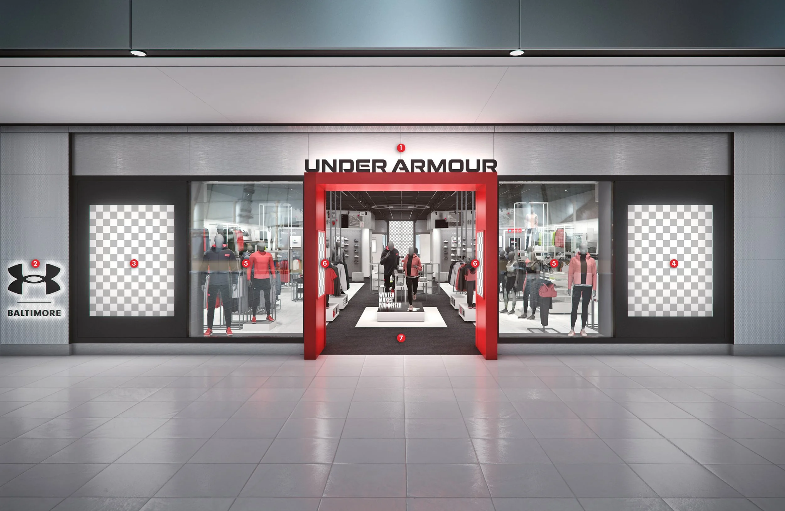
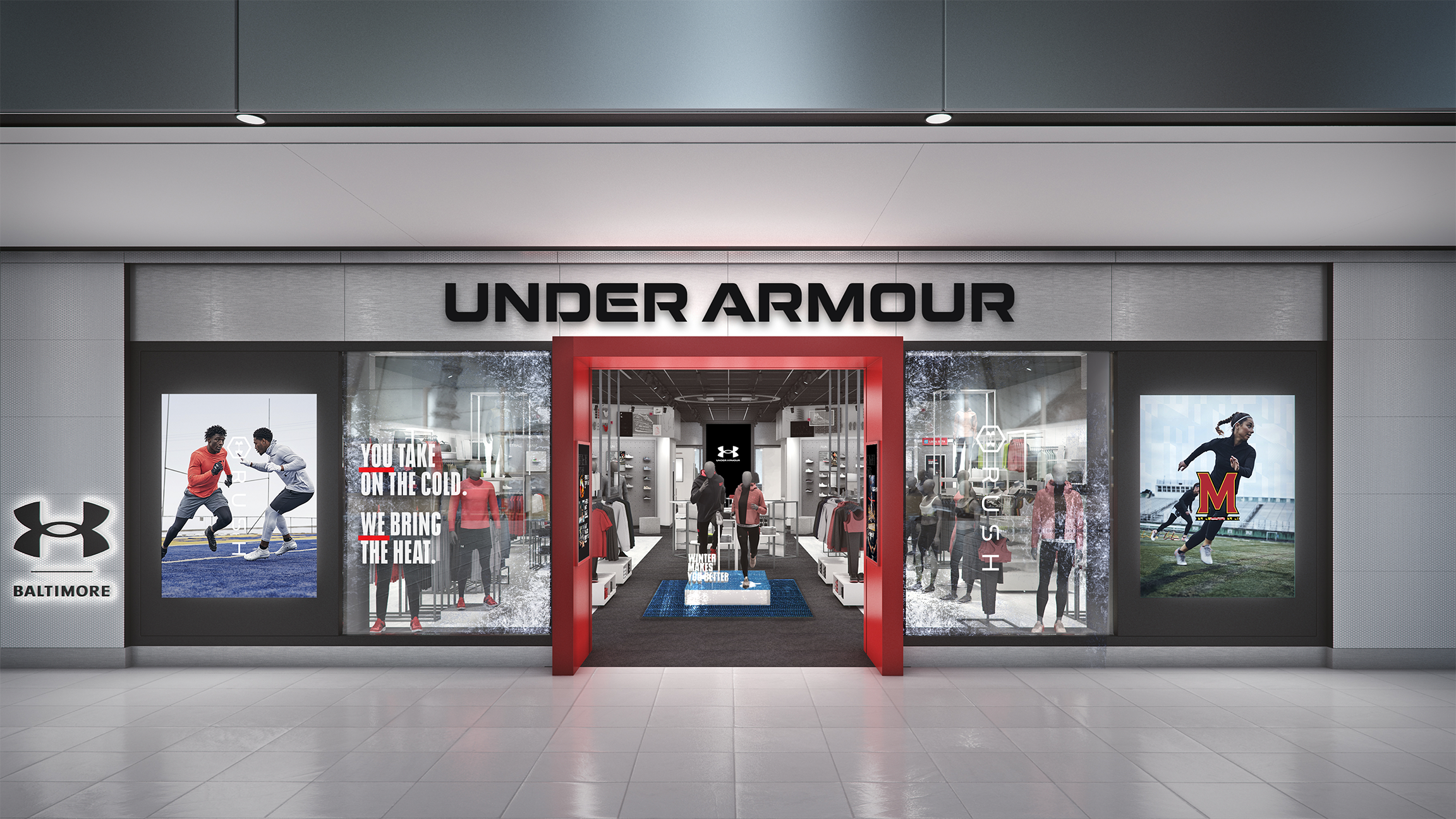
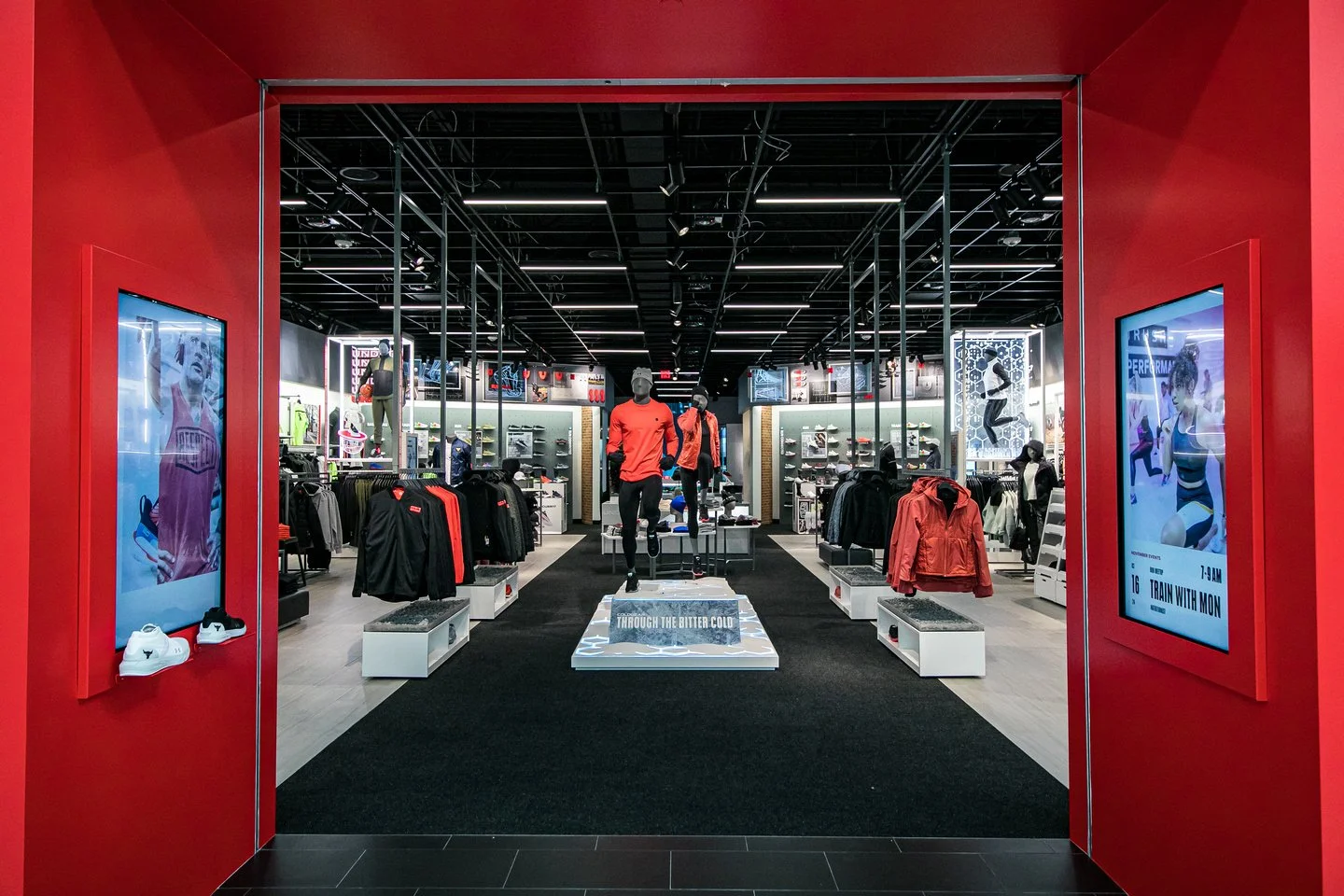
Anchored by the brand wordmark (1) and city logo lockup (2) — the storefront facade is an inspirational first touchpoint delivering emotive storytelling through global campaign screens (3), light boxes (4), and window displays (5) that align to portal screens (6) and an immersive entry display (7).
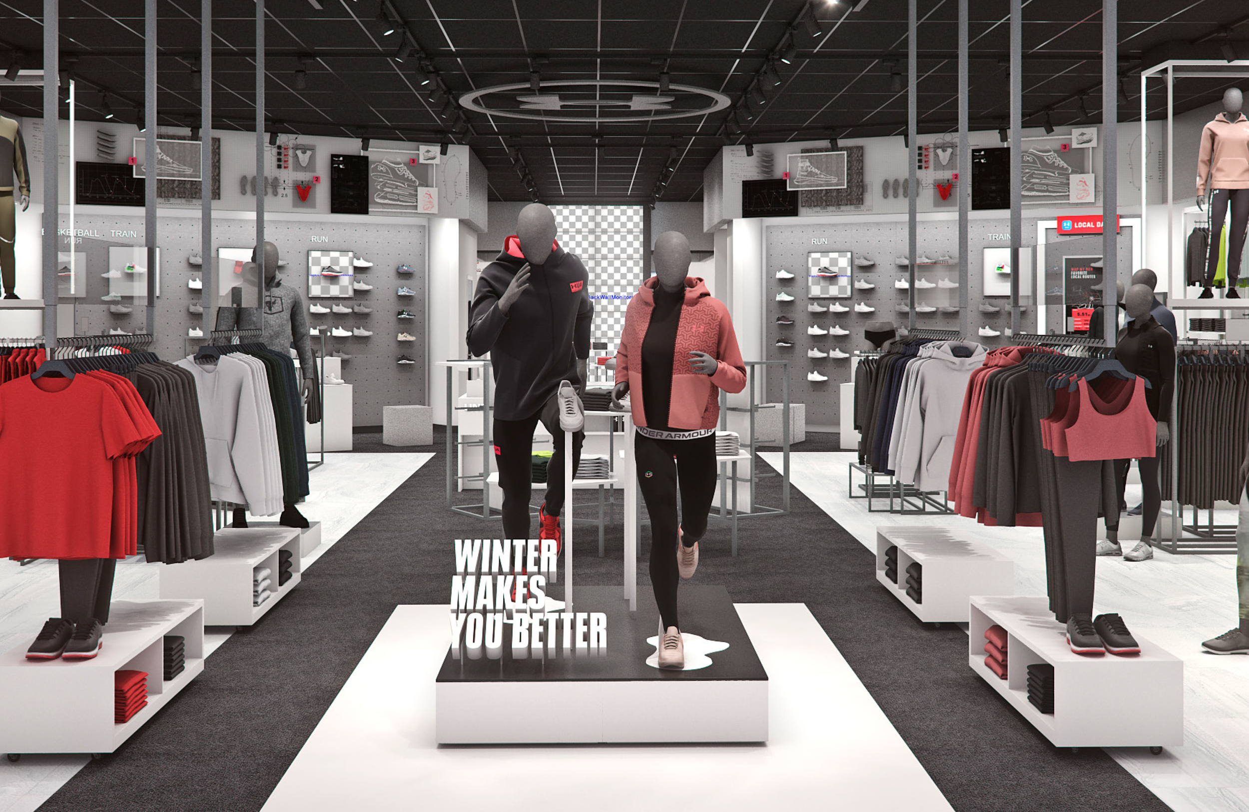
The entry display extends the storefront narrative into the retail environment — creating a seamless transition that showcases new and seasonal products as consumers cross the threshold.
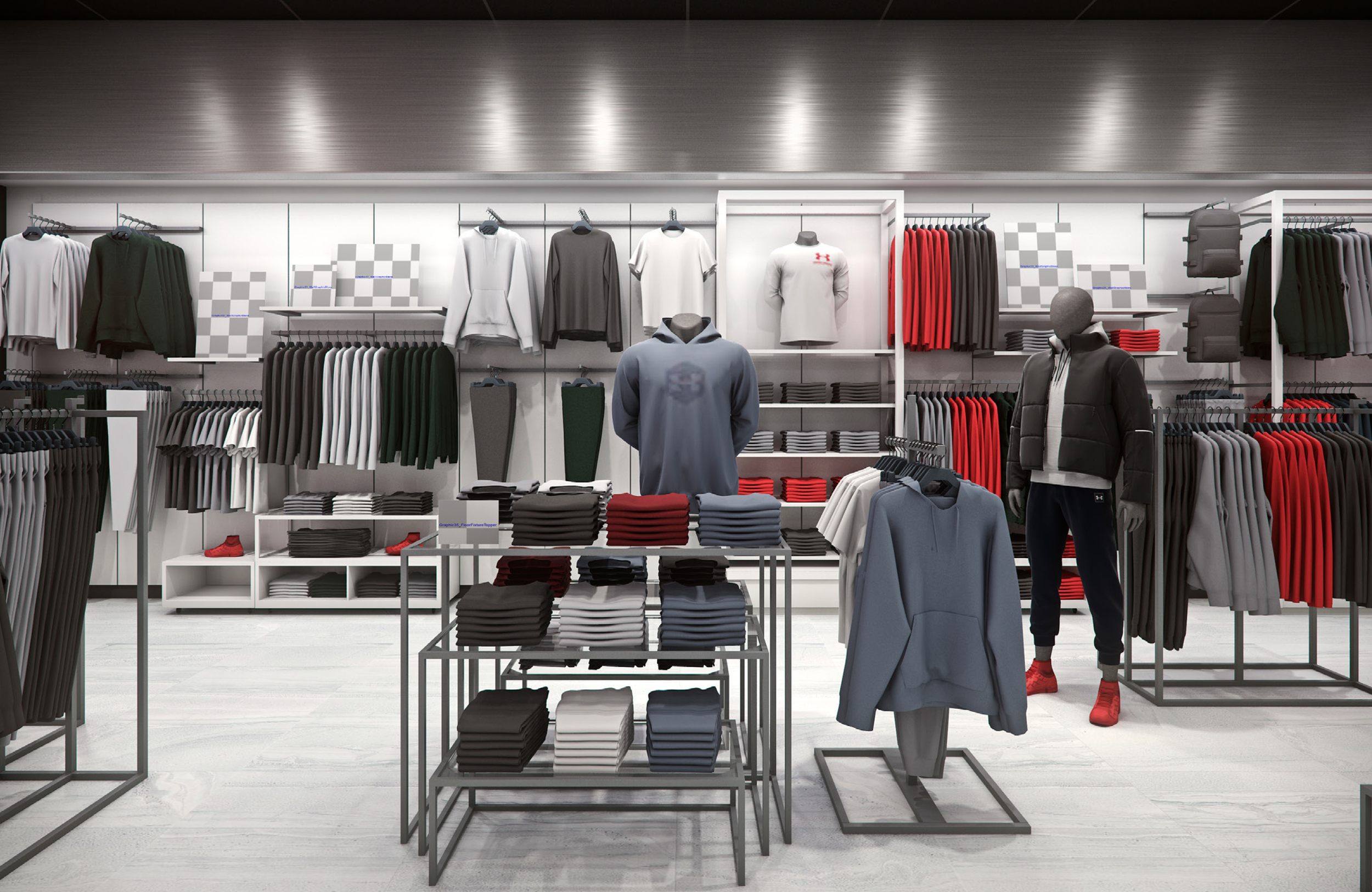
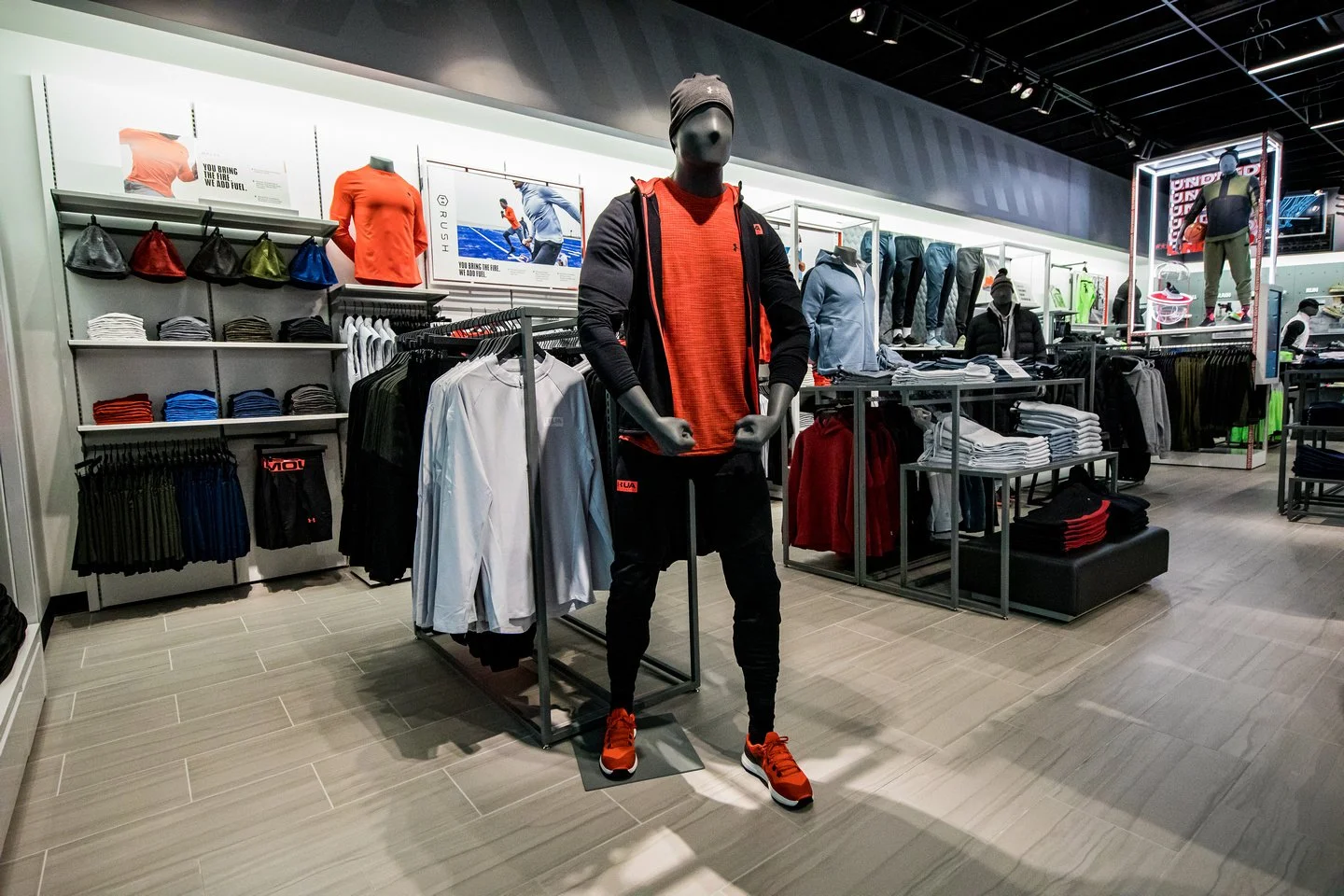
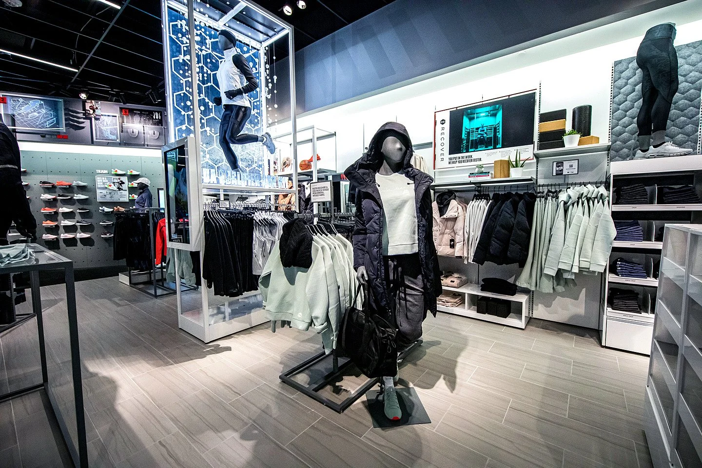
Rather than cramming every fixture with content or information, the modularity of the apparel zones created space for a flexible and moveable communication signage system — supporting a storewide story arc that is clear, concise, and benefit-driven.
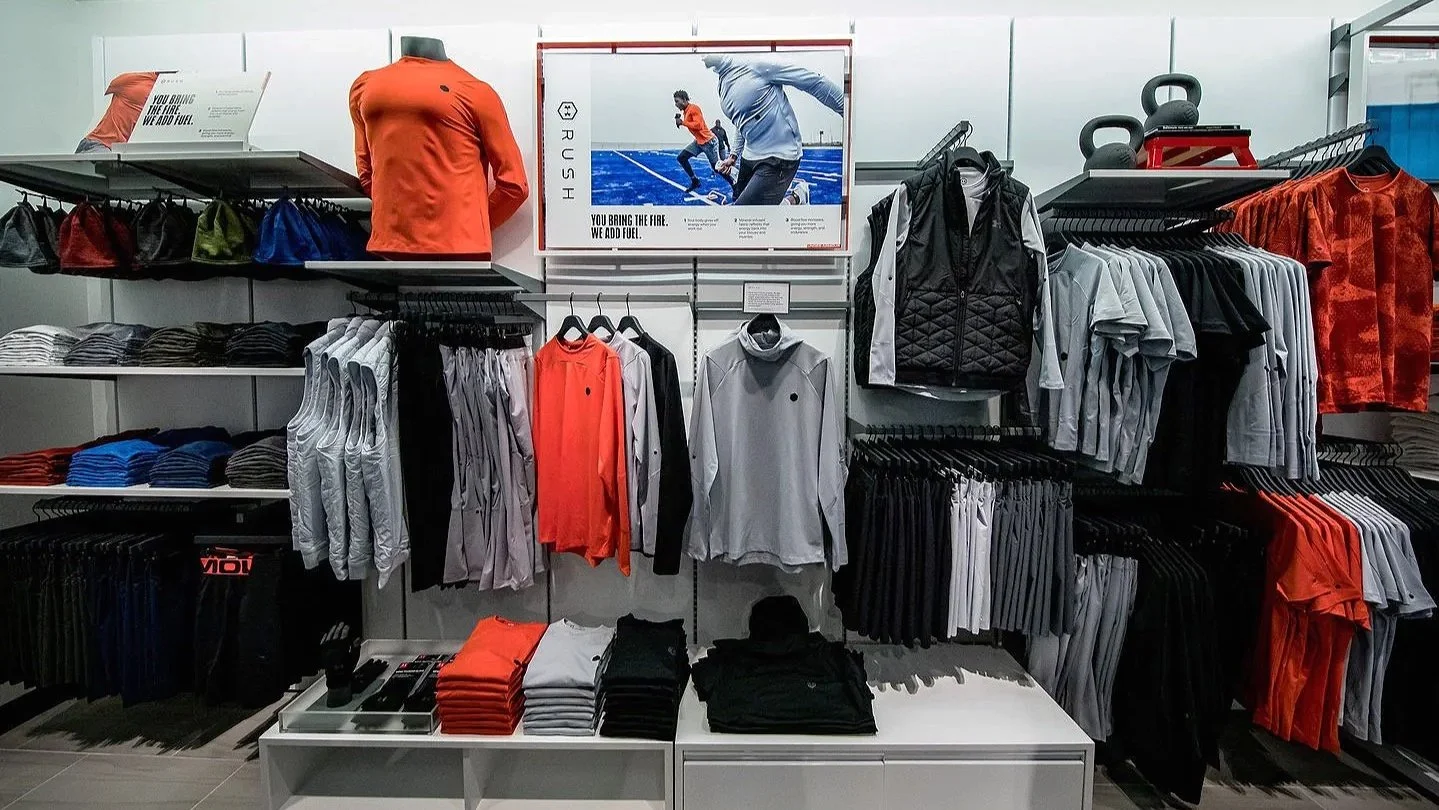
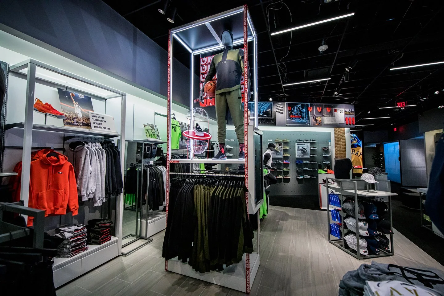
Highlight frame displays merged visual merchandising and digital storytelling into a single, high-impact fixture — connecting product and athlete narratives to digital platforms and enabling endless aisle functionality.
Every Display,
a Story
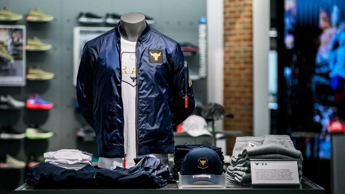
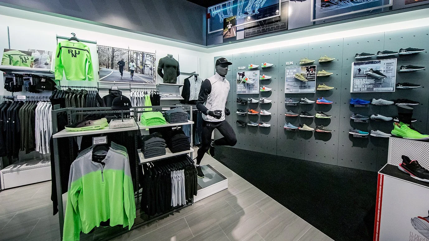
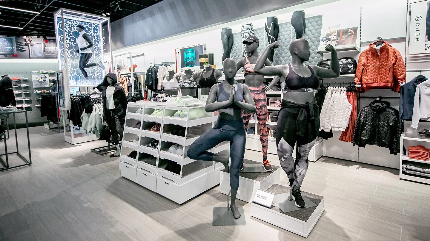
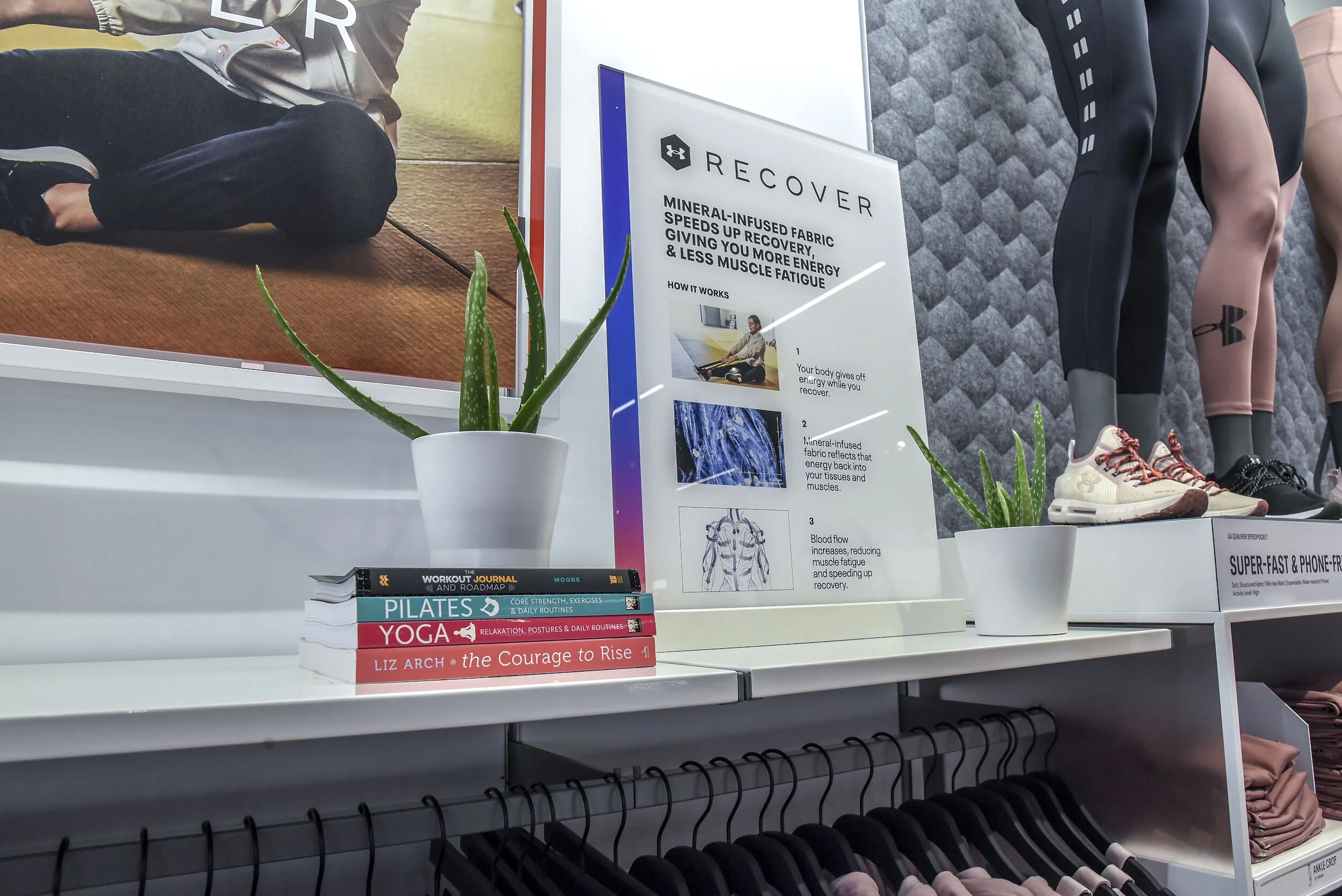
Curated mannequins, product displays, and category-specific props and graphics activated the space — adding depth to the brand story without relying solely on point-of-sale signage to communicate it.
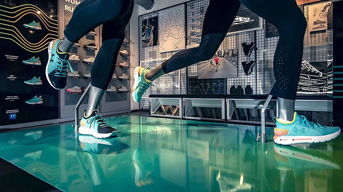
Humanized poses and expressive styling transformed mannequins into a powerful storytelling tool — communicating fit and offering consumers inspiration for head-to-toe product pairings.
Elevating the
Footwear Experience
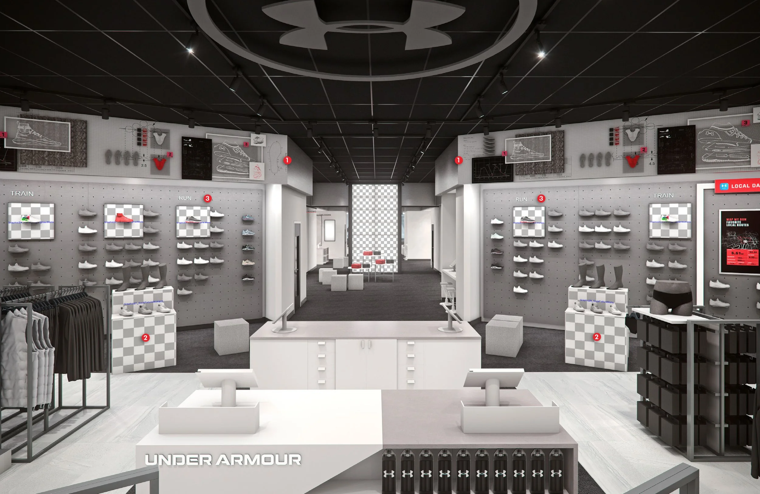
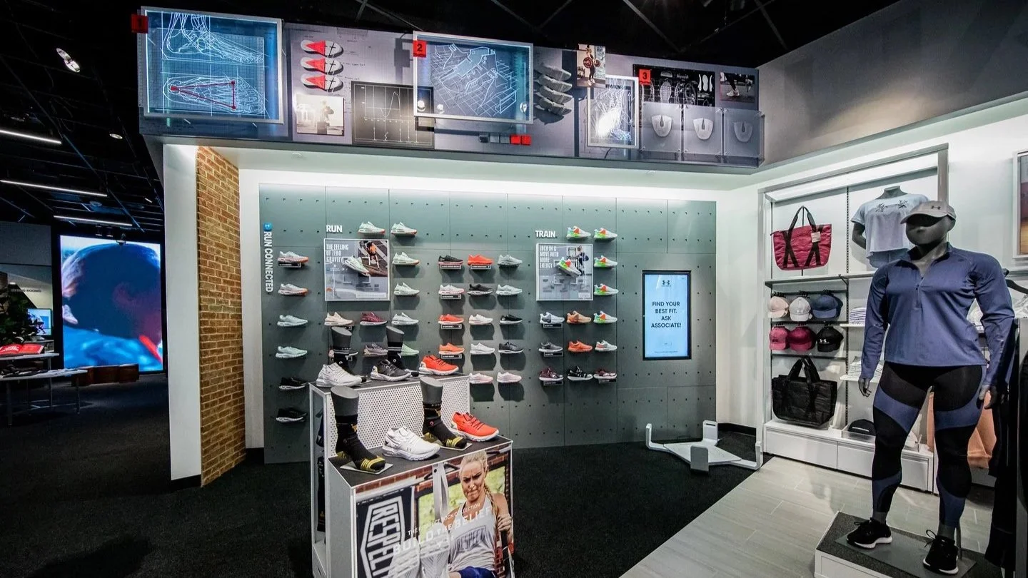
Positioned between apparel and the fitting rooms, the Footwear zone is visible throughout the store — creating a natural pass-through moment for all consumers. A clear merchandising hierarchy defined the experience:
(1) Evergreen brand displays along the bulkhead to attract
(2) Modular floor fixtures showcasing the hero footwear to drive engagement
(3) Wall glorifiers to improve category wayfinding and inform purchase decisions
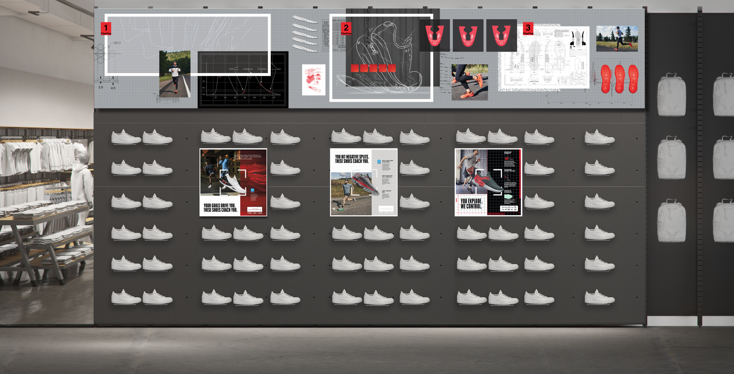
The footwear bulkhead is an overhead dimensional display anchored at the back of the Men's and Women's sections — illustrating the evolution of UA footwear through designer sketches, dimensional elements, and performance imagery. An evergreen foundation keeps the display consistent across locations, with photography updated seasonally to maintain a "Buy Ready" consumer experience.
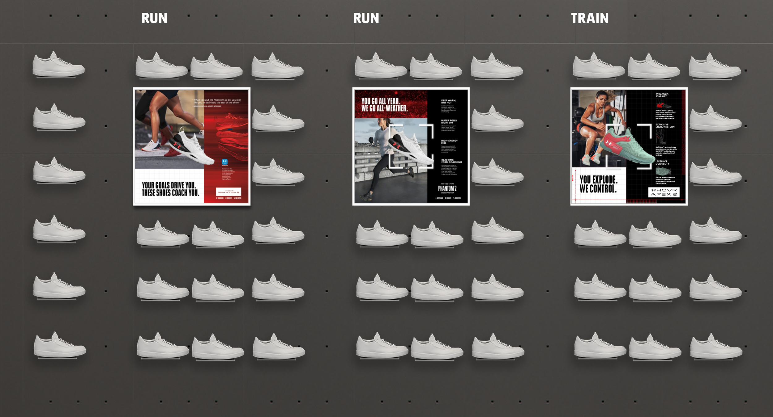
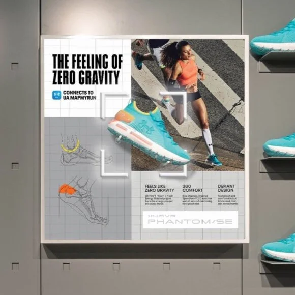
Wall glorifiers reinforce category wayfinding — highlighting a variety of seasonal footwear stories through a central display fixture that heroes the selected product, adds three-dimensional depth to the wall, and draws consumers in through photography, product descriptions, and tech callouts to inform purchase decisions.
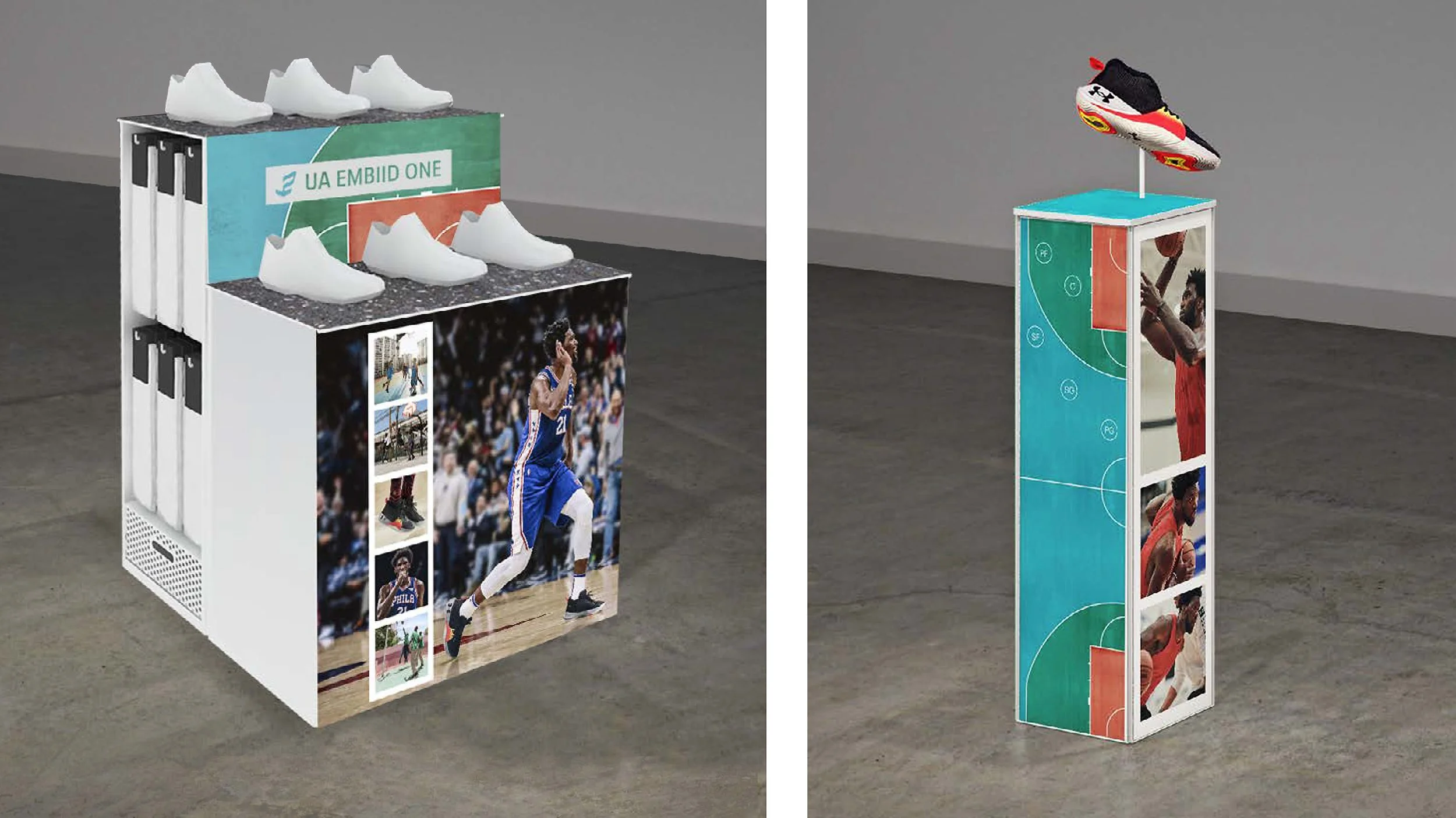
Freestanding floor fixtures in the Men's and Women's areas of the Footwear zone featured content aligned with the hero footwear story established at the storefront and entry display, to amplify the product narrative throughout the consumer journey.
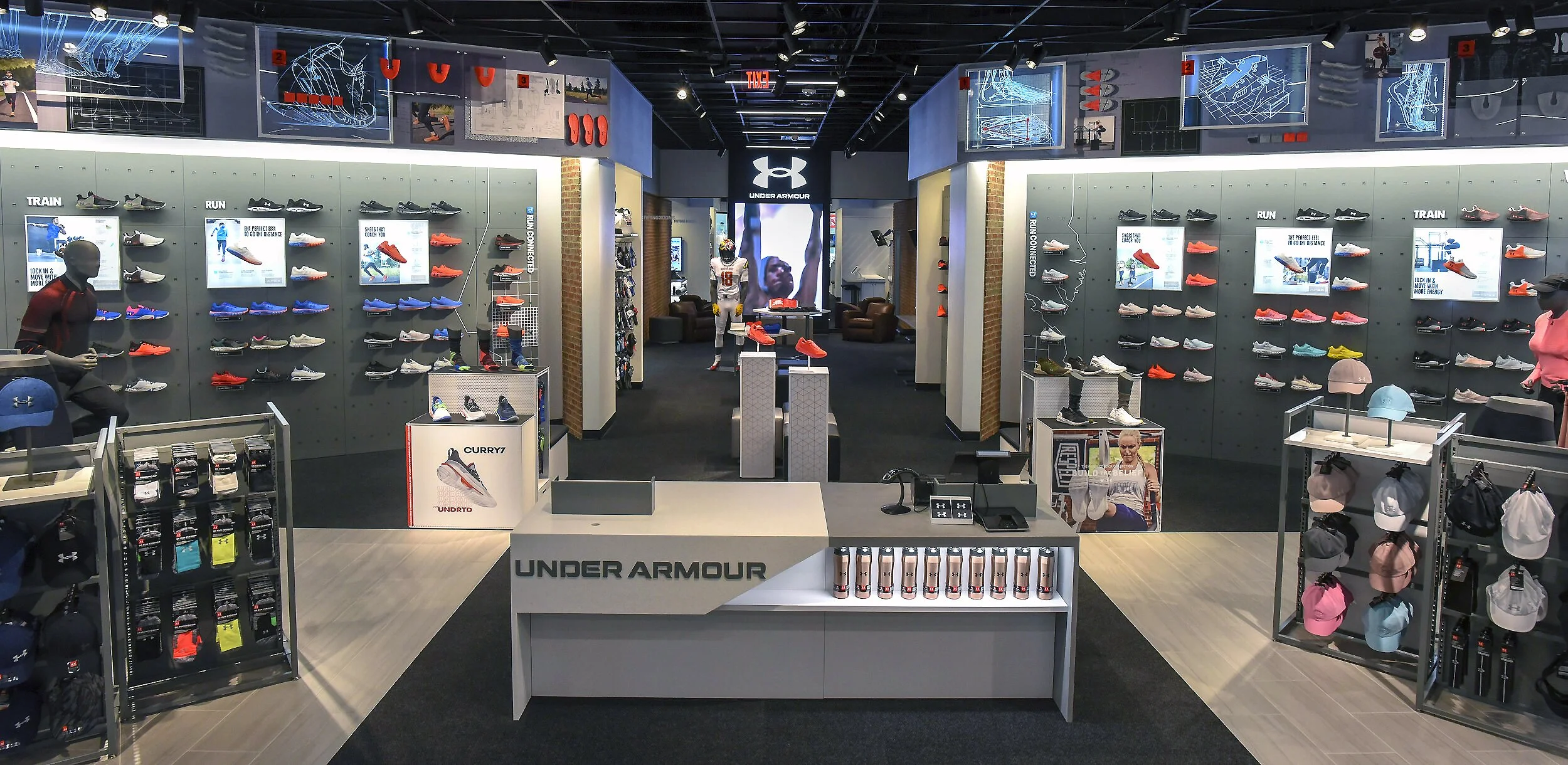
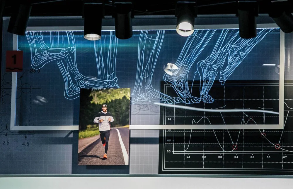
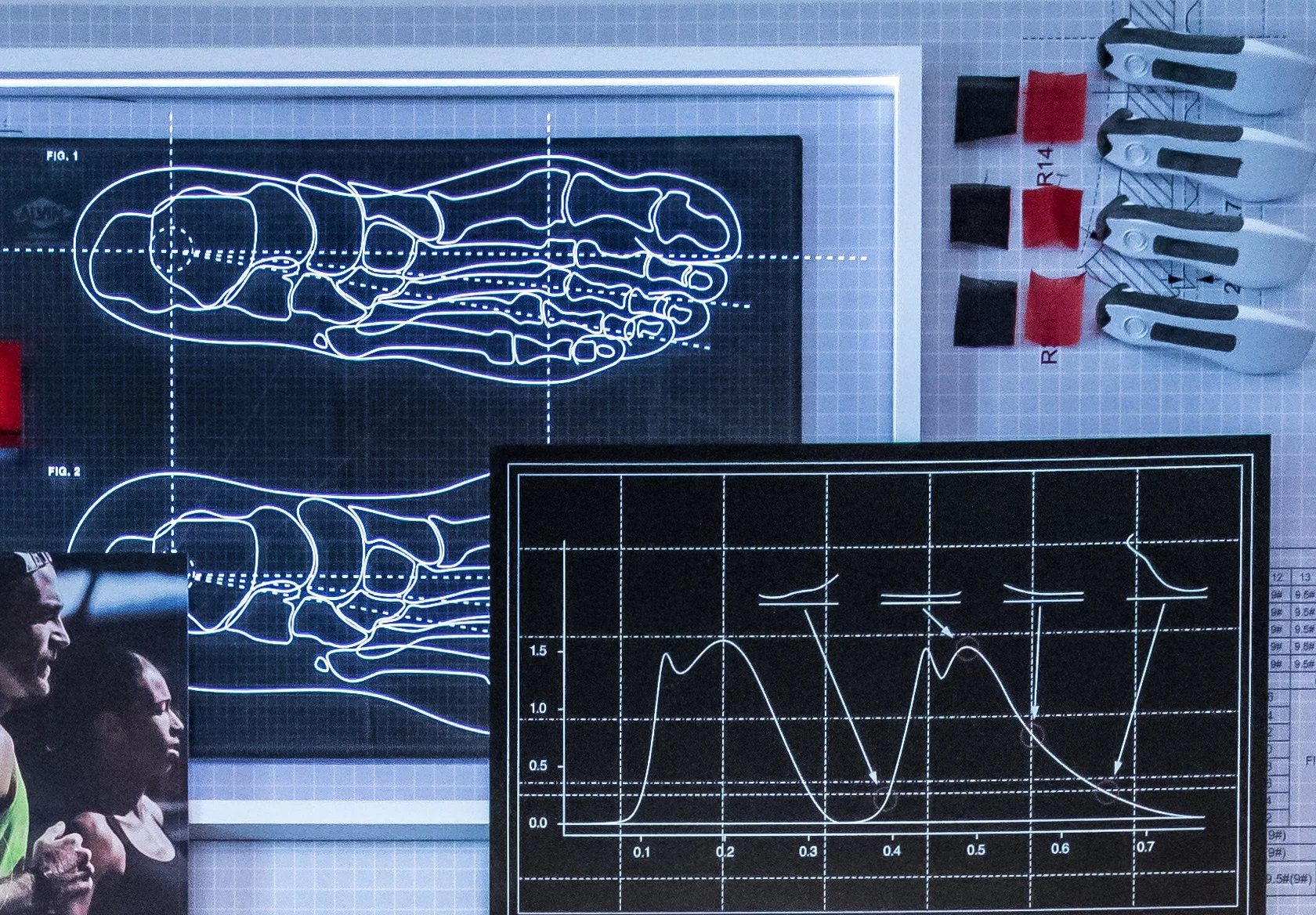
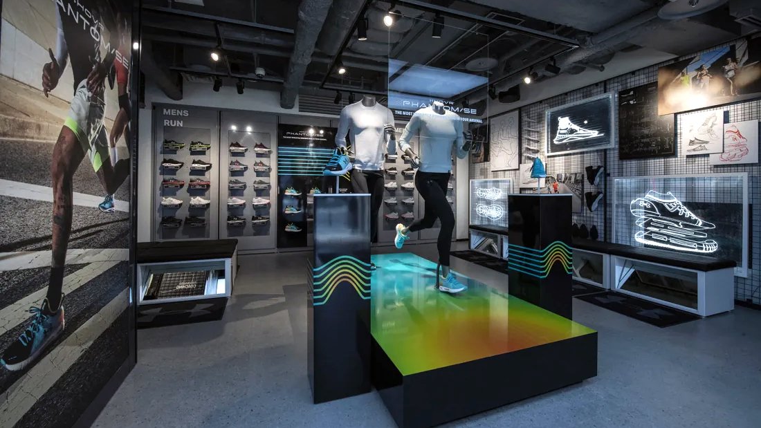
When rolled out globally, the evergreen bulkhead display was adaptable — scaling down to eye level for integration into the footwear wall as a brand storytelling device.
Fitting Room
RFID Experience
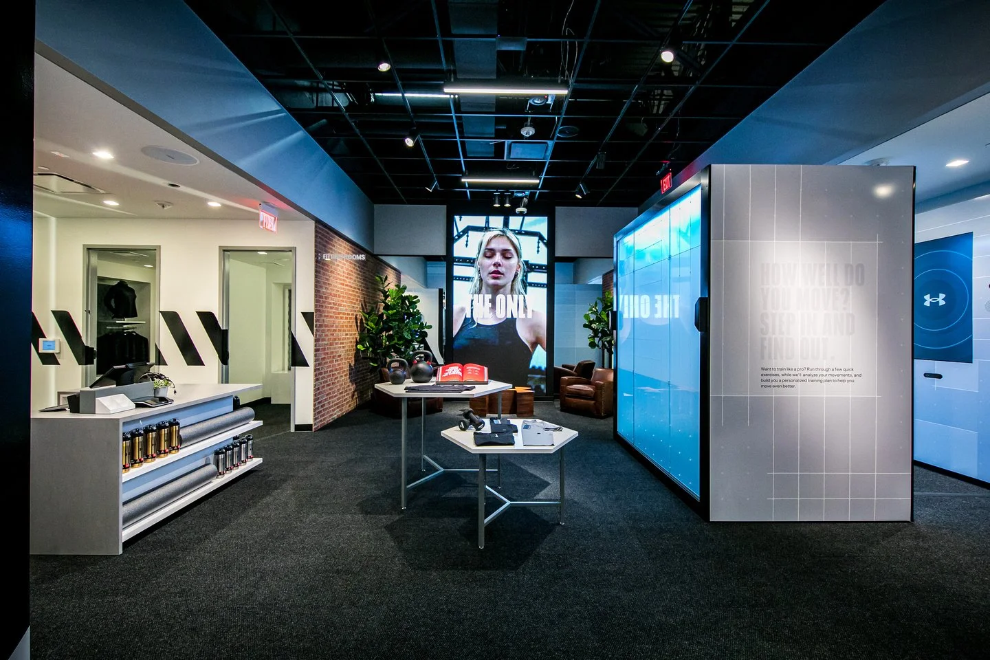
Consumer research revealed that purchasing decisions often happen in the fitting room. Using Radio Frequency Identification, the fitting room detected products brought in by the consumer and displayed them on a digital touchscreen — allowing size, color, and complementary product requests to be sent directly to store staff without leaving the room. If an item was unavailable, consumers could search, order, and purchase directly through the interface — transforming the fitting room into a personalized, conversion-driven experience that deepened consumer loyalty and improved staff productivity.
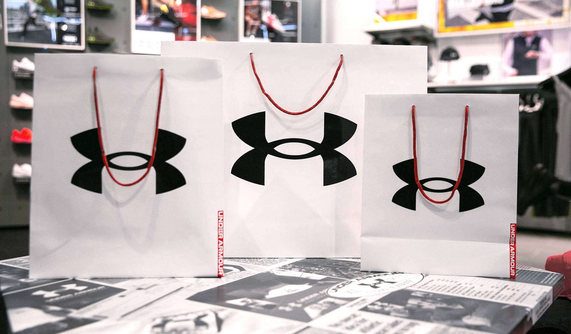
Retail Packaging & Gifting
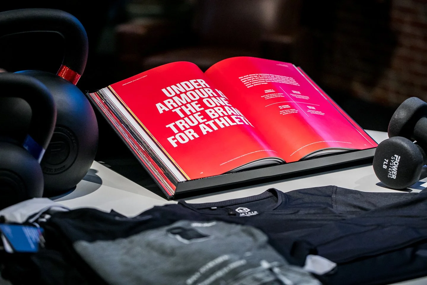
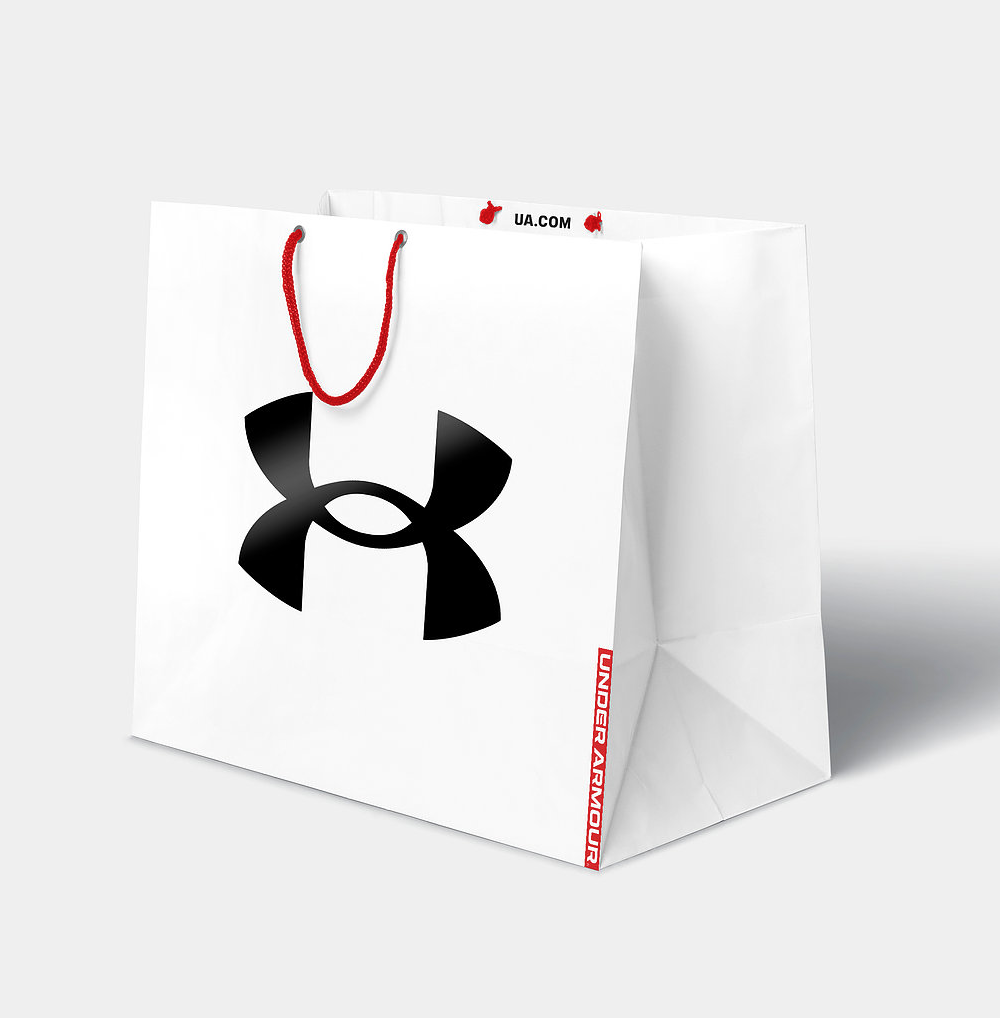
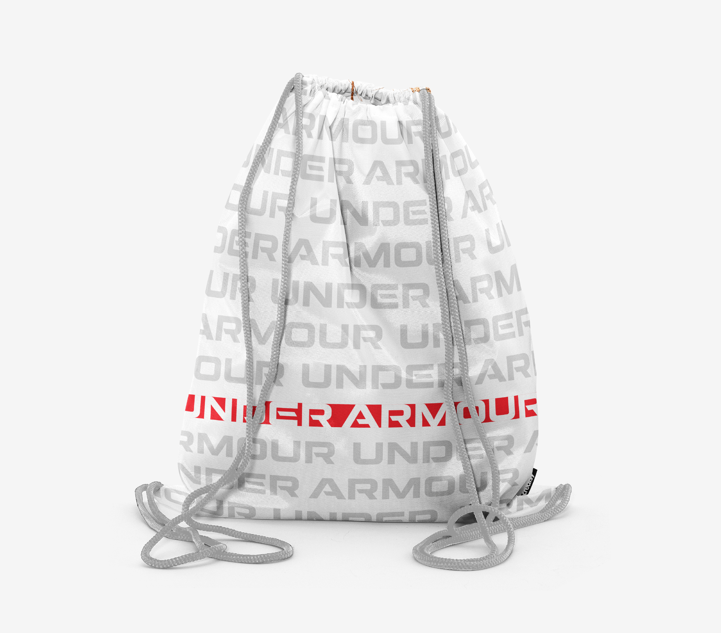
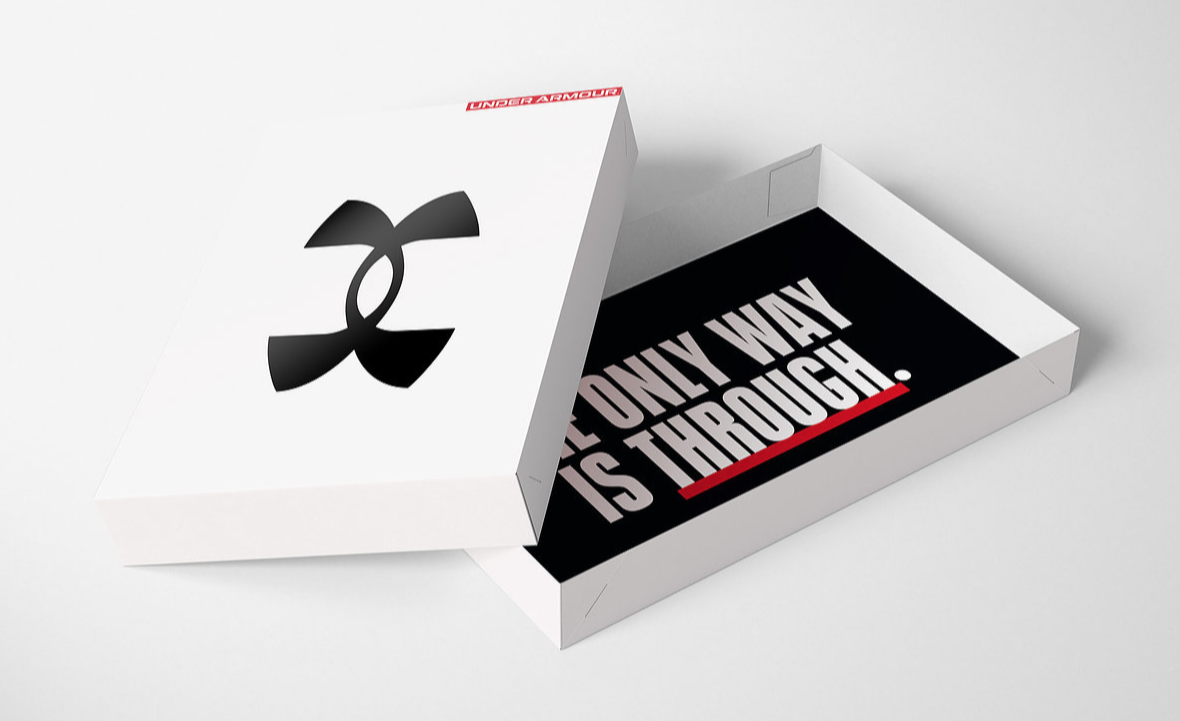
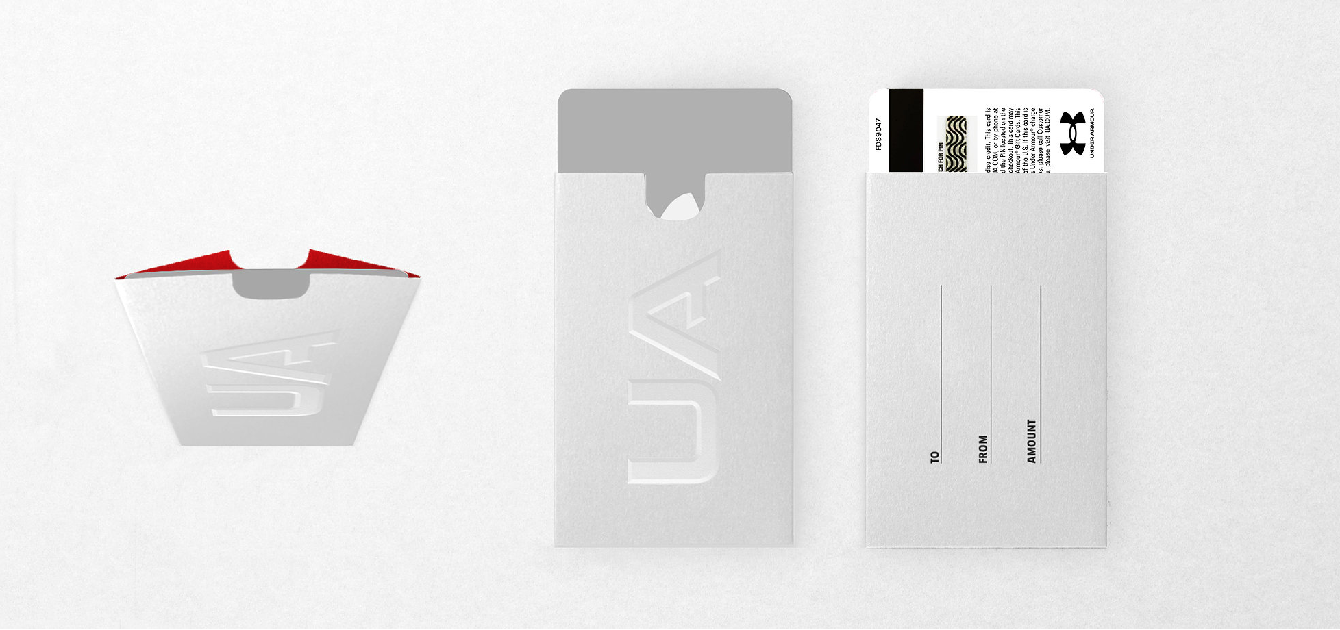
As part of the rollout, the packaging and gifting experience was redesigned around a commitment to sustainability — shifting away from floods of black inks and virgin plastics toward paper-based materials, increasing recycled content, and optimizing packaging to reduce environmental impact. The gifting suite was reimagined with FSC-certified materials and curated additions for seasonal moments and branded experiences — VIP bags, stickers, and gift boxes — elevating the unboxing moment across all locations.
Credits
-
Leadership Team
Heather Armiger
Director, Global Omni Marketing & StrategyKristian Espinosa
Director, Consumer Experience DesignAttica Jacques
SVP, Global Brand ManagementBrian Boring
VP, Global Brand Creative
Renée Lemley
Director, Brand Voice & CopyDesign Team
Nathan Grundhauser
Design Director, Consumer Experience DesignTodd Hoffman
Design Director, Consumer Experience Design, Environments
Katrina Keane
Graphic Designer, Consumer Experience DesignJosh Sadowsky
Senior Manager, Brand Voice & Copy -
Leadership Team
Megan Anderson
Senior Director, Global Retail Store Design, Development & Concepts
Natalie Burke
Director, Global Visual MerchandisingJosh Denton
VP, Global Retail Store Design, Development & ConceptsBrent Freeman
Senior Director, Global Visual MerchandisingSarah Wexler
Director, Global Retail Store Design & ConceptsDesign Team
Patrick Dougherty
Senior Manager, Global Visual MerchandisingStephen Akerblom, Assoc. AIA
Senior Lead, Global Retail Store Design & Concepts
Henry Ramirez
Manager, Global Retail Store Design & Concepts