Under Armour
Packaging Evolution
Under Armour's packaging system was fragmented across the organization. Product, trim, and accessory teams independently managed their own packaging segments, resulting in a customer experience that was inconsistent across touchpoints. To address this, packaging was centralized under Global Brand, integrating it into the Consumer Retail Experience team. Through a comprehensive audit of the market and key competitors, the team developed a unified global packaging system that established a consistent design language across all product categories, structures, and accessories.
The system was built on two core pillars: Creative/Graphic Design and Structural Development, ensuring both visual impact and functional excellence across Under Armour's global packaging portfolio. Beyond achieving design consistency, the initiative aligned the packaging transformation with Under Armour's broader sustainability commitments, setting an ambitious goal to reduce single-use plastic packaging by 75% by 2025. All box packaging, hangtags, and cartons in North America were specified as 100% recycled content, fully recyclable, and produced using minimal fiber and non-toxic inks.
This unified system created harmony across every customer touchpoint, from e-commerce unboxing to retail shelf presence, reinforcing brand recognition while demonstrating Under Armour's commitment to environmental responsibility.
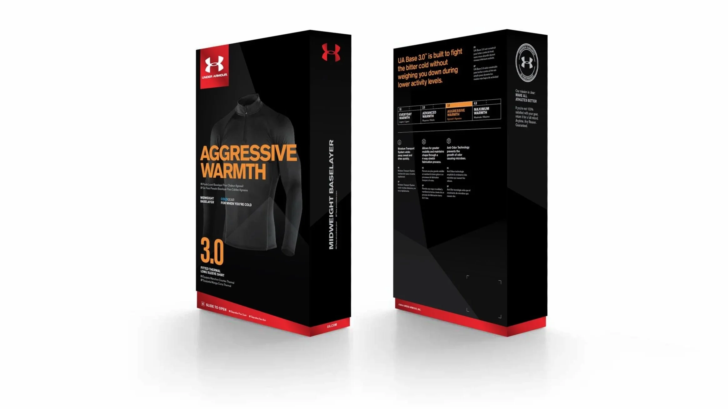
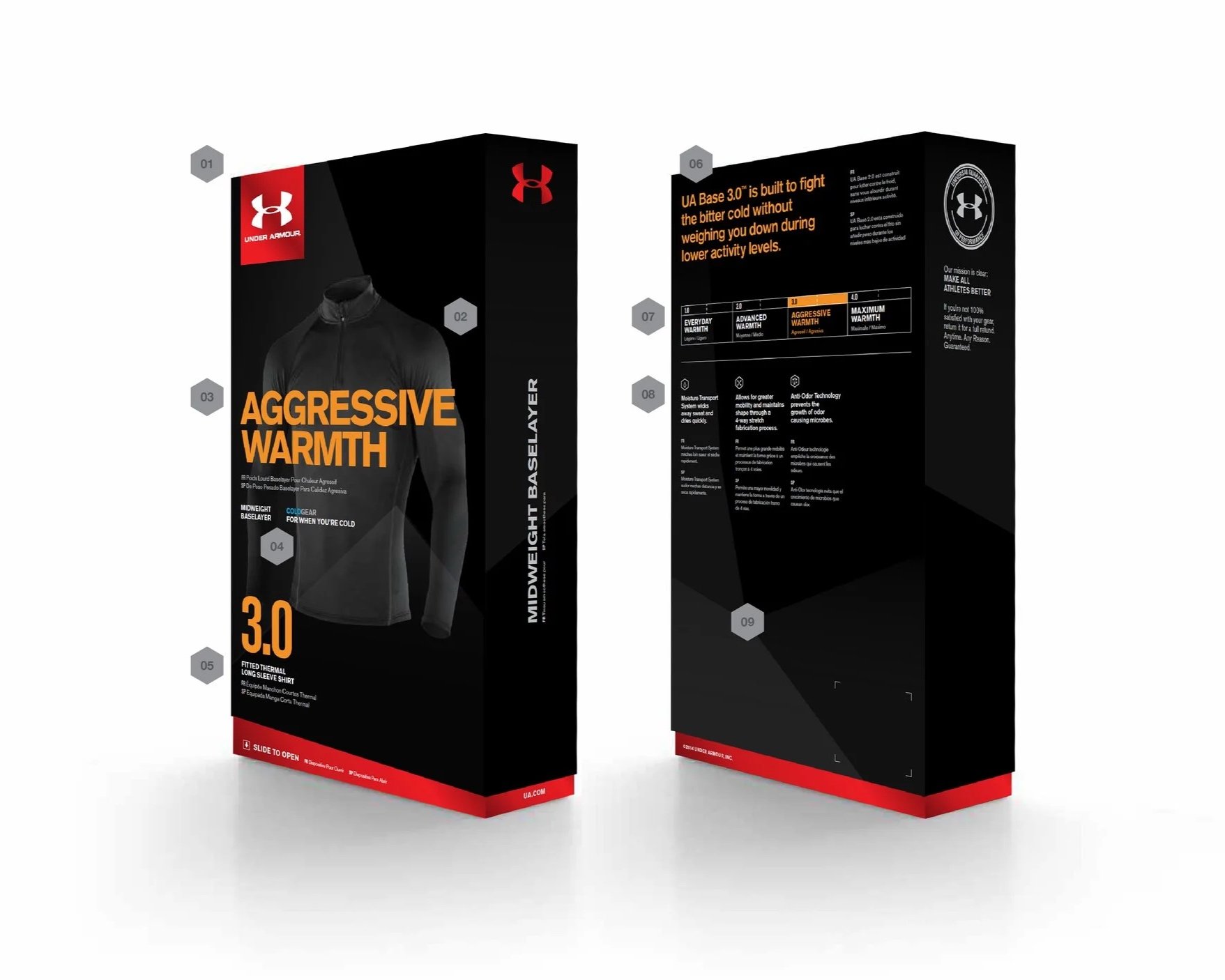
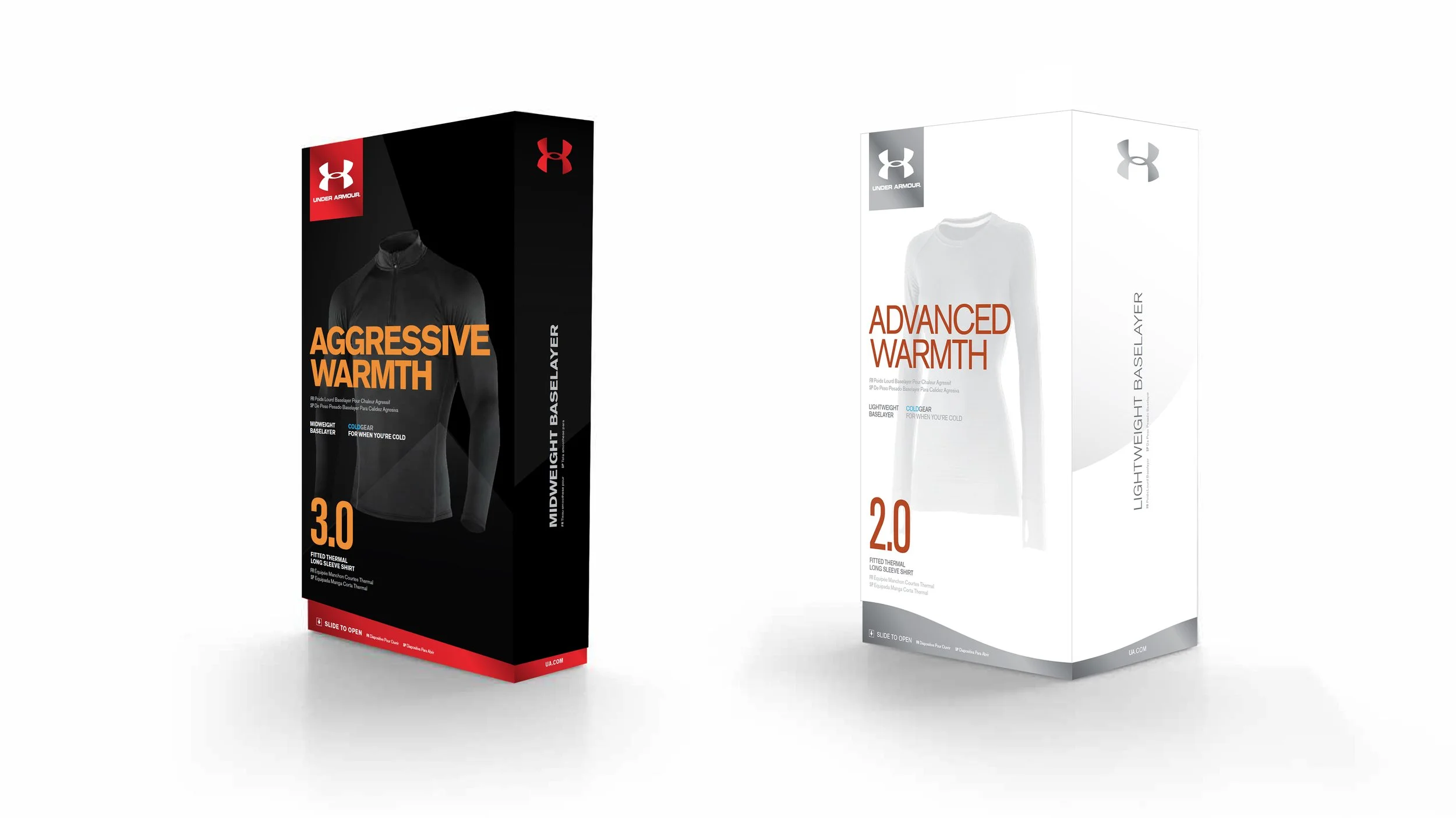
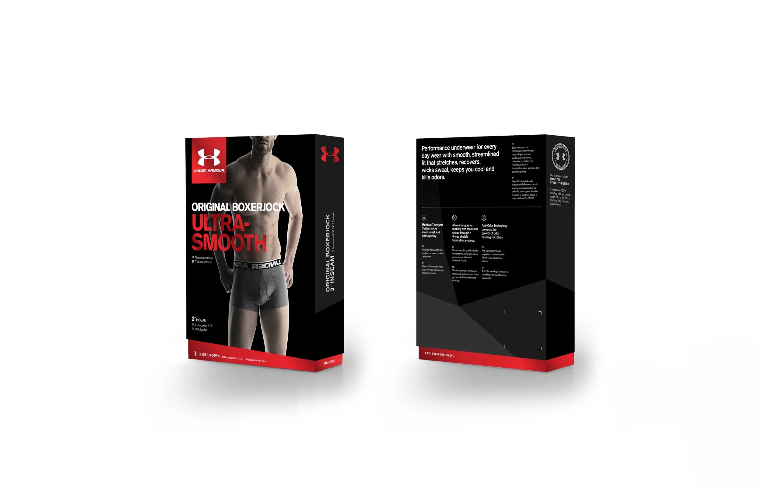
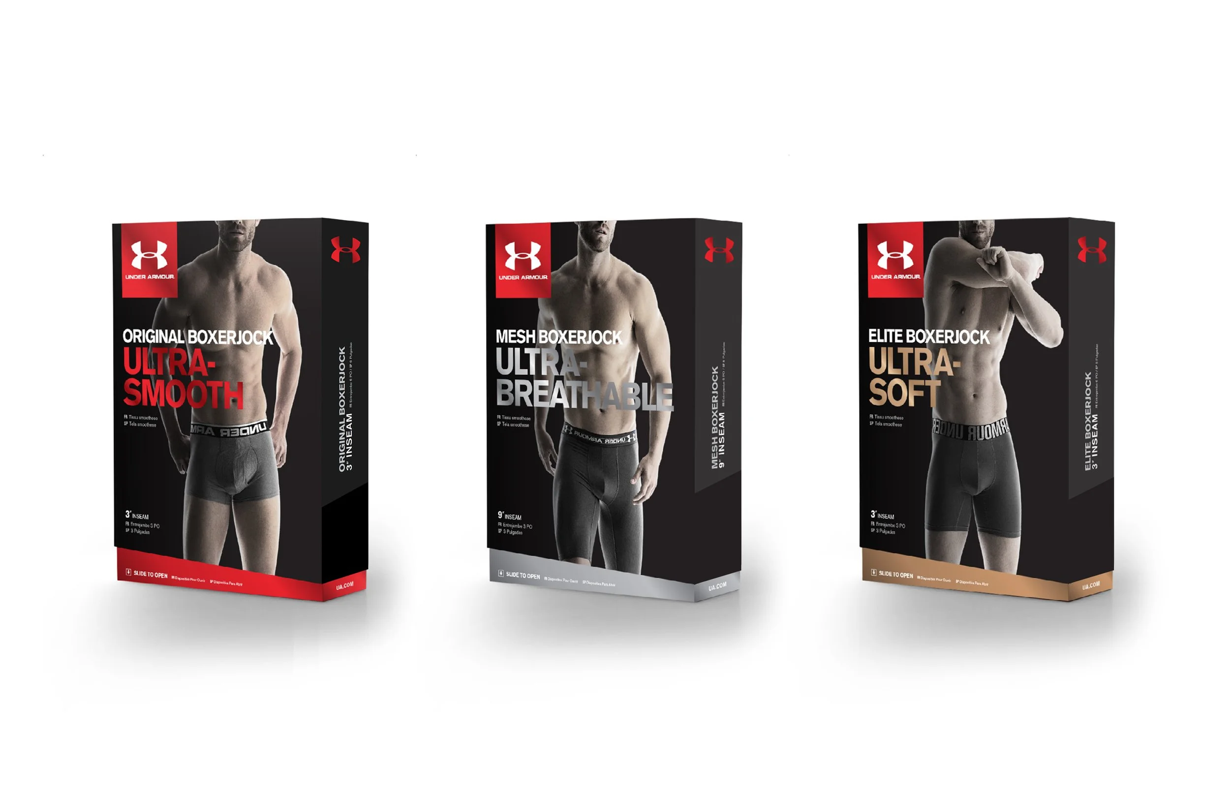
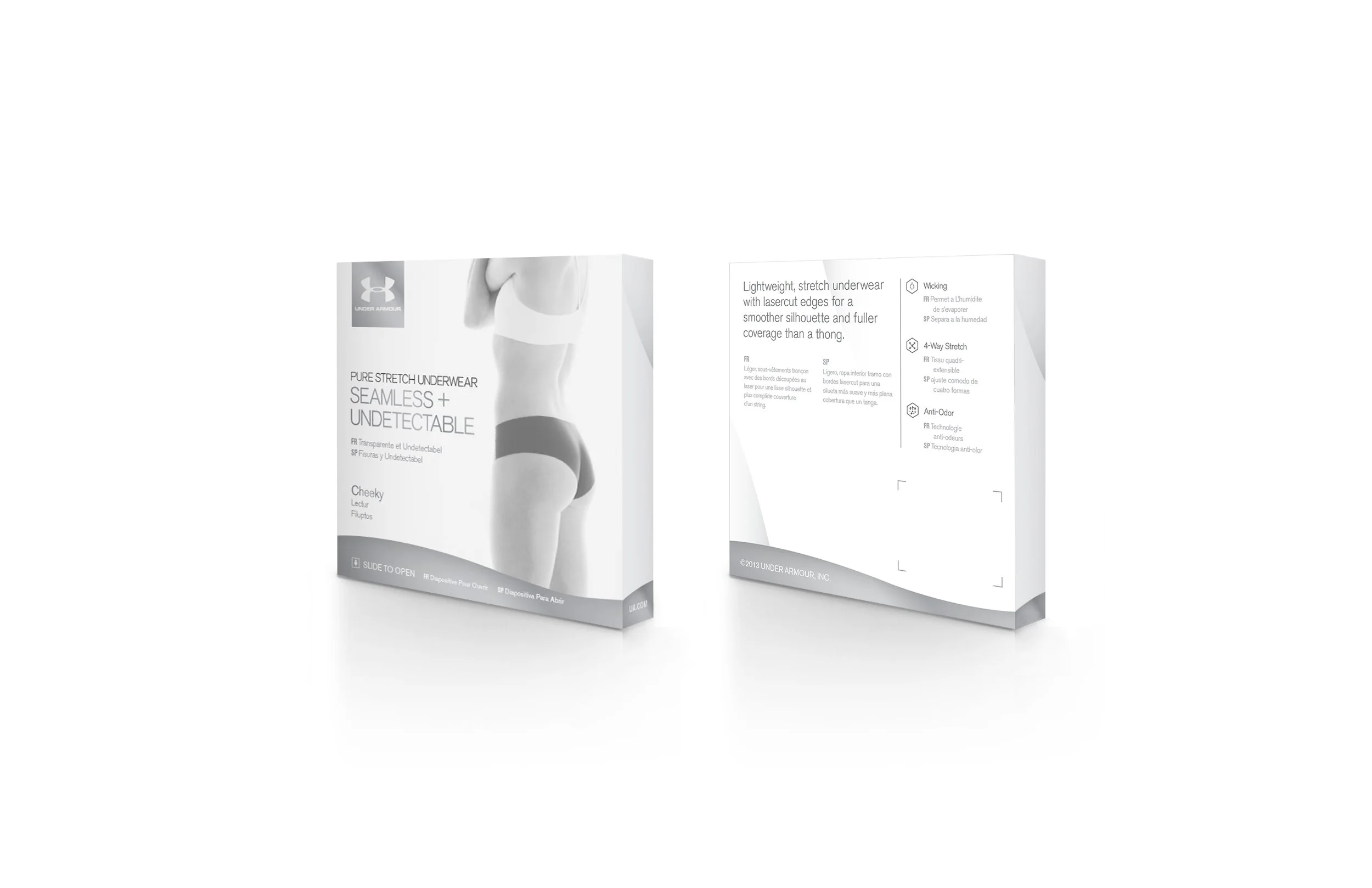
Designing a Seamless
Product Story
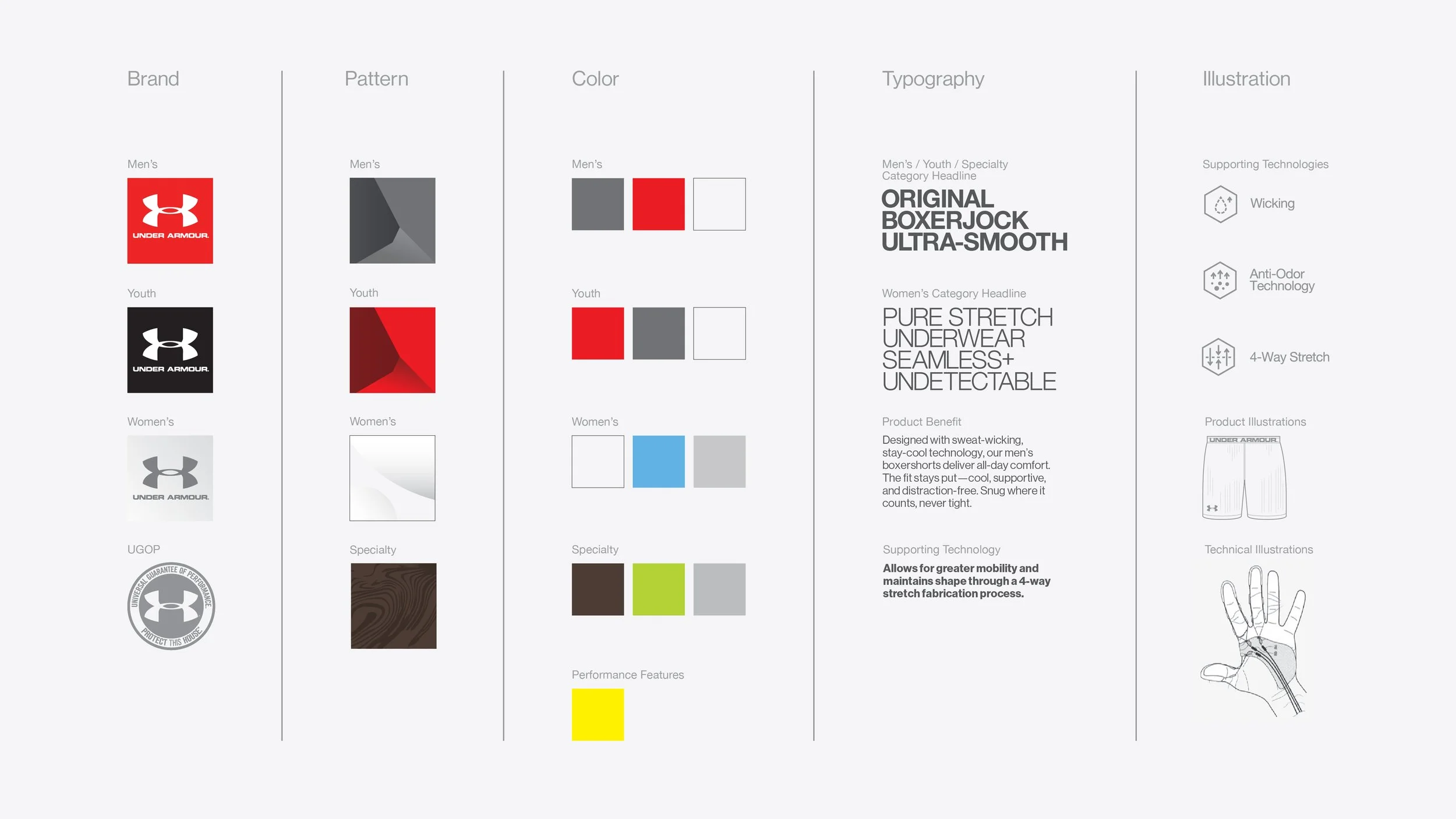
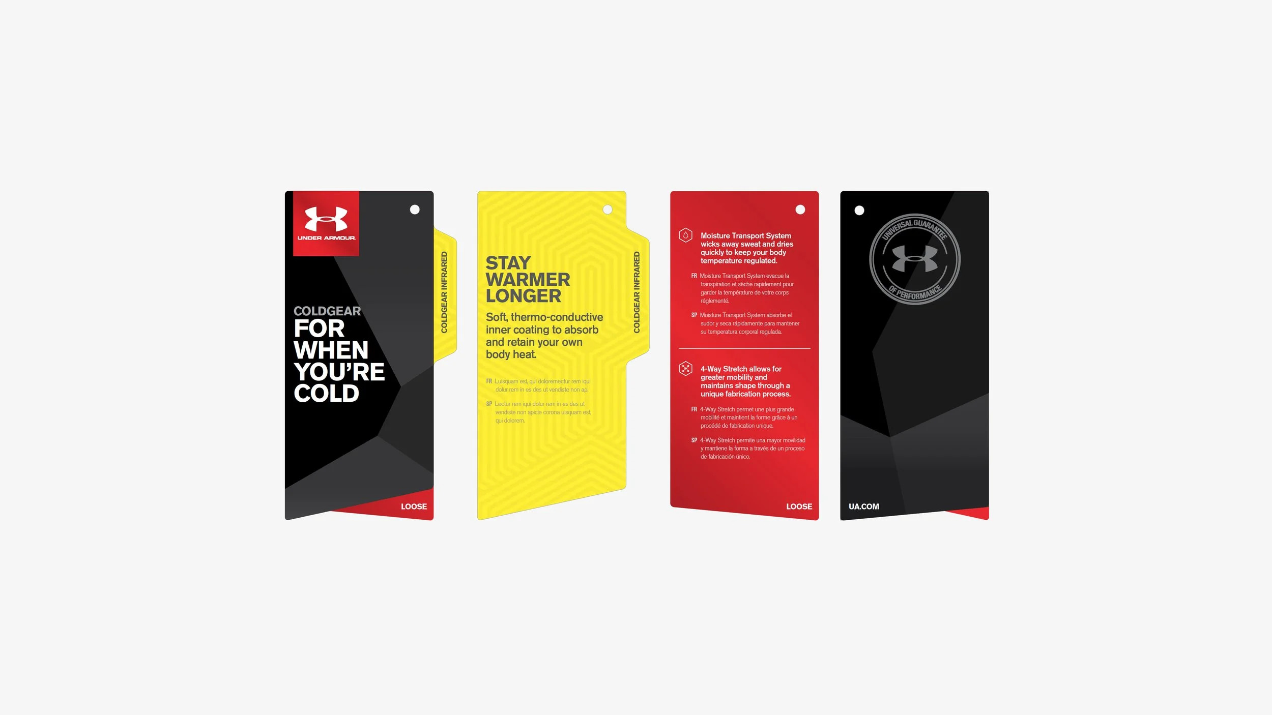
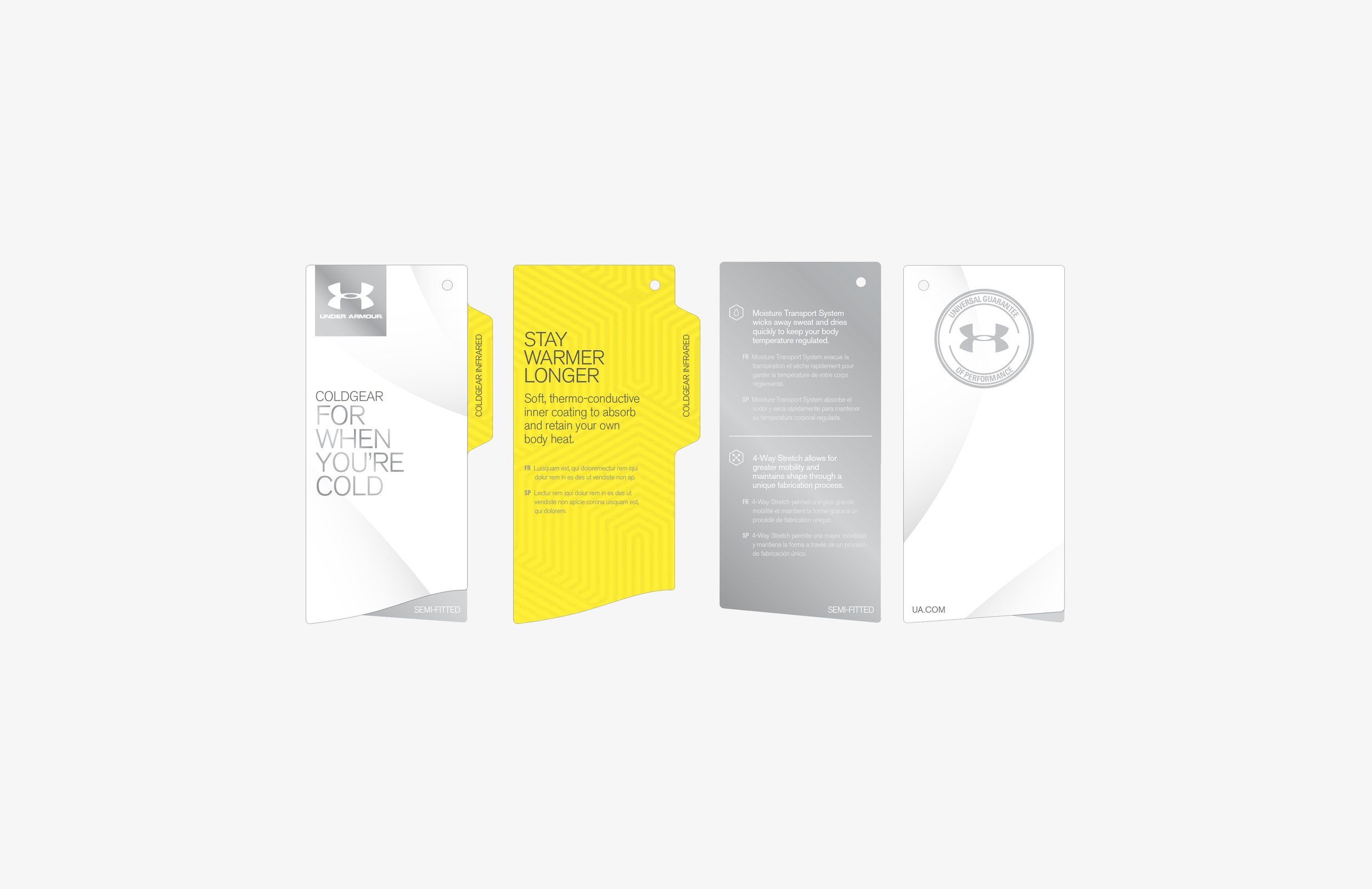
01 / Brand
Consistent logo placement reinforces brand recognition across all design system elements.
02 / Product
Product imagery creates immediate visual identification and clarifies the product category.
03 / Product Category
Communicates the product’s main purpose.
04 / Product Name & Gearline
Displayed prominently to strengthen the
product’s identity within its gearline family.
05 Product Fit Type
Clearly indicates fit type to help consumers
quickly identify suitability and comfort level.
06 / Product Benefit Description
Highlights key benefits in concise, engaging language that connects product features to user value.
07 / Product Category Comparison
Provides clear product comparisons to help consumers understand lineup differences.
08 / Technology Icons
Iconography communicates technical features.
09 / Category Pattern
Applies distinctive visual patterns to unify products within the same gender and category group.


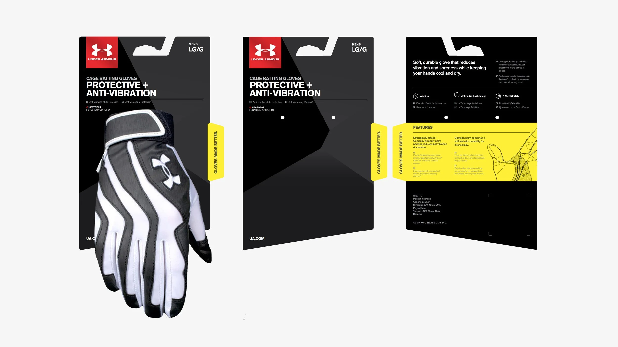
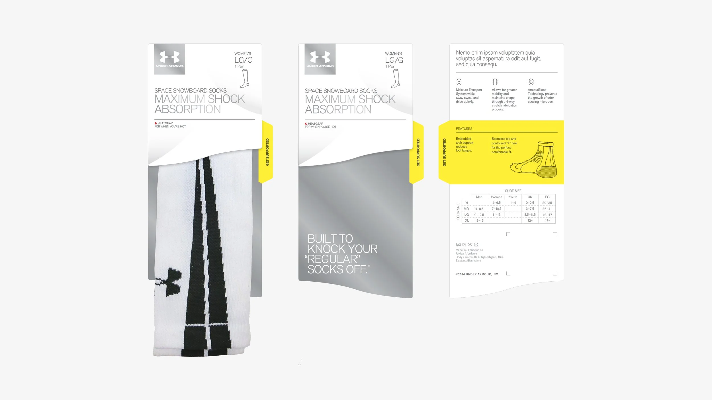
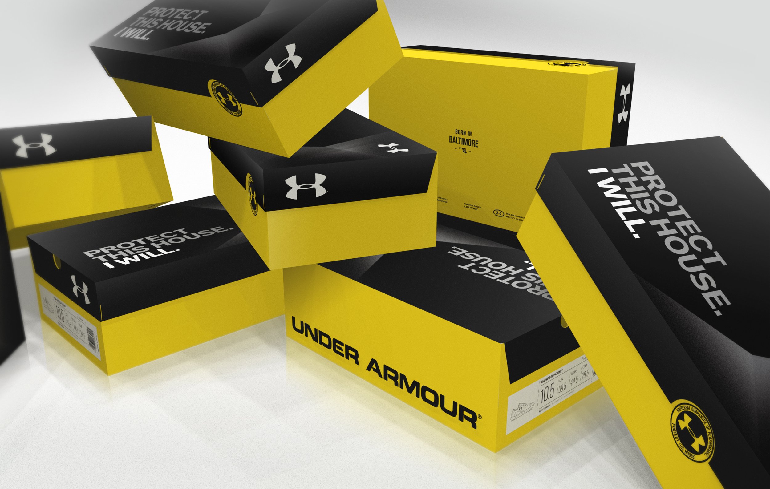
Footwear Redesign
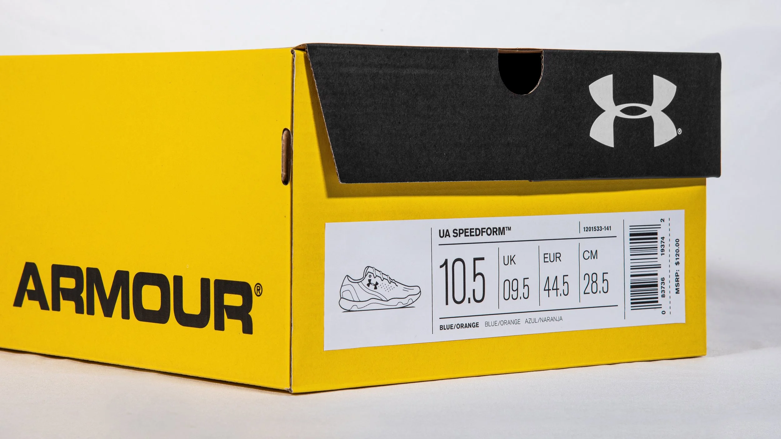
As part of the design evolution, footwear packaging was developed internally to enable rapid ideation and testing in retail environments. Working alongside our agency partner, consumer audits revealed that the previous box design lacked visual impact and failed to stand out, making it difficult for customers to locate products, while inconsistent labeling created inefficiencies to quickly identify the correct product, size, or colorway.
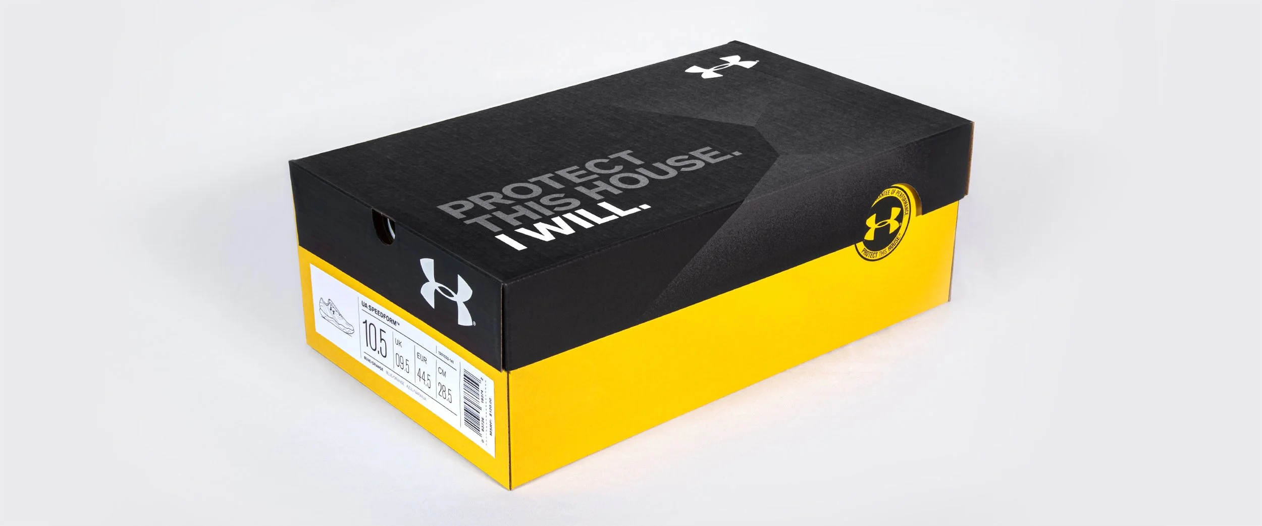
To align with the new design system, the redesigned packaging introduced key elements from the toolkit including pattern, accent color, and the iconic "Protect This House. I Will." tagline to establish cohesiveness and boost shelf visibility and brand recognition. Clearer labels and product visuals streamlined identification, while a reengineered dieline reduced assembly time and lowered production costs by 1–2 cents per unit—delivering substantial operational savings at scale.

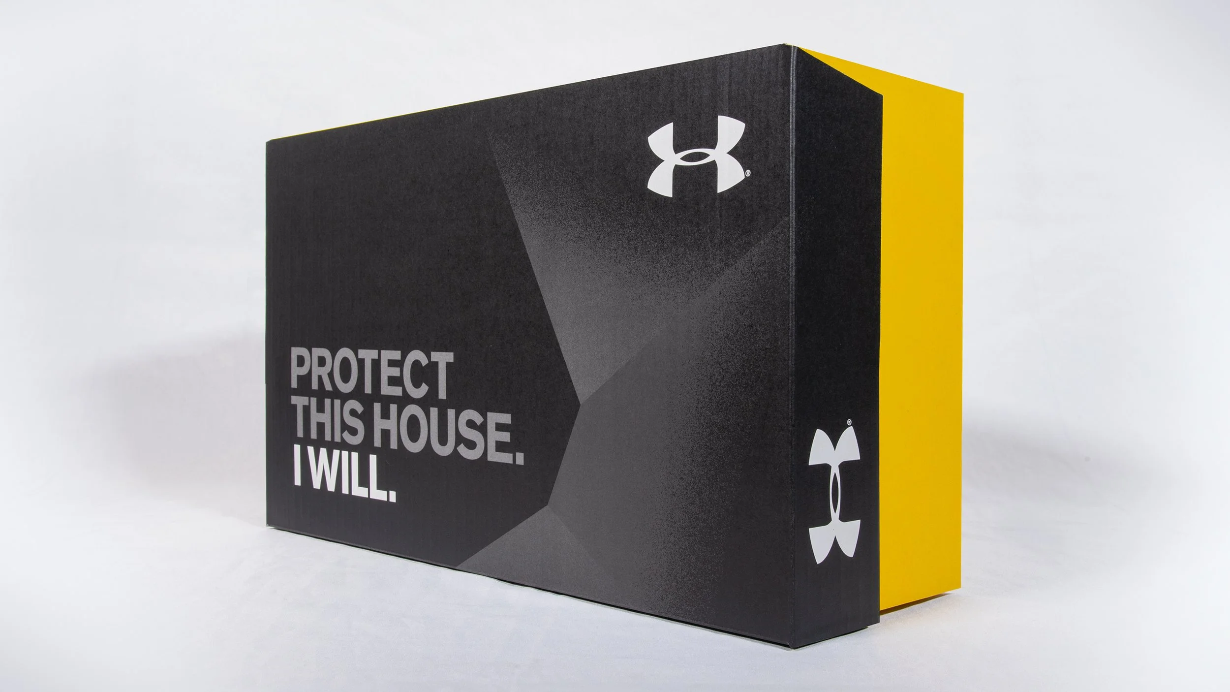
Compared to Nike’s iconic orange, Adidas’s signature sportstyle blue, and Puma’s bold red, Under Armour’s all-black kraft box lacked shelf presence and brand recognition.
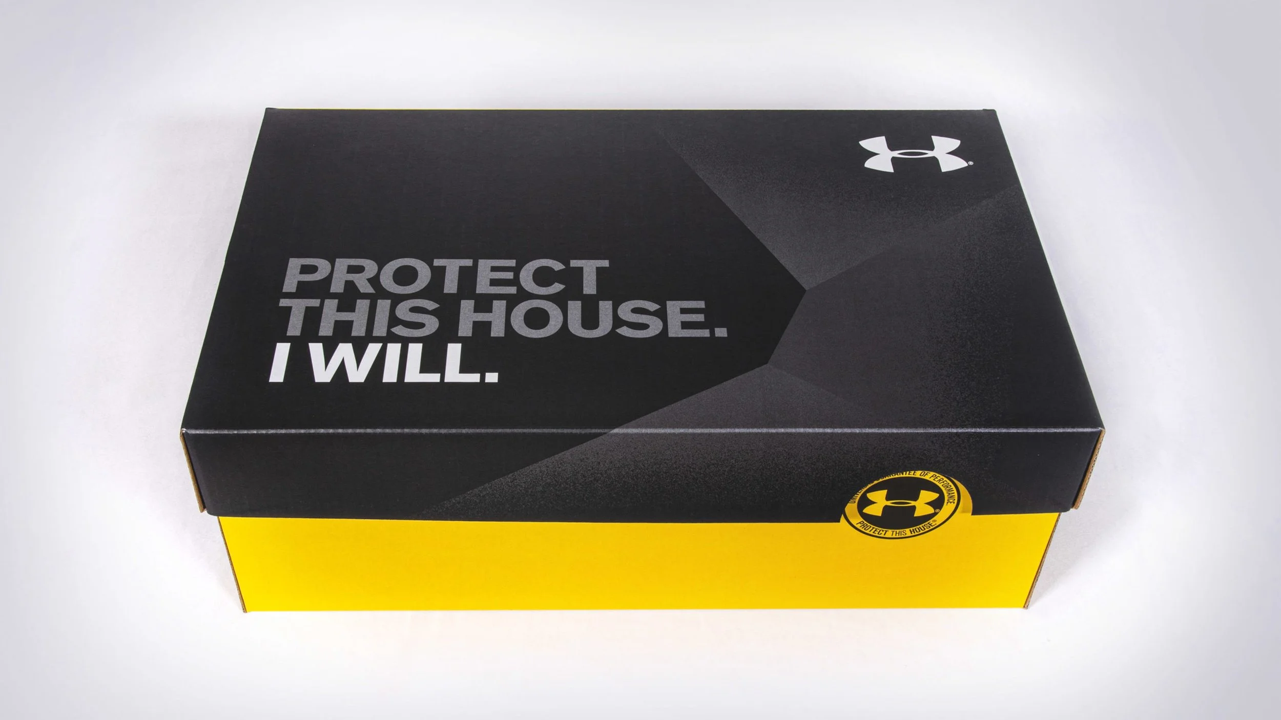
The front panel prominently featured the brand’s iconic tagline — “Protect This House. I Will.” — reinforcing Under Armour’s bold, performance-driven identity.
The redesign introduced a vivid yellow accent from the brand’s secondary color palette, strategically juxtaposed against the black base to maximize shelf impact and enhance brand recognition.
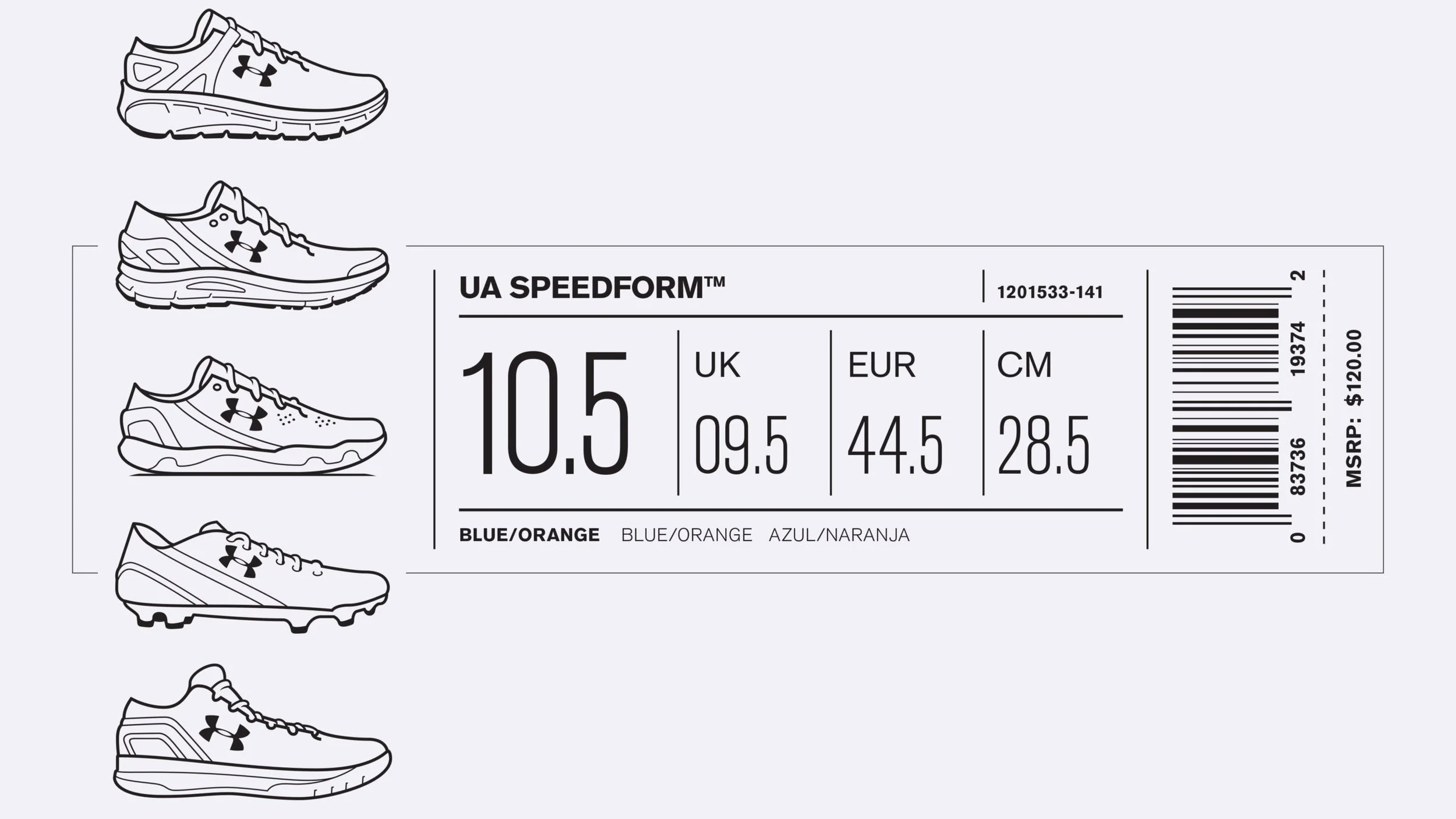
Product visuals and clearer labels simplified navigation, improving product identification speed and accuracy.
A geometric pattern inspired by hexagonal product graphics was applied to add visual texture and depth, reinforcing the connection between the packaging and the broader brand product suite.

The Universal Seal of Performance is the brand’s mark of relentless testing, trusted innovation, and uncompromising standards—built to perform under pressure, just like the athletes who wear it. A die-cut detail adds prominence to the seal, reinforcing its importance and visibility.
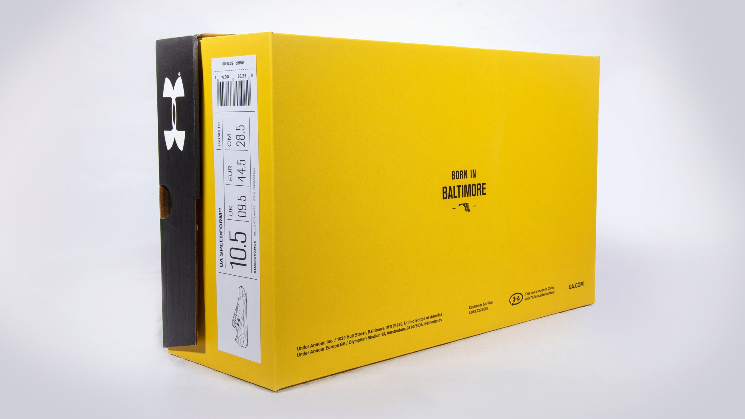
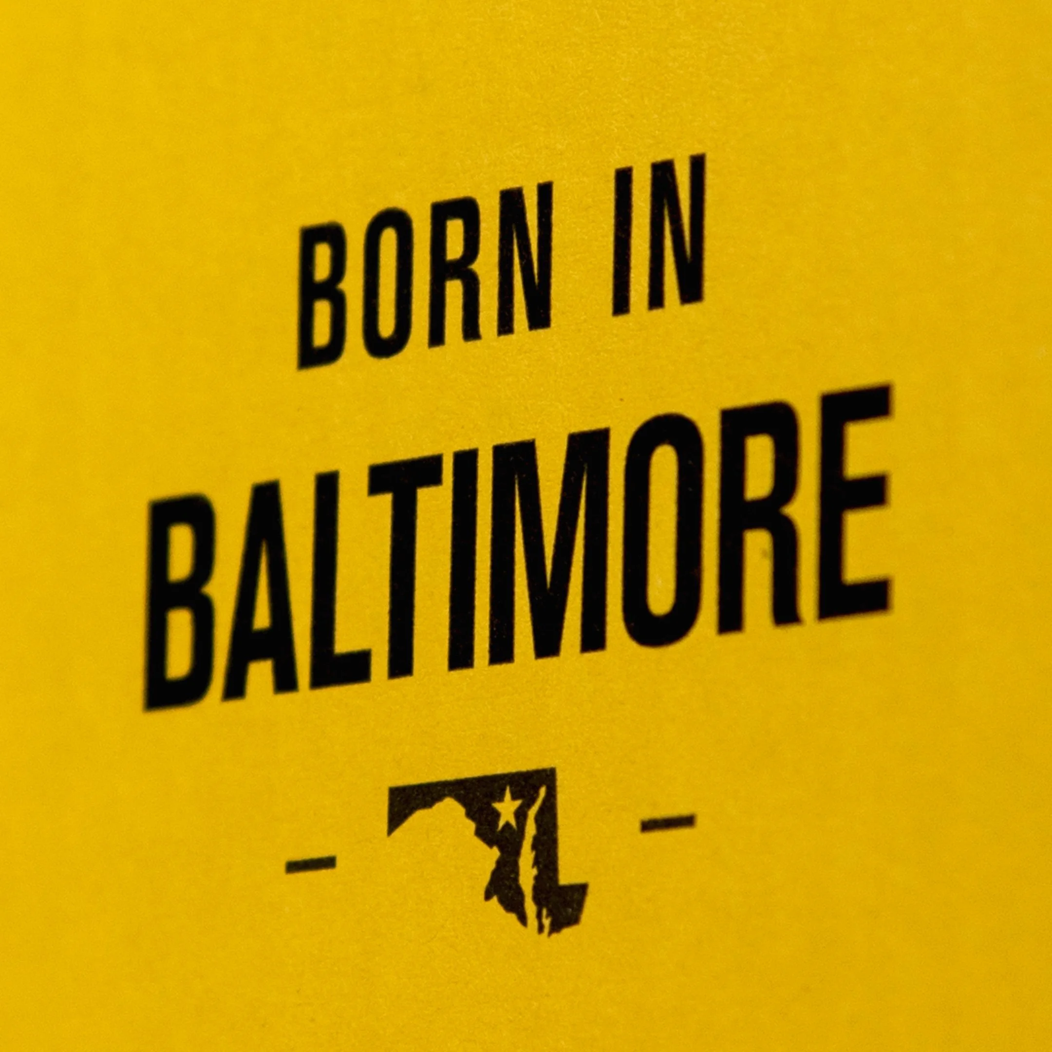
By rooting its identity in Baltimore, Under Armour honors its origin story in a category dominated by global giants. It’s a reminder that greatness is built from the ground up—one hard-earned step at a time.
Credits
-
Design Leadership Team
Luiz Andrade
Senior Director, Consumer Experience DesignKristian Espinosa
Director, Consumer Experience DesignRyan Hall
Director, Consumer Experience Design Operations
Alex Pettitt
Senior Director, Product Ops and Business PlanningCarl Smit
VP, Retail and Consumer Experience DesignDesign Team
David James Colson
Senior Graphic Designer, Consumer Experience DesignKrista Gill
Senior Graphic Designer, Consumer Experience DesignHelene Christman
Art Director & Ops Manager, Consumer Experience Design -
VSA Partners
Identity Design and Visual DevelopmentWebb deVlam
Packaging Design Development & Structural Prototyping