Motorola,
A Google Company
Following Google’s 2012 acquisition of Motorola Mobility, the brand shifted to a premium product portfolio and launched the “Hack What We Started” campaign to differentiate itself in a competitive market. The strategic and visual direction was defined in collaboration with Global Marketing, Consumer Insights, agency partners Siegel+Gale and Goodby, Silverstein & Partners, and Google teams. The result was a comprehensive identity refresh—including logo, color palettes, typography, and imagery—rolled out globally in Q1 of 2013.
At the core of this transformation was a renewed brand belief: breaking down barriers that separate people from the things they love. Motorola’s design philosophy focused on seamless connectivity, placing consumers at the center and delivering content instantly. Every touchpoint across design, digital experience, hardware, packaging, and campaigns were reimagined to reflect this vision. This body of work was done during my tenure as Design Director of Global Brand Design.

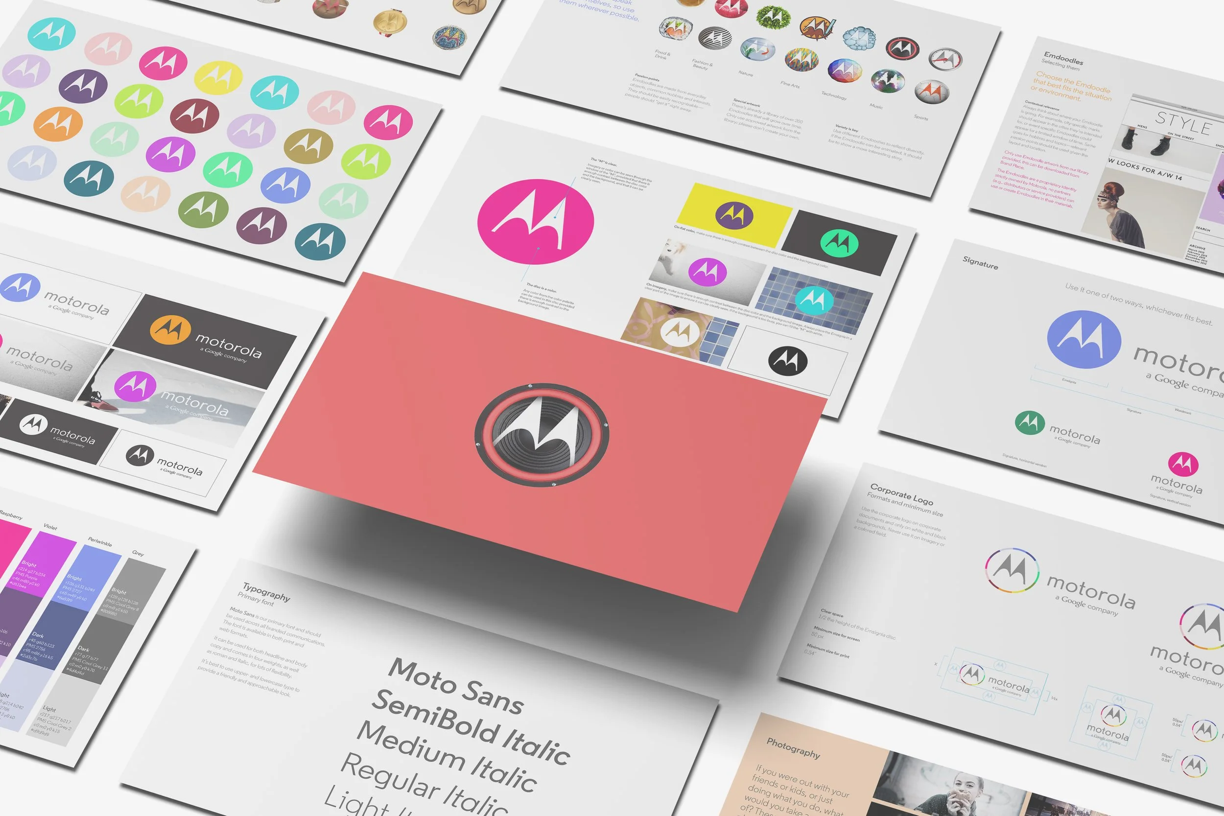
The Motorola Emdoodle:
One Logo, Endless Stories.
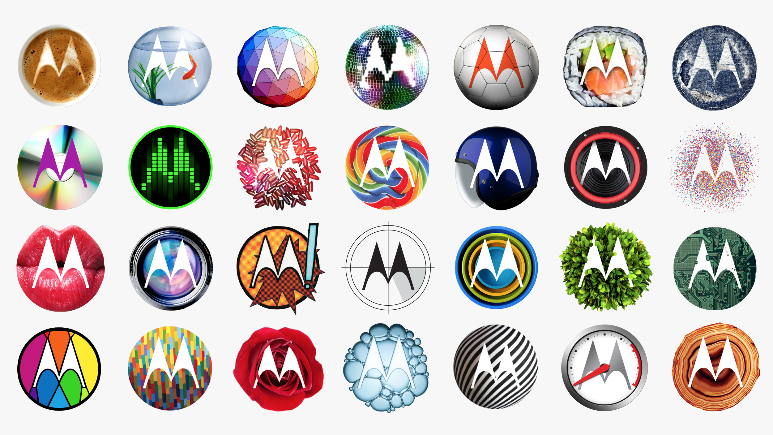
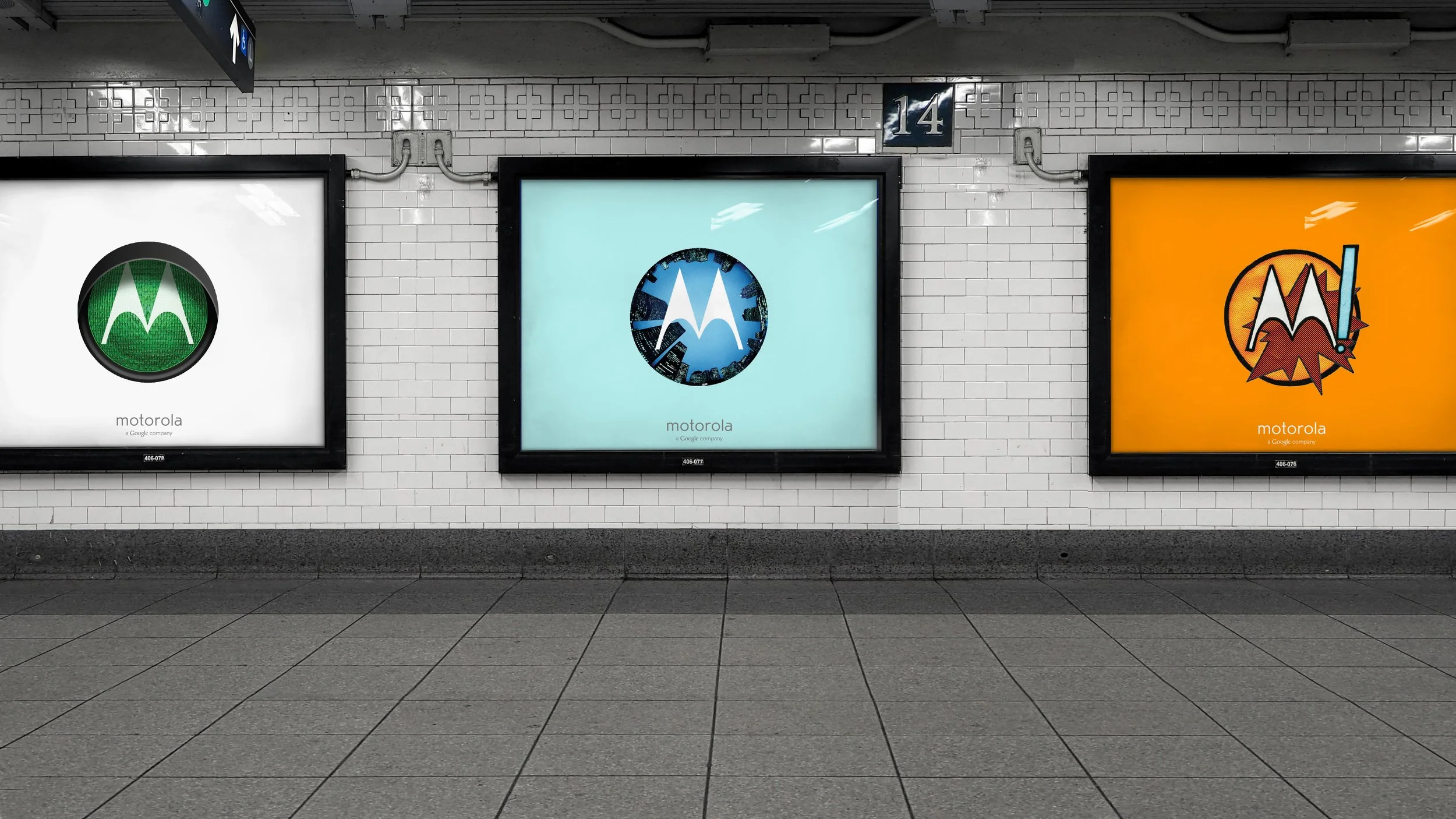
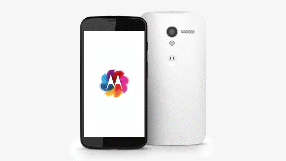
The Motorola Emdoodle forged a playful visual link to Google, the parent company, while building on the strength of Motorola’s brand equity. This ever-evolving symbol—shaped by familiar objects, hobbies, and cultural moments—brought fresh, relatable personality to the brand. Each variation was instantly recognizable and reflective of the world’s diversity. As the primary consumer-facing logo, the Emdoodle spoke without words—sparking curiosity, embracing irreverence, and strengthening brand recognition through a bold, expressive evolution of identity and connection.
To align with the brand’s evolving visual language, the Motorola logotype was redesigned to be more open and modern. This allowed it to support the iconic Emsignia, creating a more cohesive and balanced brand expression.
Motorola’s iconic Emsignia remained the brand’s core mark, celebrated for its strength and flexibility. Used on its own across a wide range of applications, it supported the expressiveness of the Emdoodle and was brought to life through the open use of color from the new palette.

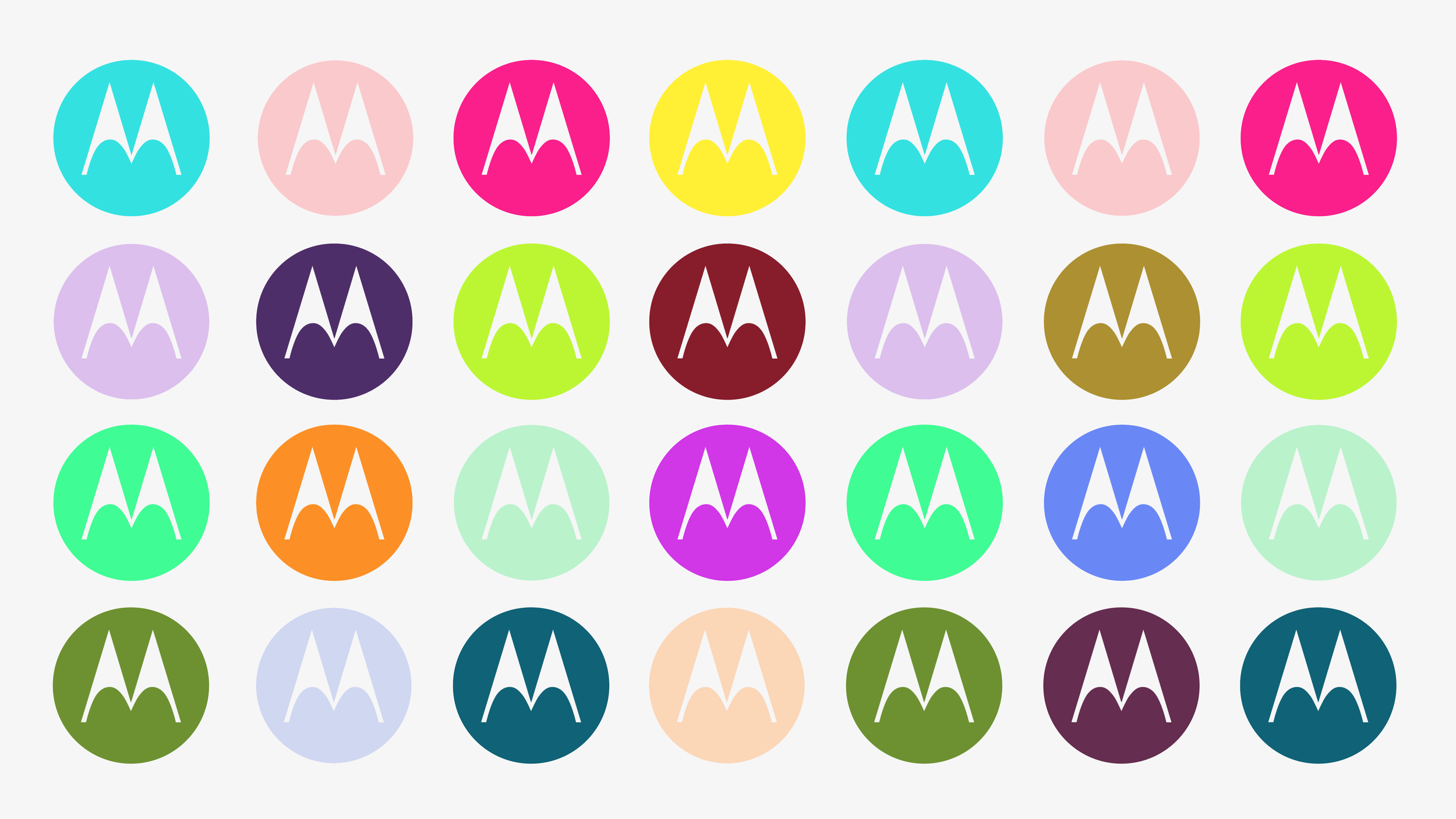
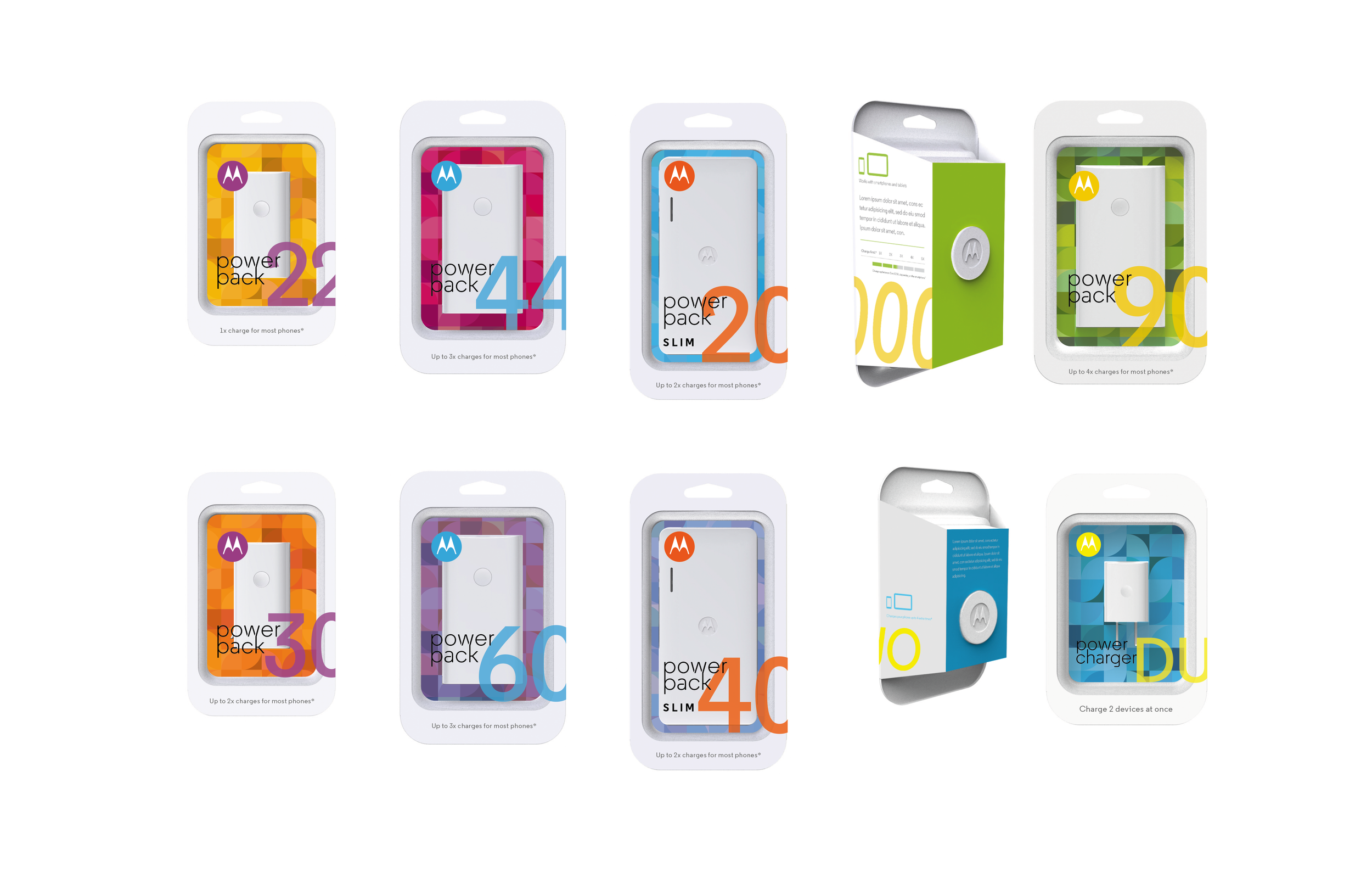
The introduction of a new multicolor palette brought bright, distinctive lead colors supported by balanced neutrals. As part of the design system, these “color chords” were active and approachable, helping Motorola stand apart—creating a look that was both vibrant and unmistakably ownable.
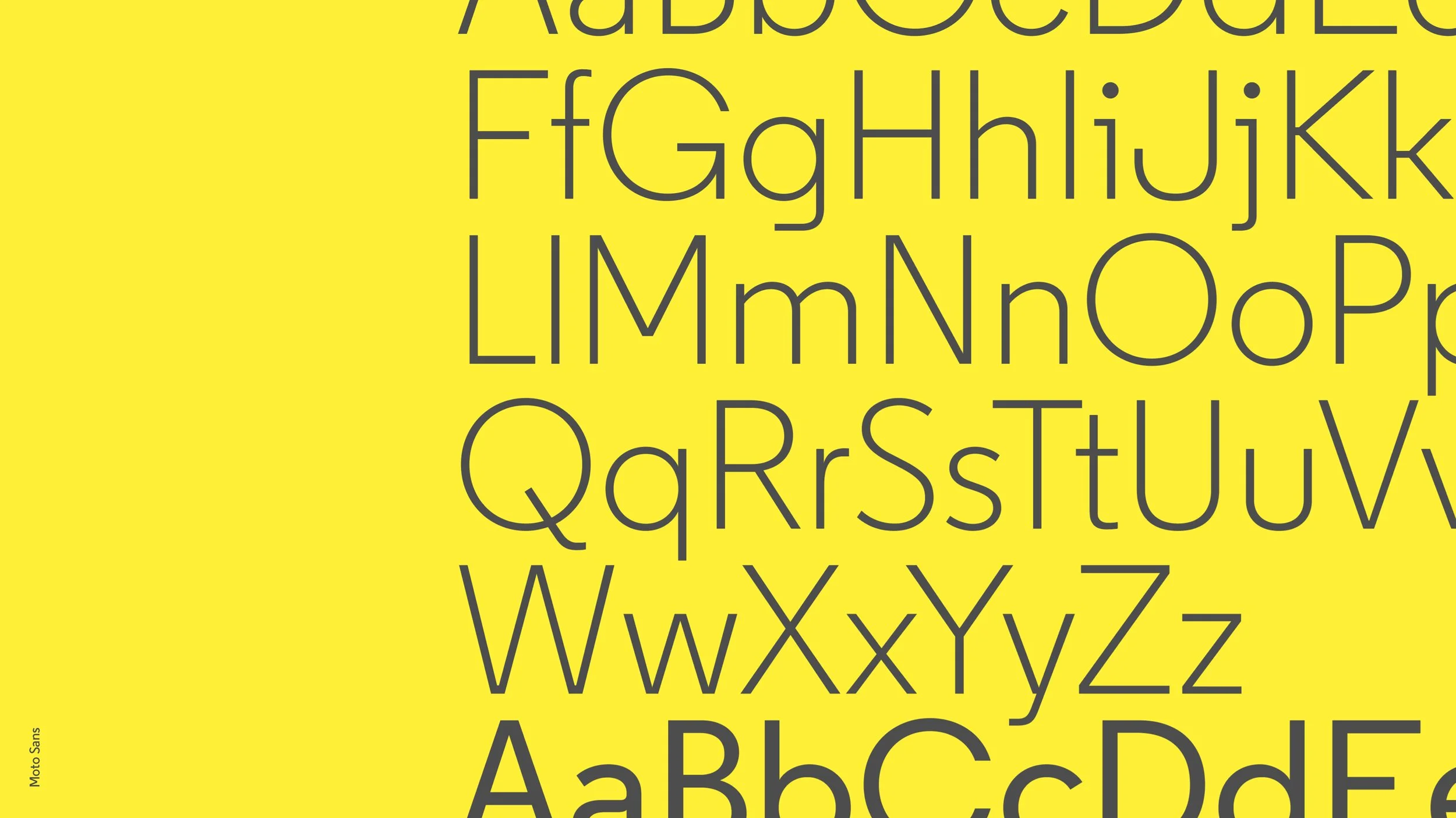
The introduction of the customized typeface Moto Sans brought an approachable, balanced voice to the brand. Available in a variety of weights, it echoed the curves and lines of the Emsignia, creating visual harmony across all touchpoints.
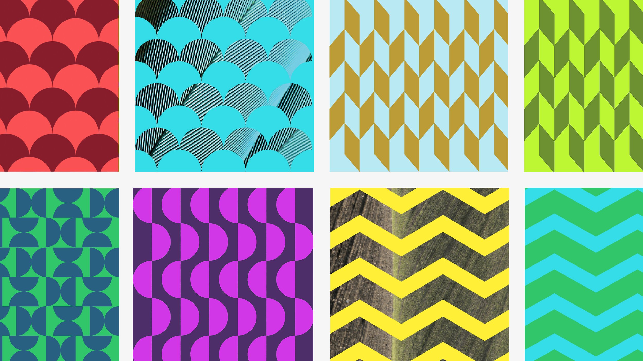
Brand patterns were designed to bring energy and visual interest to applications. As complementary elements, they offered flexible, recognizable backdrops that reinforced brand identity without overpowering content.
Everyday Moments. Reimagined.
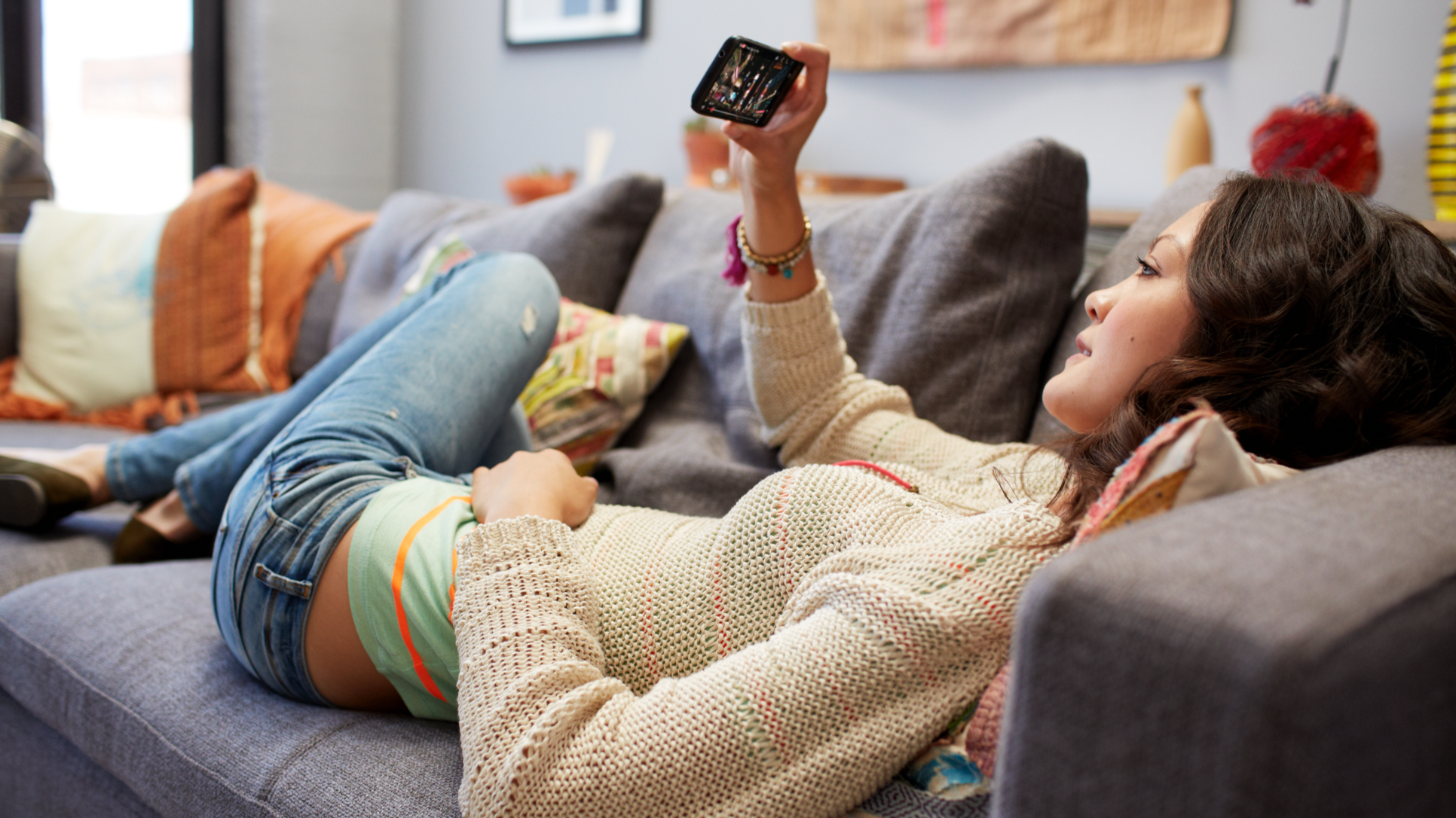
During Motorola’s transformation under Google, photography shifted to reflect real, unpolished life. Subjects were real friends—not actors—and the imagery captured spontaneous, casual moments that felt true to everyday experiences. Framing was loose and imperfect, using only natural light.
The color palette ranged from muted to bold but always remained clean and intentional. High saturation was used sparingly, with a focus on balance and clarity.
The result was a more human, relatable visual identity—capturing real people in real moments.


–
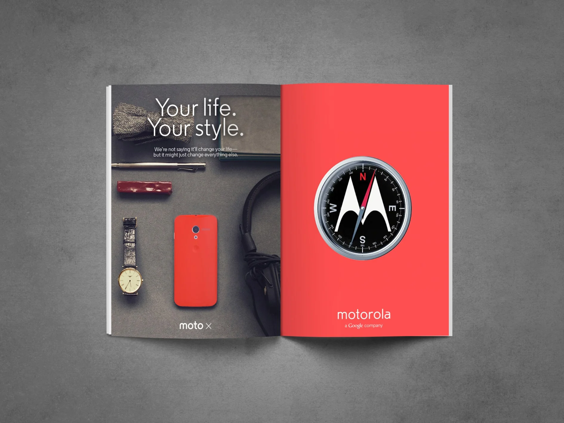
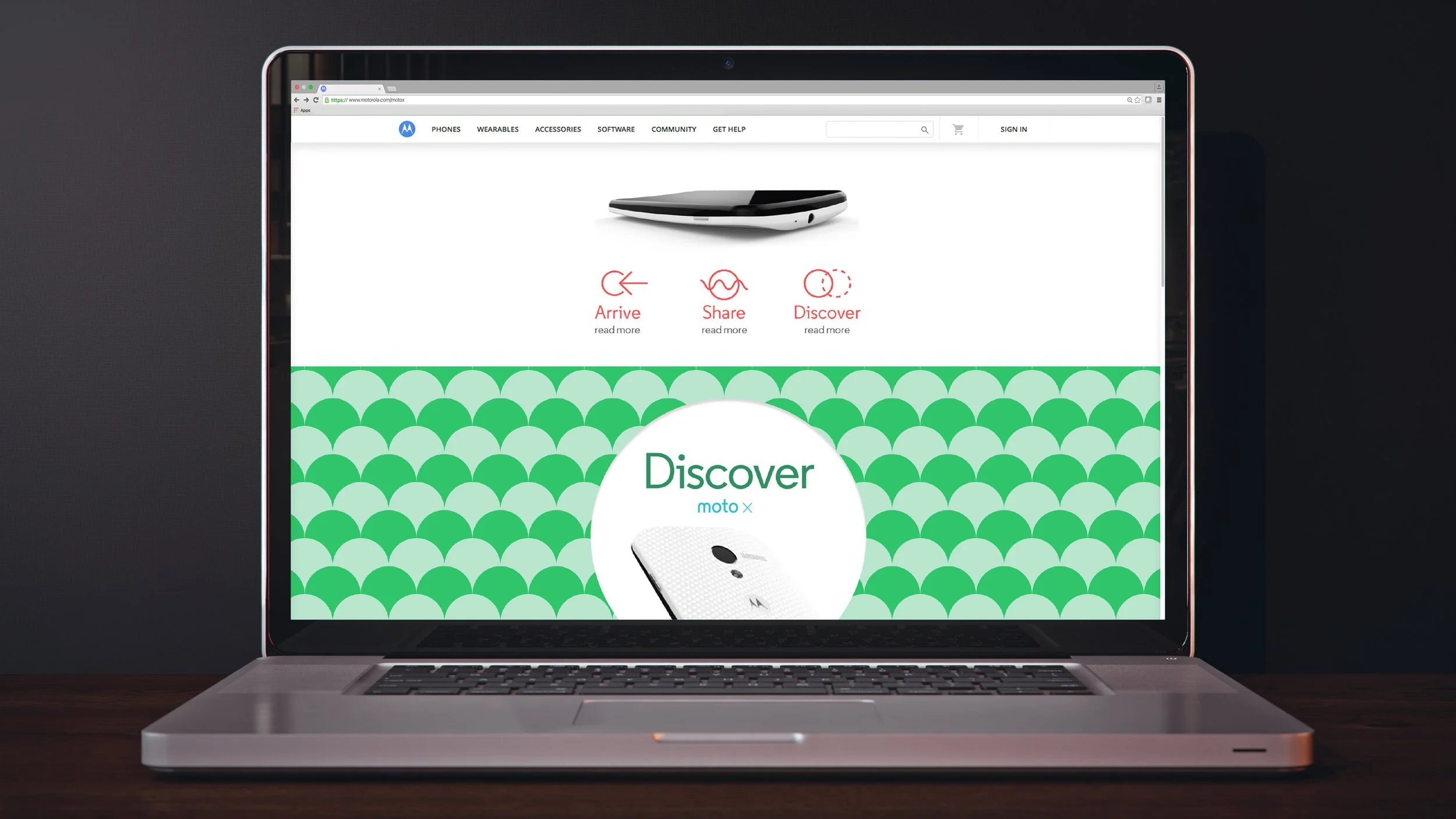
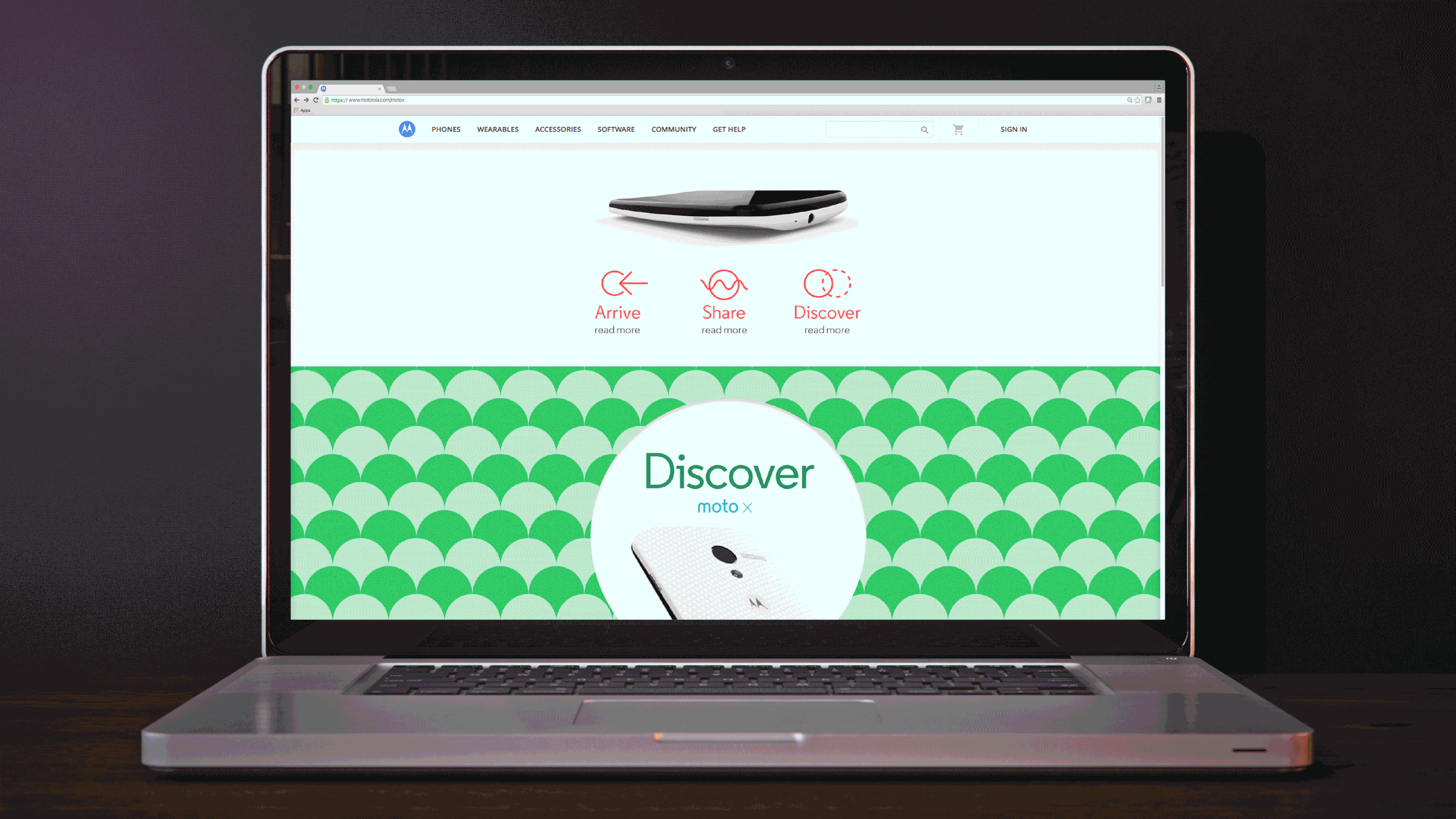
Hardware photography evolved toward a more natural, lived-in—and lived-with—aesthetic. Devices and companion wearables were shown in situ: on the body, in hands, and within real environments, paired with personal items to tell a story, complement lifestyle photography, or stand alone.
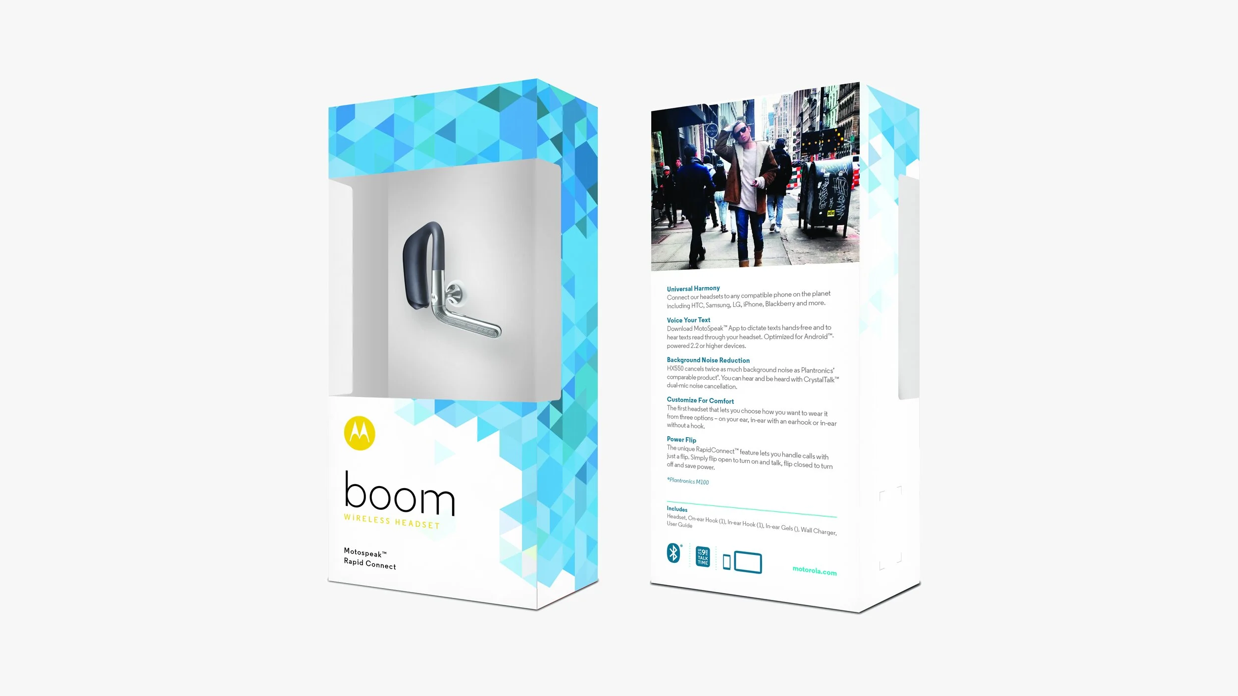
Product laydowns were curated with meaningful objects that reflected individual style, routines, and interests. Natural light and minimal styling kept the focus on hardware design, while color ranged from neutral to bold, with selective saturation used to highlight key details.
The result positioned Motorola’s products as seamless parts of everyday life—integrated, not isolated.


Uncomplicated.
Inspired.
Unexpected.
Carrying forward the spirit of innovation with the “Google gene,” the new Motorola unveiled a cohesive, recognizable design system that put the customer first—flexible, unconstrained, and intuitive. The result was a more human, relatable visual identity that captured real, unscripted moments, featured playful logo interactions, and embraced an approachable visual language across all channels.


Credits
-
Leadership Team
Gary Briggs
SVP & Advisor to CEO, Global Brand MarketingKristian Espinosa
Design Director, Global Brand DesignRyan Hall
Brand Manager, Global Brand MarketingBill Morgan
SVP & CMO, Global Brand MarketingAdam Schettle
Director, Brand Packaging, Global Brand Marketing
JoEllen Silverman
Director, Brand Management, Global Brand MarketingDesign Team
Mary Clare Butler
Graphic Designer, Global Brand Design
Mike Dornseif
Senior Graphic Designer, Global Brand DesignCheyenne Medina
Senior Graphic Designer, Global Brand Design
Suzie Zhang
Senior Program Manager, Global Brand Design & Packaging -
Siegel & Gale
Brand Identity & Design DevelopmentGoodby, Silverstein & Partners
Brand Advertising & CampaignsCBA Design
Brand Packaging & Experience -
Day XIX
Jeremy and Claire WeissWe Are The Rhoads
Sarah and Chris Rhoads
—
Need’Em Productions
Sarah Gersbach, Partner & Executive ProducerProduction on 5th
Ana Seely, Partner & Executive Producer
Adee Pelleg Zach, Partner & Executive ProducerSnog Productions
Deborah Burch, Partner & Executive Producer