Verizon Access
Before the Verizon brand relaunch, VerizonUp was a rewards program offering exclusive entertainment offers. However, many of these experiences had low visibility, were buried in the myVerizon app, and remained largely unknown, limiting the program’s reach. To address this, the program was rebranded as Verizon Access and introduced alongside the Verizon brand relaunch, featuring a refreshed visual identity that redefined its role within the Verizon ecosystem. This overhaul brought the program to the forefront, increasing its prominence with customers. By introducing a consistent stream of new offers and perks, Verizon Access created anticipation for premium music, sports, and entertainment experiences. Tailored to individual preferences, these experiences aimed to deepen engagement, strengthen brand loyalty, and build excitement among customers.
You’re in with
Verizon Access
Inspired by the timeless aesthetic of vintage letterpress and concert posters, bold color, imagery, and typography were pivotal in shaping the overall visual identity. As interchangeable design elements, this approach ensures a balanced and harmonious composition when paired with IP imagery or V-symbol designs. The result is enhanced visual impact and a clear, organized flow across various touchpoints, activations, and channels. This visual versatility fosters deeper customer engagement, allowing the brand to resonate across different platforms and audiences.
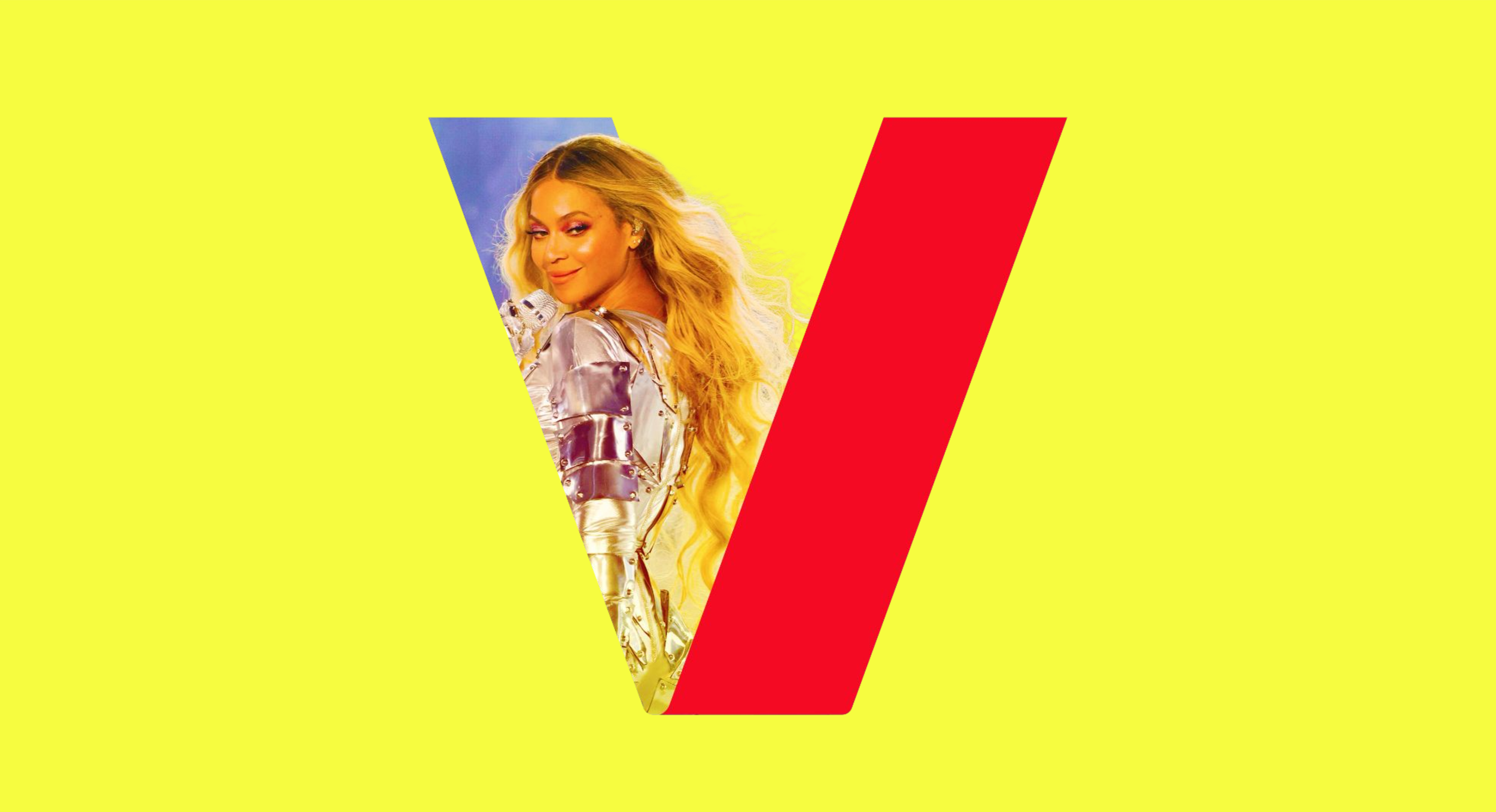
It’s not VIP
without the V
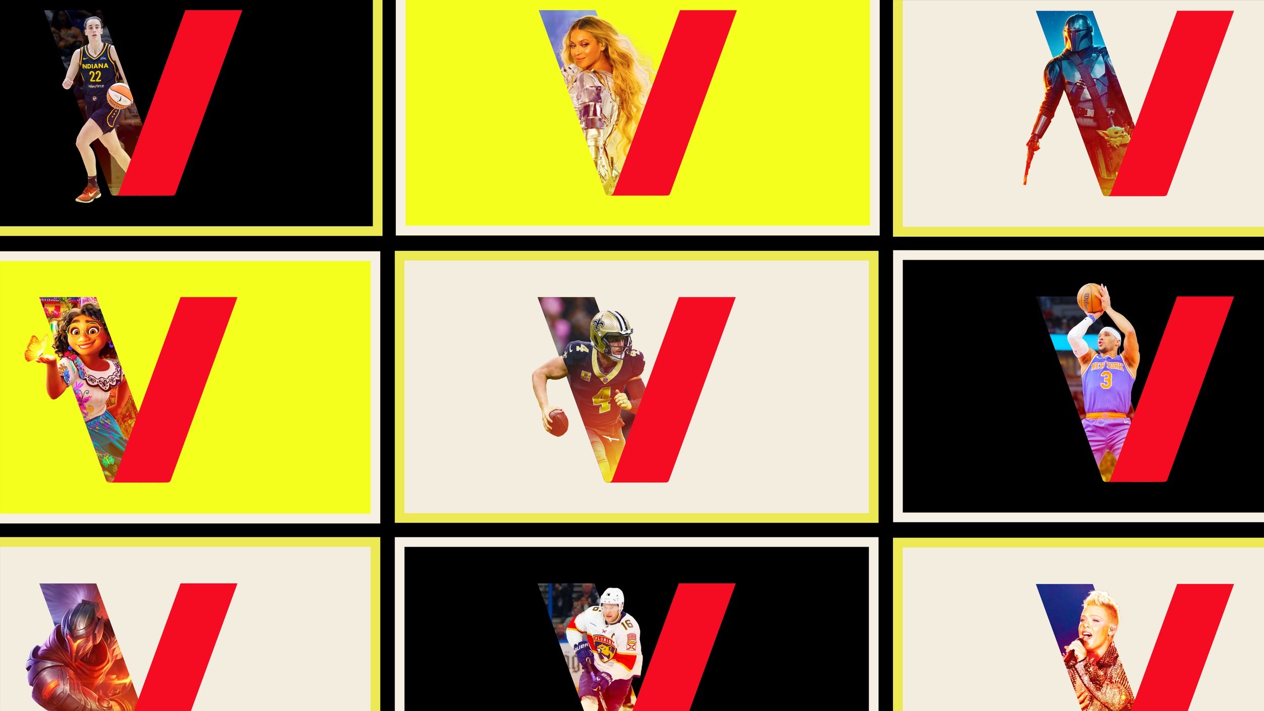
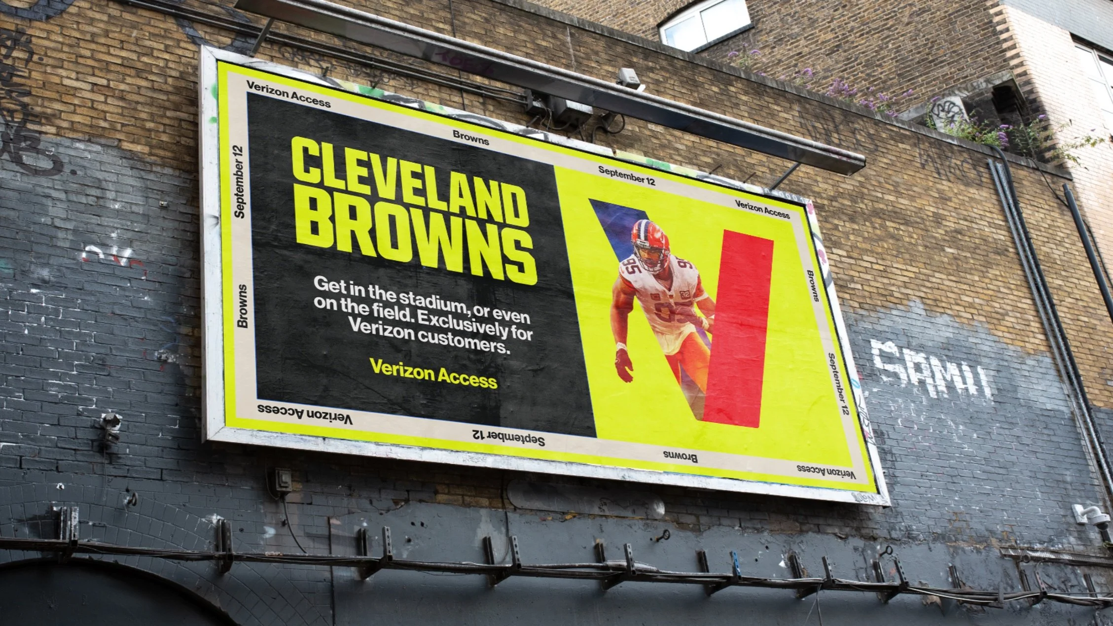
The V symbol, a powerful visual mnemonic within the Verizon Access design language, strengthened brand recognition and boosted awareness. Serving as both a standalone identity element and a complement to key messaging, it acted as a visual gateway for the brand, showcasing IP imagery, partnerships, and category offerings. Seamlessly integrated across creative applications and channels, it played a crucial role in fostering recognition and strengthening customer connections.
Boldly Defined
by Color
While Verizon Red remains central to the brand, this program introduces a broader color palette. Black, stone, and yellow are intentionally selected as statement colors to create bold contrast and elevate the overall identity. By limiting the number of colors and using each in thoughtful proportion, the palette works in harmony with the V symbol—drawing attention to it and reinforcing its significance.

—
Yellow adds a modern, energetic flair, while black and stone bring depth and sophistication. Together, these colors complement Verizon Red, strengthening the visual identity and establishing a clear color hierarchy that enhances the overall aesthetic of both the composition and the system.
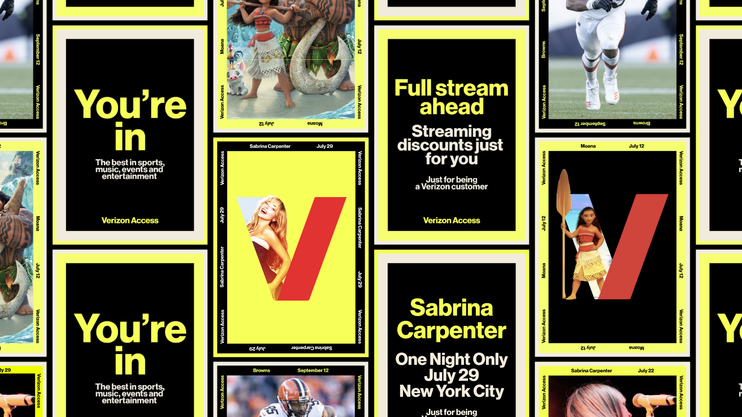
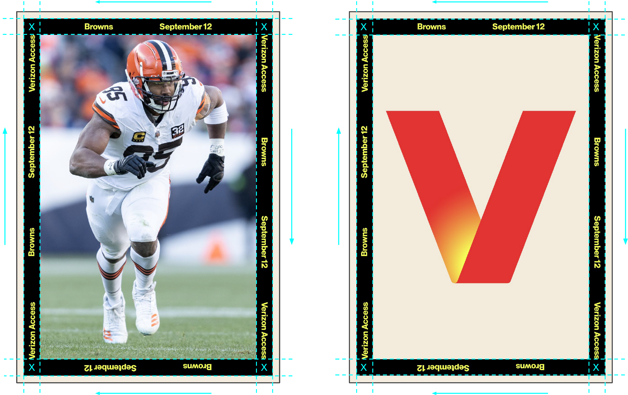
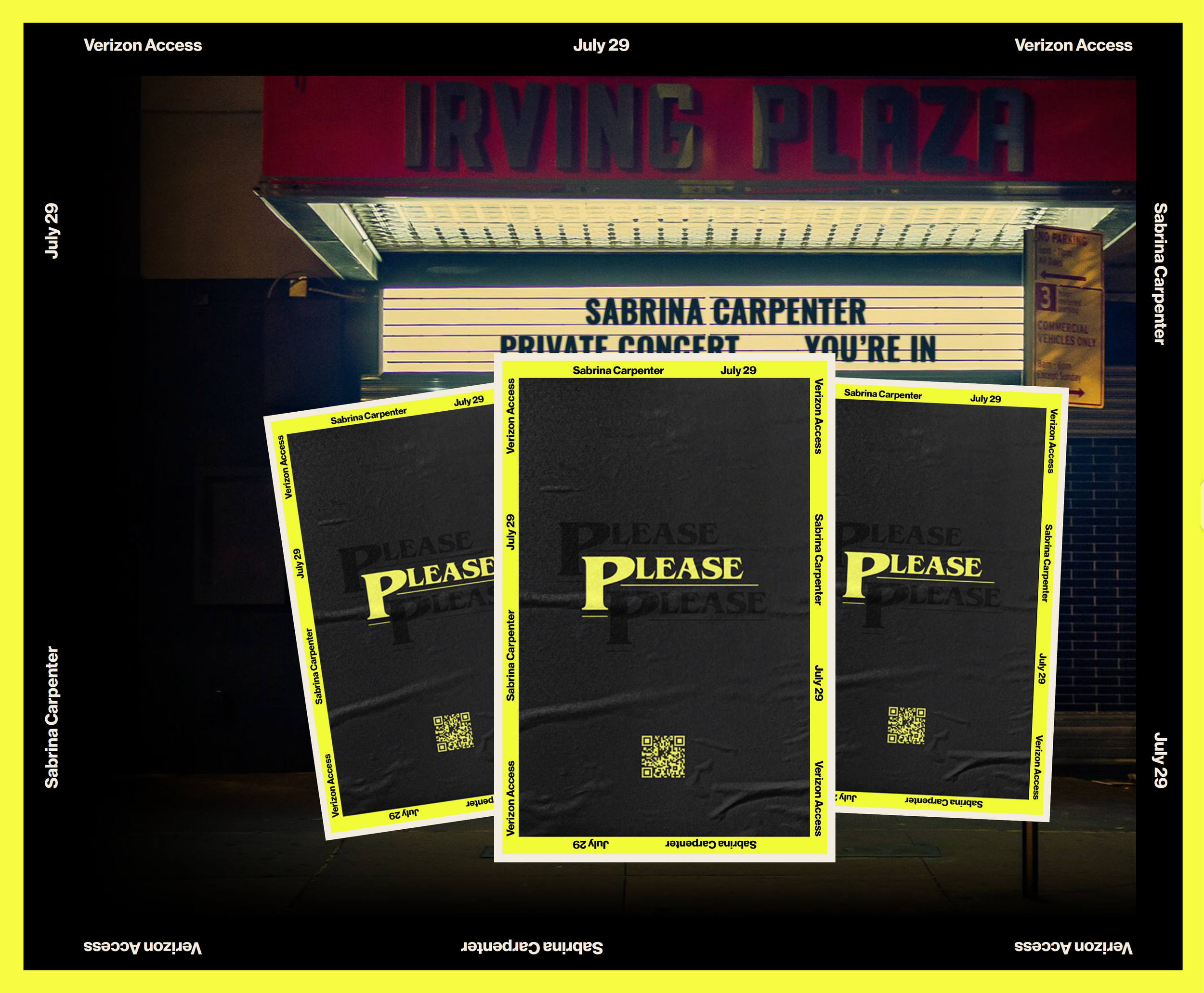
Activated Borders
The border creates a sense of movement within the design, acting as both a unifying graphic element and a functional step-and-repeat. It connects important, real-time information when paired with IP imagery, an activated V, or the standalone V-symbol. From a technical standpoint, the "Verizon Access" program title, partnership IP, and event date are included. Spacing is evenly distributed within the inner frame, and the text follows a clockwise path to maintain balance and ensure a centered, cohesive layout.
Headlines, Logos, and Typography
To maintain flexibility within the system while ensuring a cohesive layout, headlines, partner logos, and messaging are intentionally scaled up and center-aligned—creating a bold graphic focal point that complements imagery and color across channel applications.

—
A bounding box inset 5% from the interior edge of the outer border establishes a consistent frame for headlines, partner logos, and messaging. This clear space reinforces visual hierarchy and enhances readability across all applications. Copy is intentionally concise, delivering clear, impactful statements that draw the viewer in—engaging attention and sparking curiosity, rather than revealing everything upfront.

Connecting Visually
with Imagery
Photography evokes energy, drawing the viewer into the moment. In-situ shots of artists, athletes, and venues focus on action—using dynamic angles and clean compositions. Lighting plays a key role in enhancing the atmosphere, adding depth through color, and capturing the vibrancy of the experience.
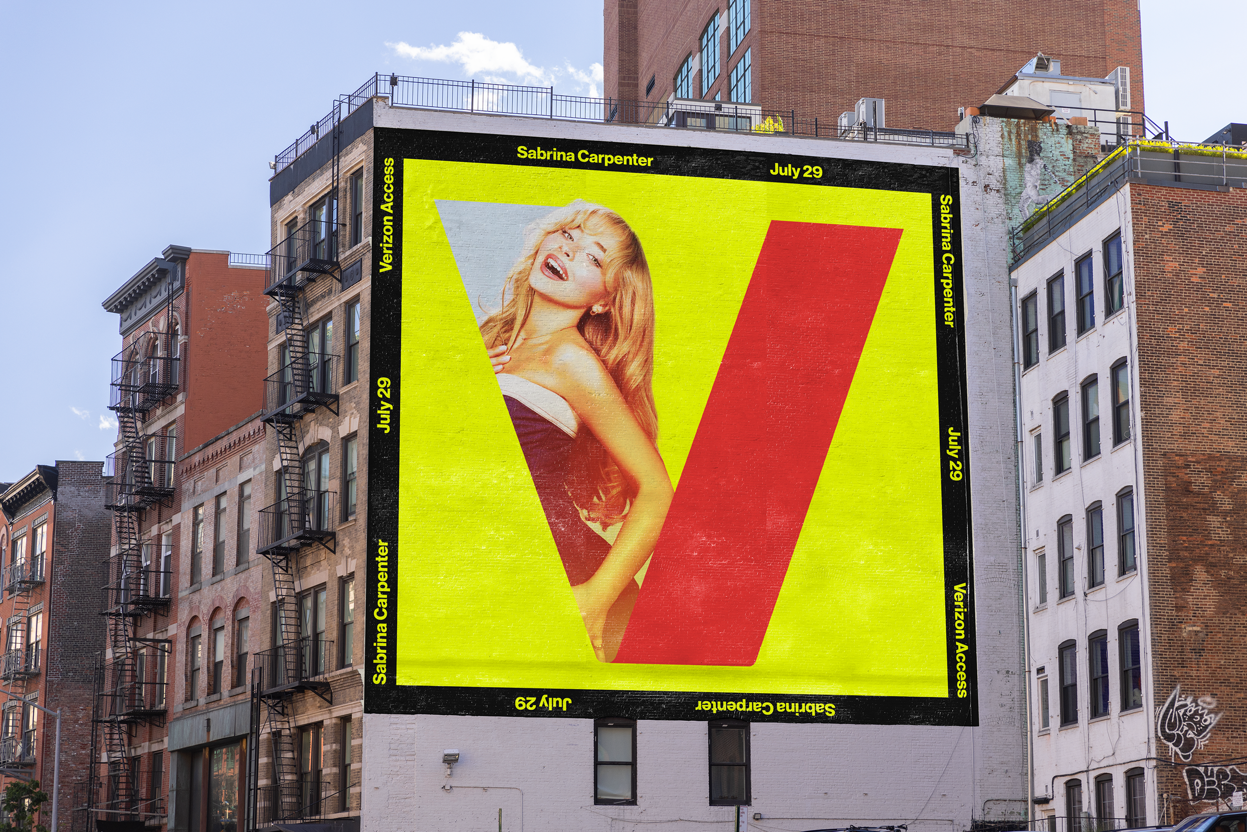
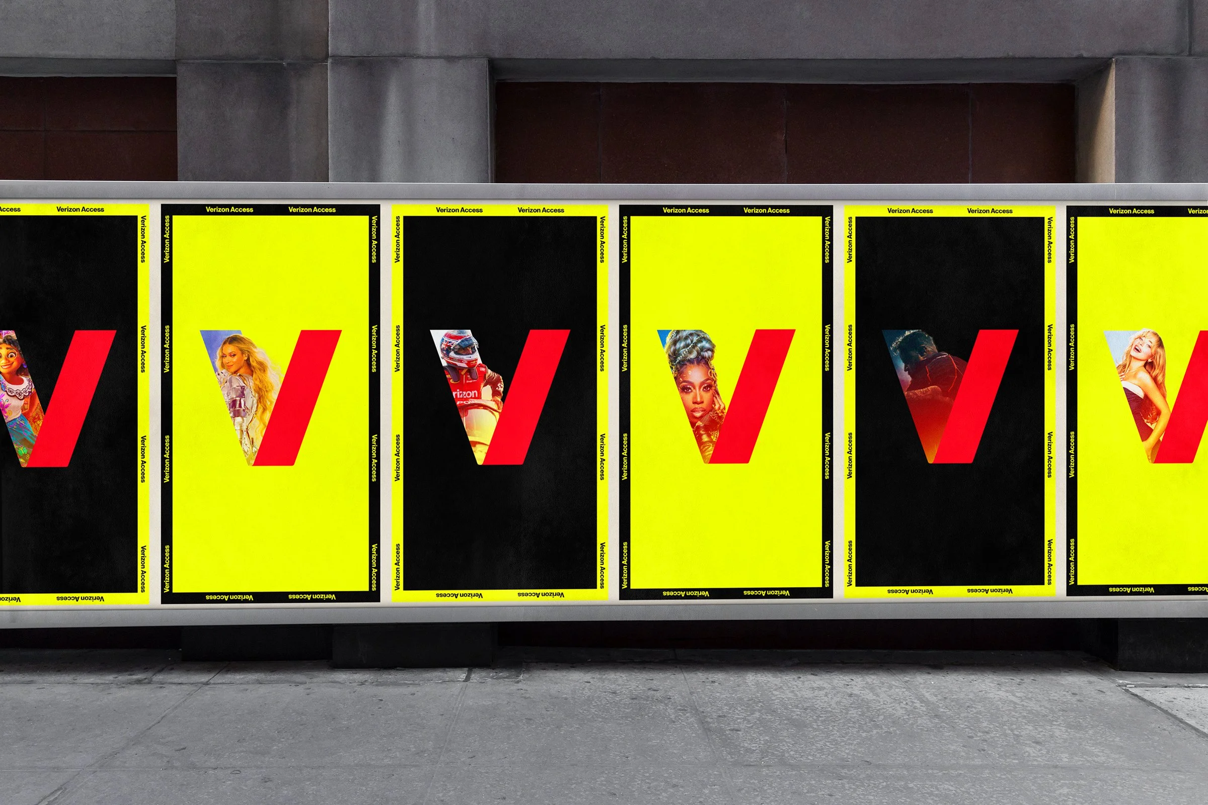
Marquee Moments. Maximum Reach. Meaningful Engagement.
Building on the success of the brand relaunch, Verizon Access’s go-to-market strategy was designed to amplify awareness in key spaces, creating a sustained and powerful “wall of sound.” Dotcom and retail channels were activated with ongoing support from both owned and partner networks, while paid media across OLA, OLV, radio, social, and OOH was strategically layered to maximize reach and impact. The approach prioritized upper- to mid-funnel amplification, leveraging marquee experiences—such as concerts, premieres, festivals, and sporting events—as a consistent engine fueling ongoing audience engagement.

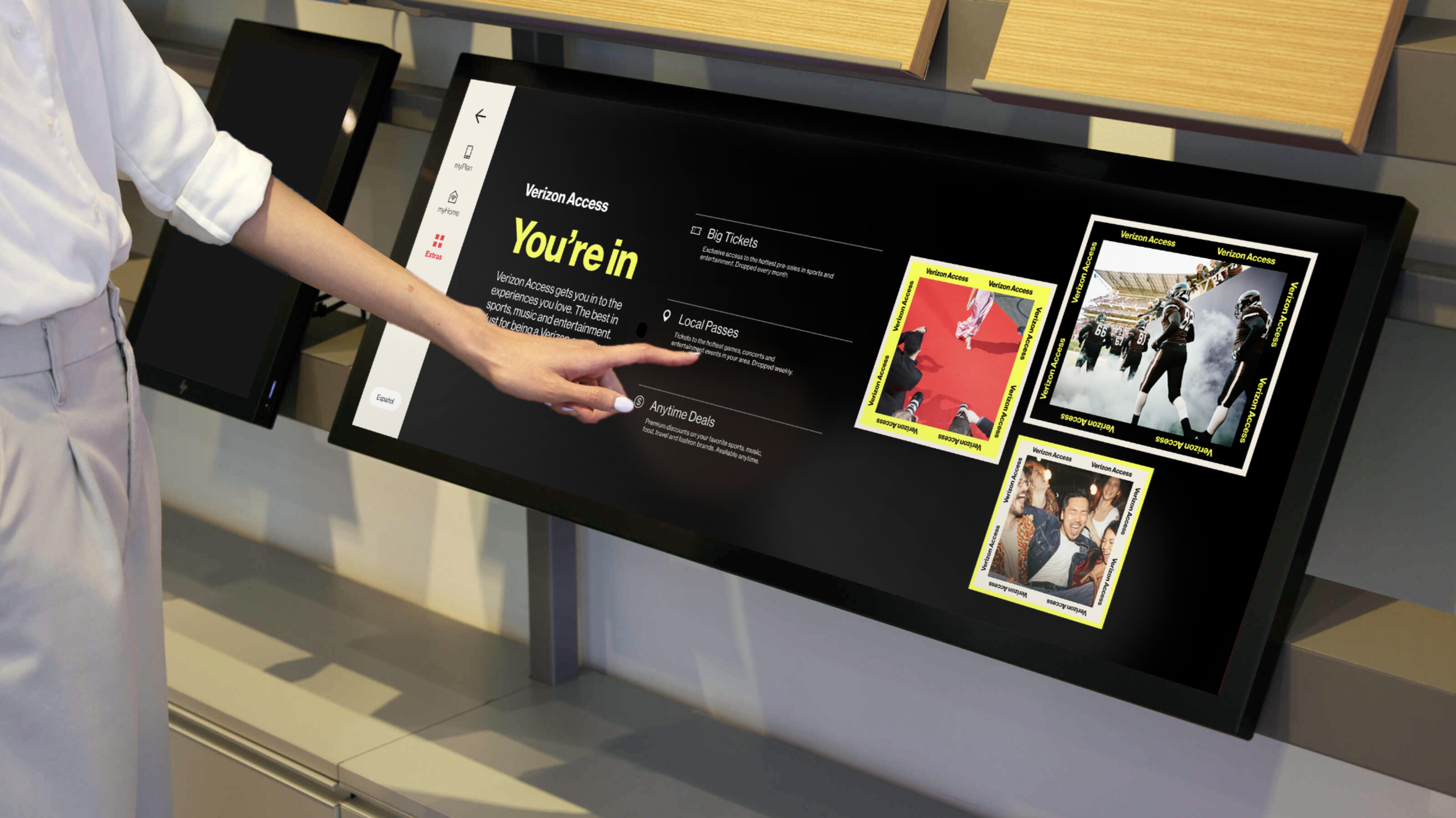
Owned channels build momentum by ensuring consistent messaging across platforms and spotlighting marquee events through targeted channels, driving engagement both in-store and online.

Driving engagement through social and paid media (OLV, OLA, Radio) to boost awareness.

The flexible design system allows the V symbol to adapt across various touchpoints, ensuring consistent brand expression while maintaining versatility for diverse applications and evolving needs.

The design system was tailored to exclusive events—whether a VIP concert, movie premiere, or sports event—ensuring a consistent brand presence. This was further amplified through out-of-home ads, branded merchandise, and VIP activations.


Credits
-
Kristian Espinosa
Senior Director, Brand Design & IdentityMike Wente
Vice President, Creative Marketing & Brand Design——
Matt Brant
Creative Director, Brand DesignJac Dion
Program Manager, Brand DesignKaty Mccarthy
Production DirectorKyle Potter
Senior Designer, Brand DesignKent Szlauderbach
Copywriter, Brand Voice & CopyDaniel Tovrov
Copywriter, Brand Voice & CopyMartin Virginillo
Senior Creative Director, Brand DesignDoug Wiganowske
Senior Creative Director, Brand Design