Verizon Identity Evolution
Verizon has long been seen as high-performing, trustworthy, and visionary. However, a year of research revealed that the brand was often perceived as distant and transactional, missing opportunities to build emotional connections. This insight prompted a shift from being a service provider to a brand that engages consumers on a deeper level. By focusing on the personal impact of its services, Verizon moved beyond selling products to fostering meaningful relationships, closing the emotional gap, and building stronger affinity. The brand was redefined to expand beyond its network focus and become an integral part of people's everyday experiences, deepening its connection with consumers.
We power and empower how people live, work, and play.
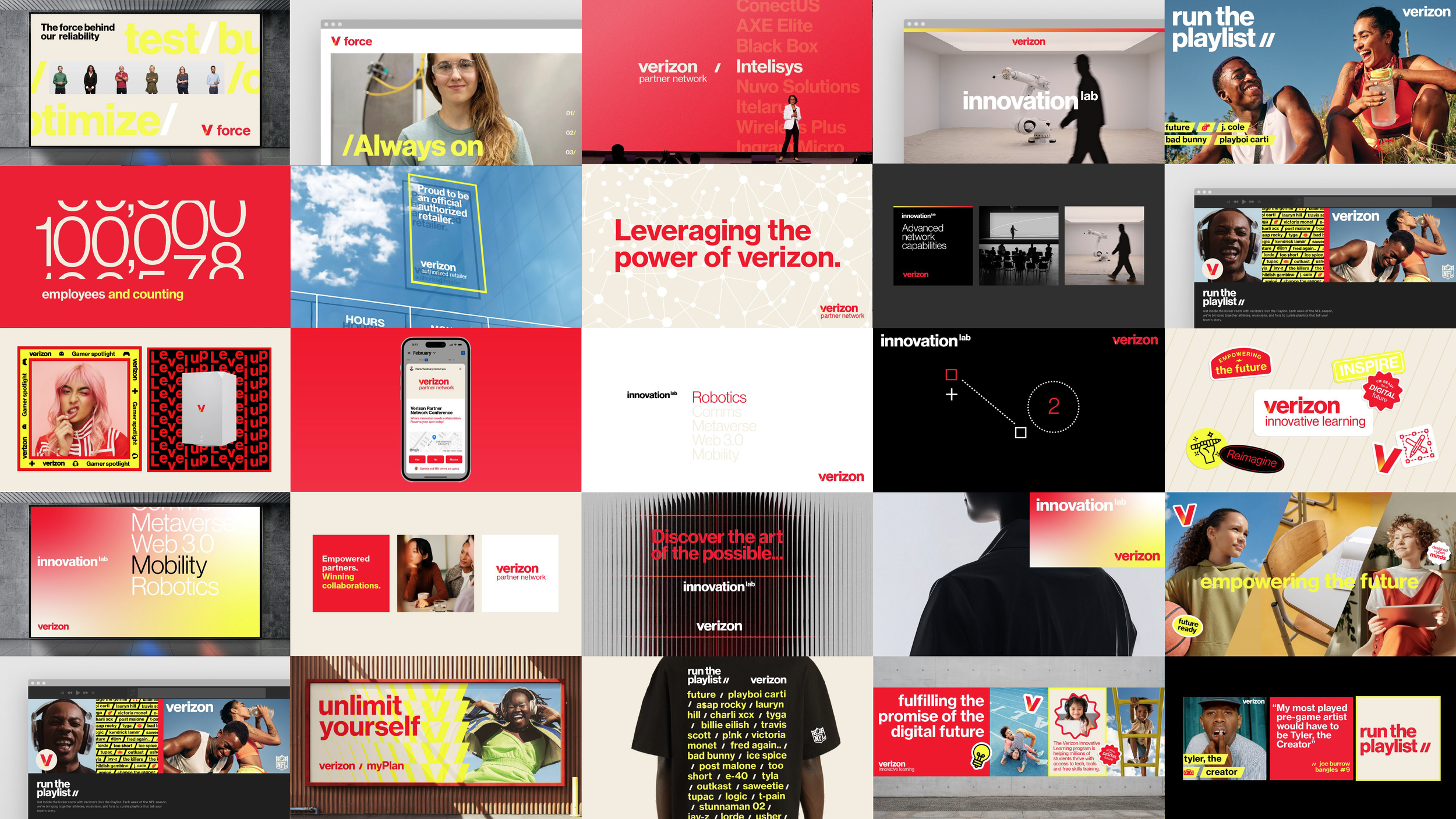
In response to low awareness and transactional signals, Verizon built on its existing design strengths while transforming its identity. In partnership with Turner Duckworth, the brand updated key elements such as color, photography, typography, and the logo to maintain recognition while signaling its evolution. This approach made Verizon feel more contemporary, vibrant, and relevant, helping the brand stand out in a competitive market.
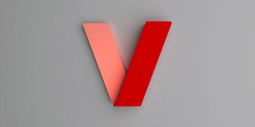
From Checkmark
to Glow V
The wordmark and checkmark are replaced by a refreshed, glowing ‘V’ symbol, inspired by the wordmark’s letterform and distinguished by its central glow. This glow emanates from the point where the arms of the ‘V’ converge, symbolizing the power of connection—connecting with others, with what we love, and with the world around us.
This update enhances the wordmark’s visual versatility, creating a stronger impact and more direct connection. It reflects the brand's evolution toward a modern, personalized, and adaptable identity that resonates with both consumers and businesses.

The yellow glow is a deliberate choice, rooted in the deeper meaning of the brand’s name. ‘Verizon’ is a portmanteau of ‘Veritas’—the Latin word for truth, symbolized in mythology by a god with a golden torch—and ‘Horizon,’ a term linked to the golden glow of a sunrise. These layers of meaning converge in a mark that carries timeless significance for the brand. As highlighted in the color section, the ‘V’ also influences our brand’s unique color palette.
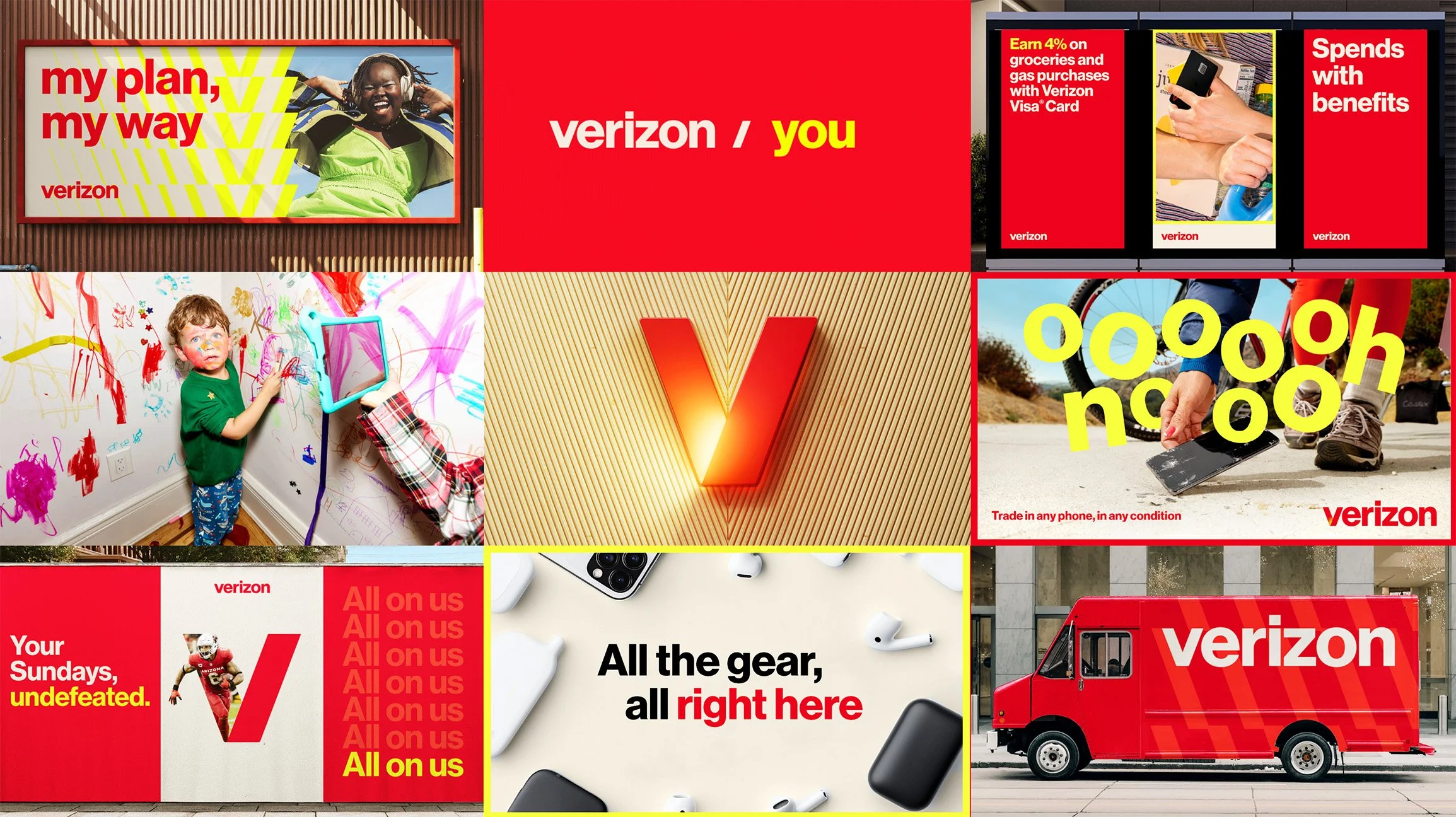
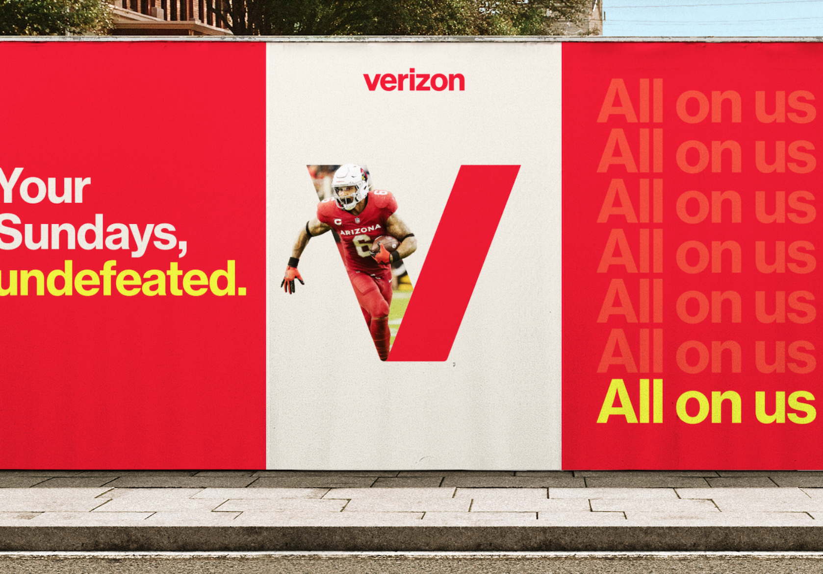
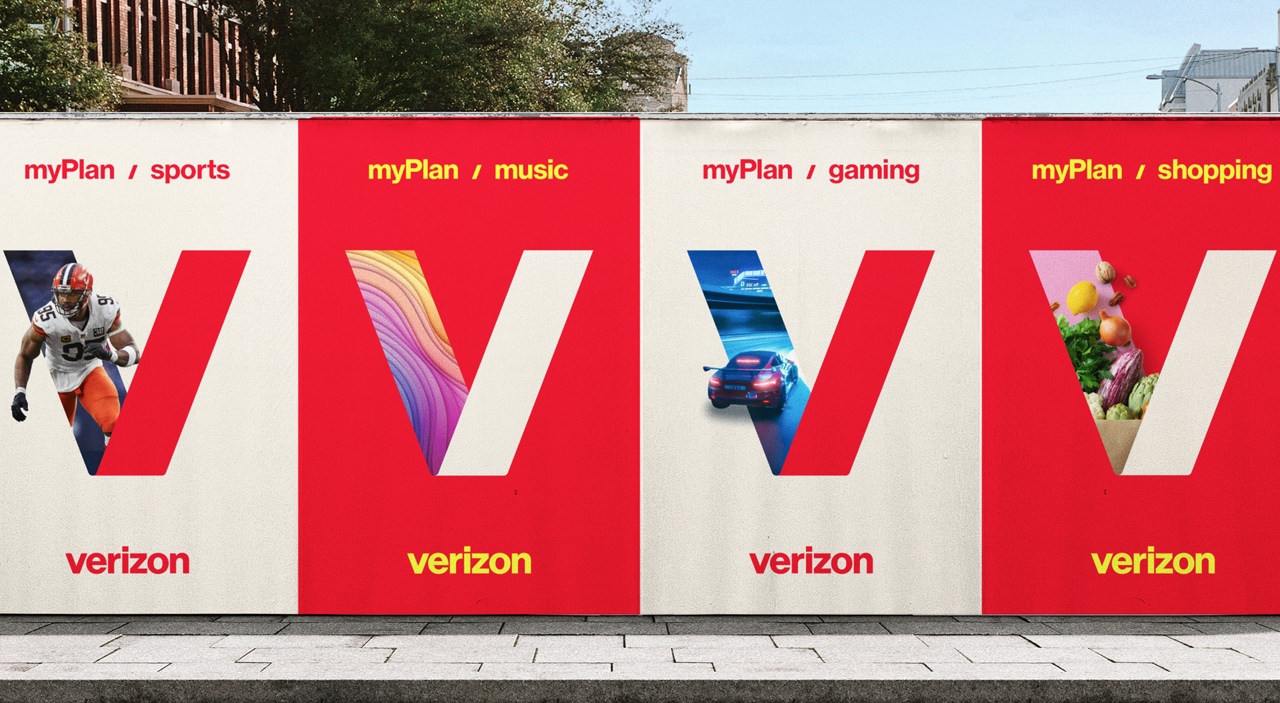
Activating the V Symbol
As a hero element, the V symbol was reimagined as a dynamic window. This evolution made the letterform more inclusive and approachable, adapting seamlessly into various applications, graphics, and patterns to strengthen connections with cultural touchpoints and key messaging.


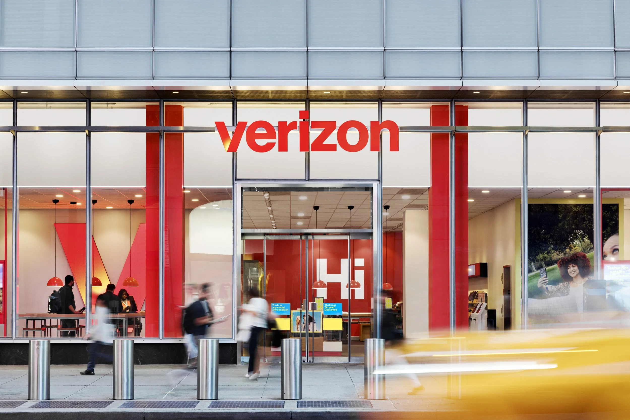
We are a
Red Brand
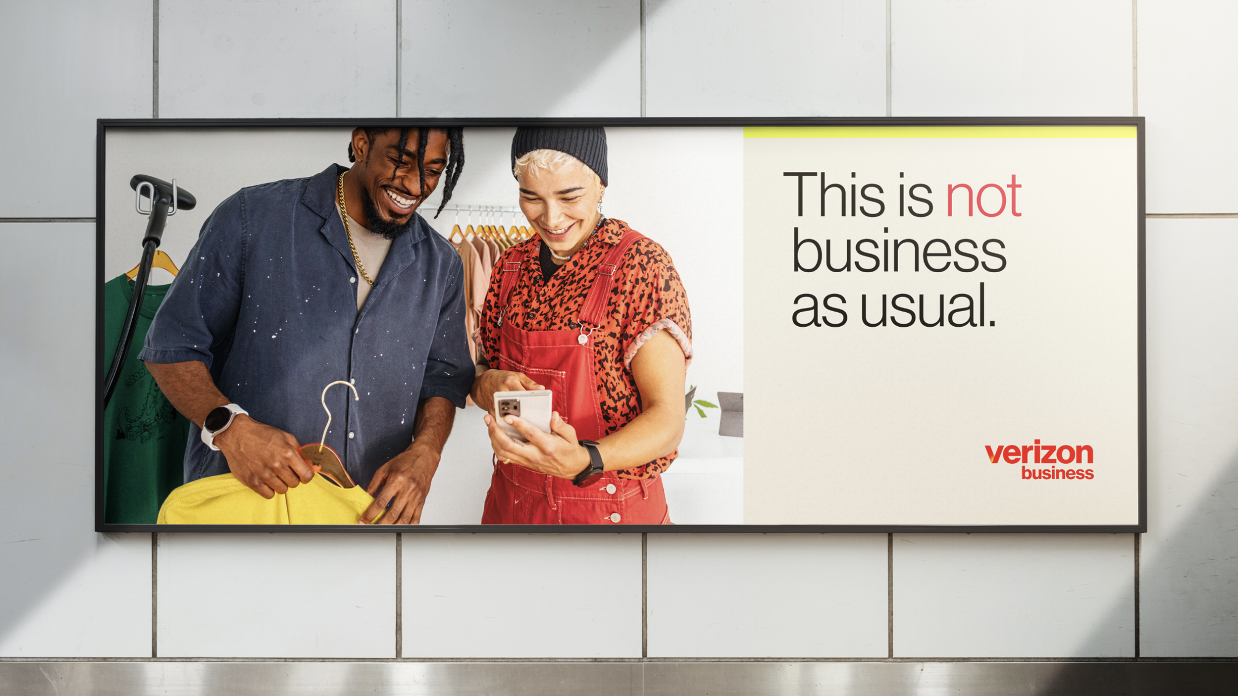
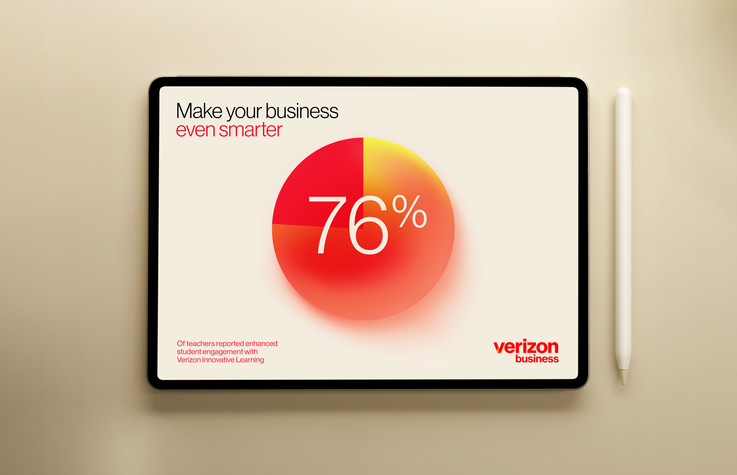
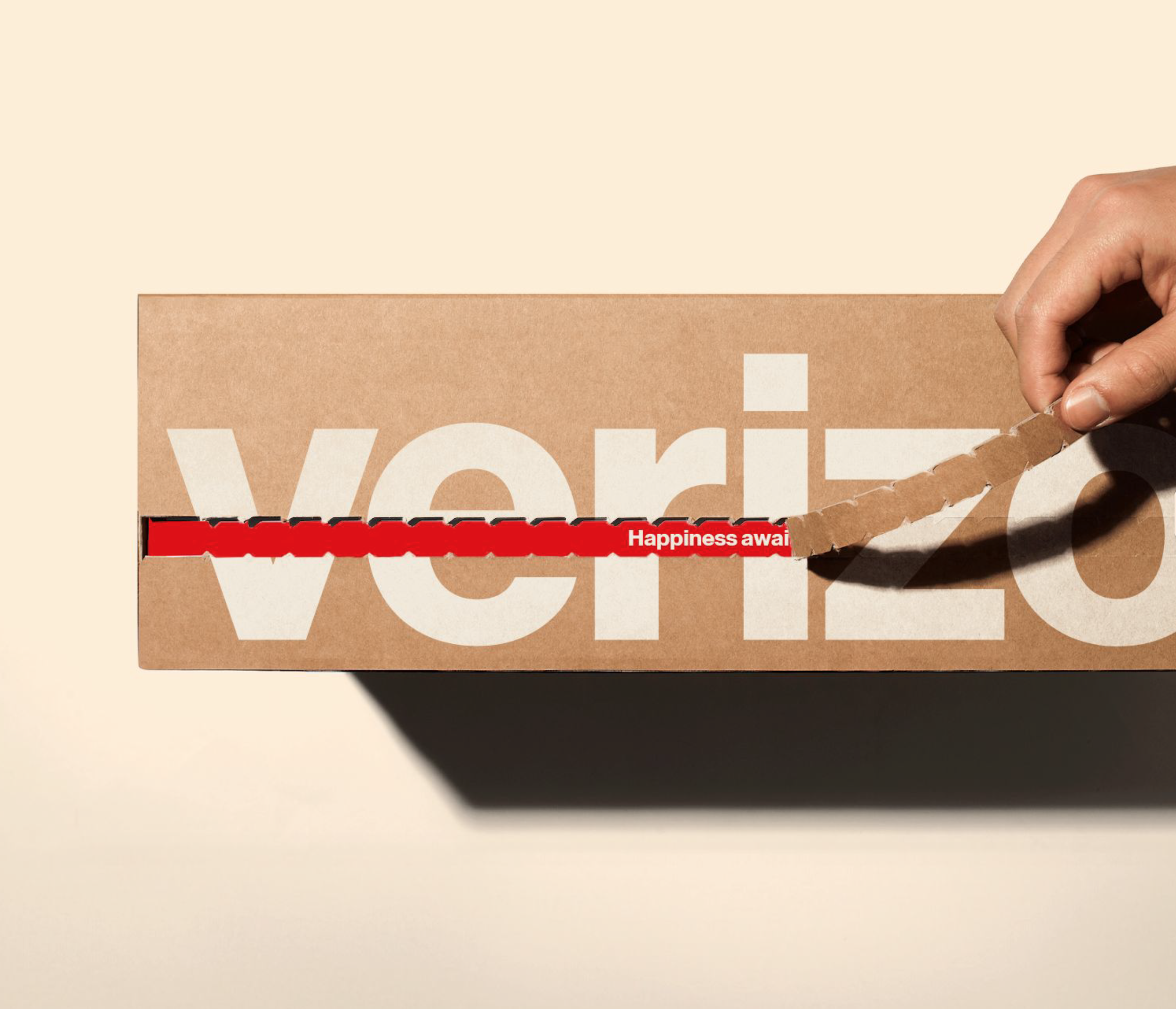
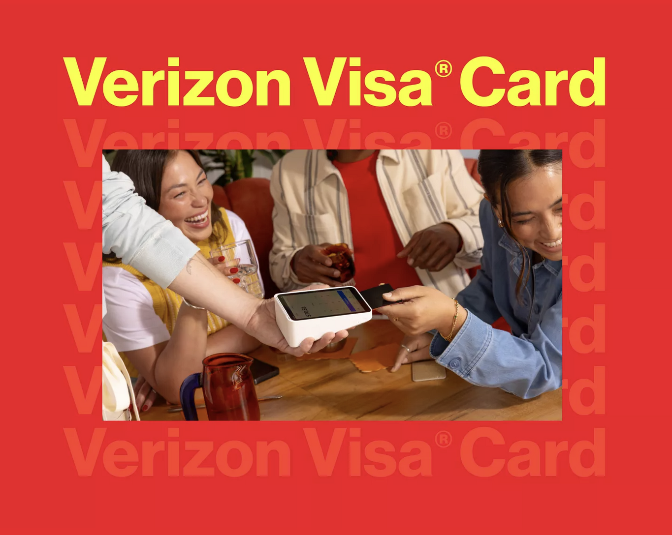
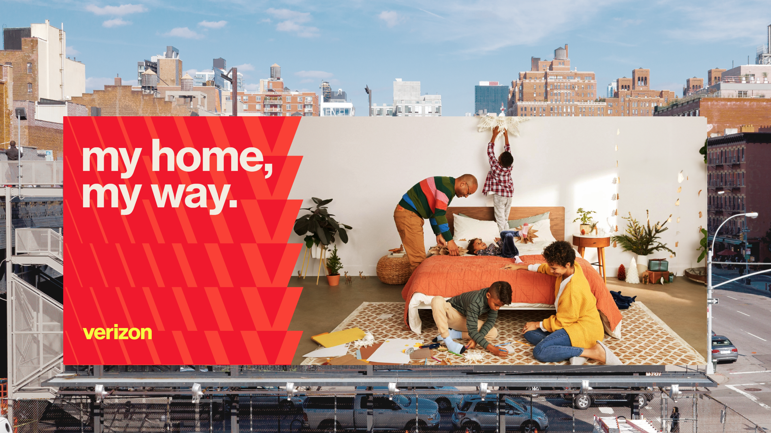
Verizon Red is the cornerstone of the brand’s identity, representing energy, power, and recognition. Paired with carefully selected "statement colors," it adds depth and personality, ensuring the visual identity remains fresh and dynamic.

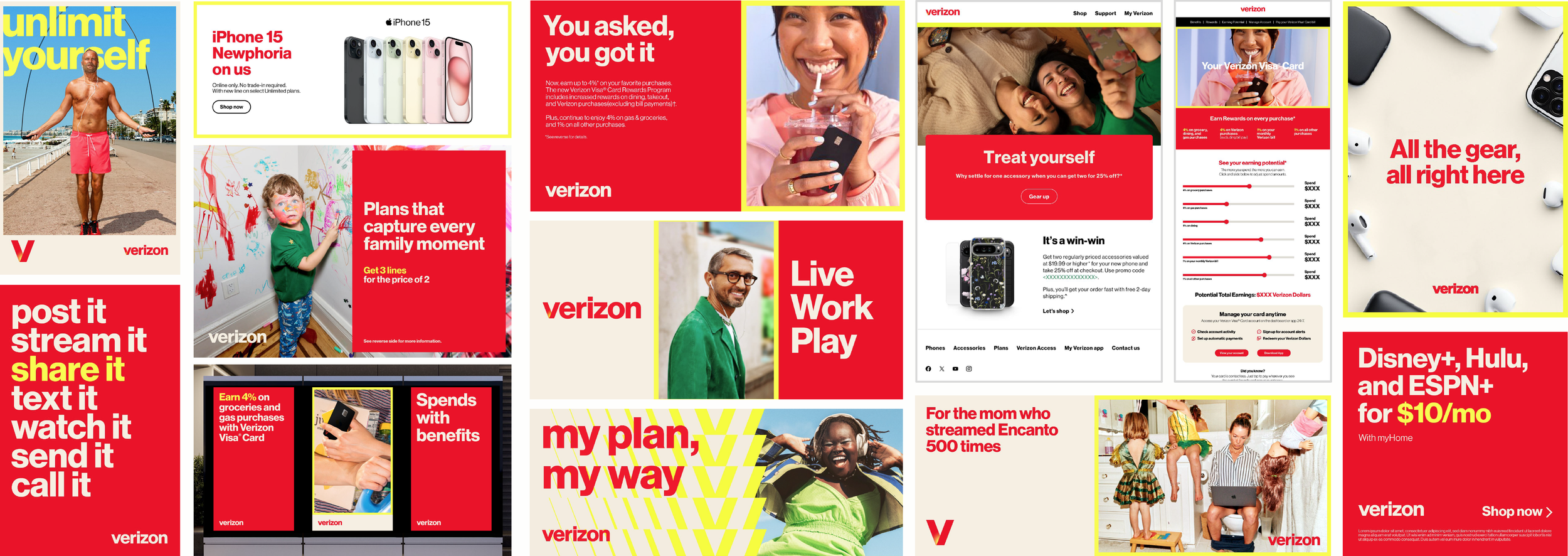
Verizon Red is prominently featured in every activation, either as the primary color or in support of brand marks, typography, and graphics. When paired with neutrals, Verizon Red creates a balanced contrast, allowing it to shine without overwhelming the viewer. This thoughtful approach maintains harmony and sophistication, ensuring the brand remains visually striking and aesthetically appealing.
Beyond the Frame—
Crafting a Narrative
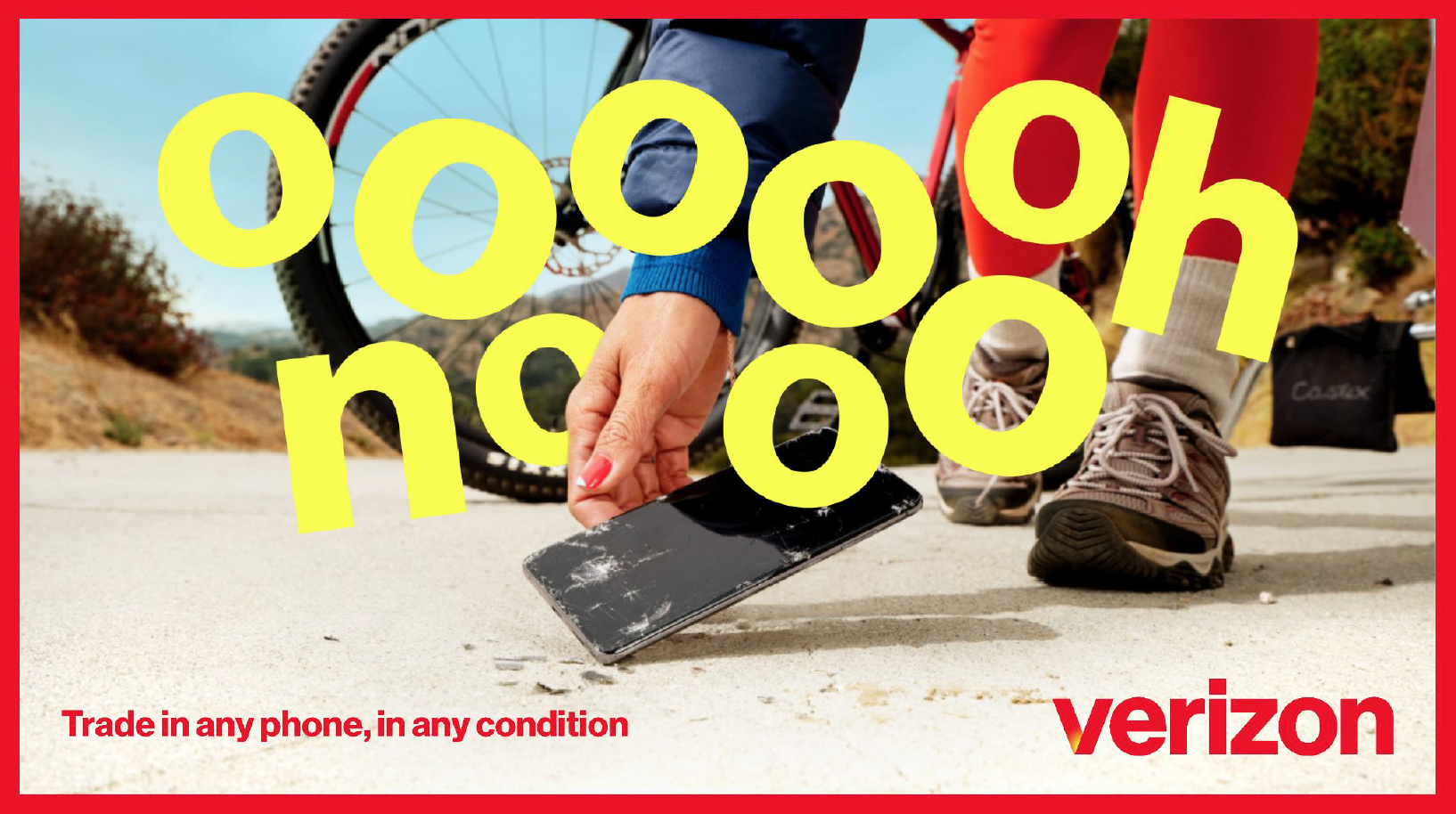
The photography vision was bold and expressive, capturing individuals or groups authentically showcasing their true selves. Vibrant colors and dynamic activities portrayed real, unposed moments. Simple framing ensured focused, uncluttered imagery, even in complex settings. A subtle warm grade enhanced the visuals while preserving the unique colors of each shot.


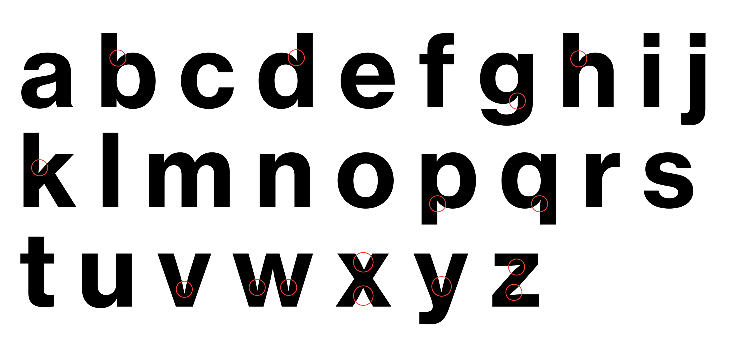
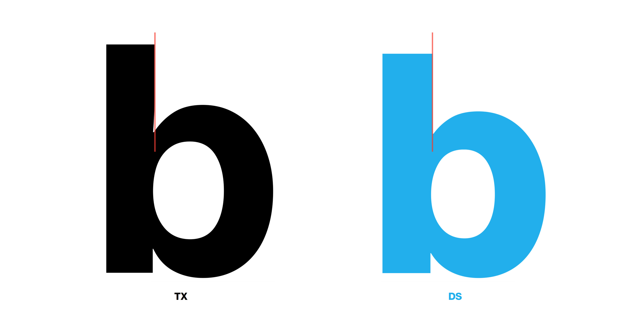
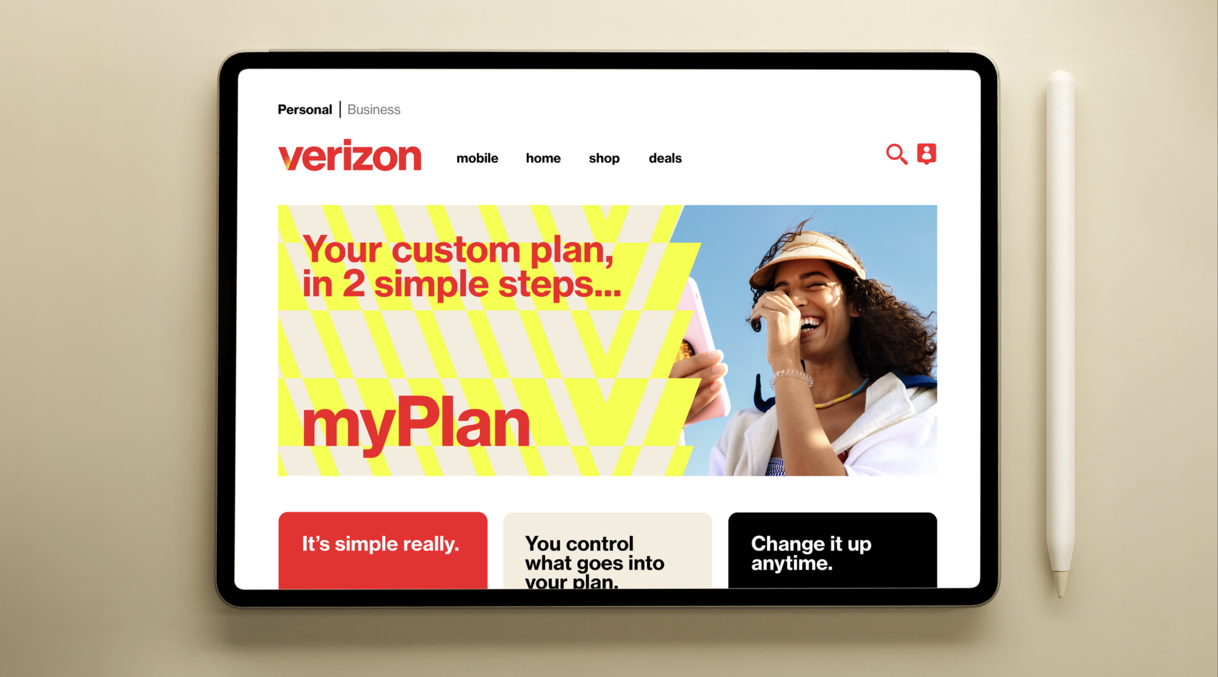
Expanding our typographic voice
Verizon’s identity and graphic program were built around a single typeface: Neue Haas Grotesk Bold. Initially defined by bold, white text on a black backdrop, this minimalist, almost stoic approach was instantly recognizable and flawlessly executed. However, over time, it began to feel a bit rigid. We intentionally expanded our typographic range with additional weights, refined characters, and custom variations for occasional departures to introduce more personality. This brought greater visual flexibility, impact, and subtle nuances, especially in our friendly, conversational customer communications.


Type as Texture
Loosening the guardrails—left-aligned, right-aligned, centered, light, bold, dynamic—allows typography to adapt seamlessly across brand channels and custom touchpoints. This flexibility transforms letters, words, and headlines into an expressive tool that elevates Verizon’s playful and uplifting tone. As a core design element, expressive typography amplifies the brand’s personality. When guided by a clear concept, typography’s behavior, shape, and form reinforce the message and enhance the overall design.


Making the Invisible Visible:
Brand Launch 2024


Credits
-
Leadership Team
Ricardo Aspiazu
Senior Vice President, Creative Marketing, Brand Management & Brand DesignKate Carnesale
Senior Director, Brand Management & GovernanceKristian Espinosa
Senior Director, Brand Design & IdentityMike Wente
Vice President, Creative Marketing & Brand Design -
Chris Garvey
Executive Creative DirectorJared Britton
Creative DirectorOliver Lo
Design DirectorWyeth Whiting
EVP, Director Of PartnershipsSam Brown
Managing Director, Head Of Accounts